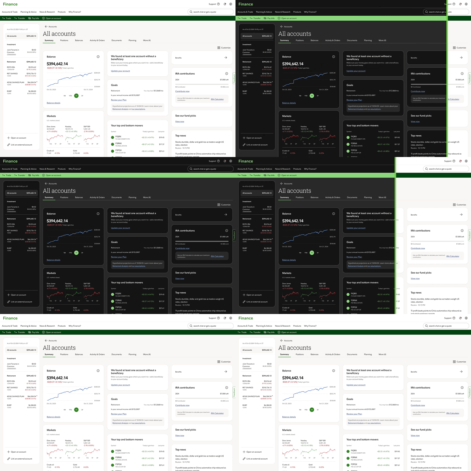
Design system themes
How might we ensure consistency across different platforms and devices?Overview
Our organization faces significant challenges in maintaining consistency and efficiency across multiple systems, platforms, and products due to disparate design assets and custom theming.
Design tokens provide a single source of truth, ensuring that both design and engineering teams share a common specification language. This unified approach streamlines the handoff process, making collaboration more efficient and reducing misunderstandings.
Approach
A shared language is a critical factor when it comes to navigating conversation surround properties that translate to components and ultimately user experiences.
While design tokens can be an underlying piece of design systems that live behind the scenes, they are a critical player in building a framework to scale as new product offerings require new sub brands or user preferences like color modes and density.
I primarily worked with two front-end engineers and an enterprise architect to audit and consolidate existing token repositories, synthesize recommendations with usage guidance, and determine the recommended practices for the enterprise.
-
Key findings
- Inconsistent and generic naming conventions are used to describe tokens across systems.
- The absence of a documented programmatic approach to scale color across systems is a critical issue that needs to be addressed.
- It is imperative to ensure that all color combinations in coded components meet the AA-compliance standards for accessibility.
- Tokens are maintained manually across design software and coded repositories.
- Gaps in design software and front-end development created workaround paths, further confusing the source of truth in design decisions.
-
Recommendations
- Define token naming convention to scale and support business units and their use cases outside core and system design tokens.
- Leverage Style Dictionary to transform defined brand visual styles across Android, iOS, Web, and Figma.
- Educate enterprise on token tiers, their intent, benefits and value to the broader organization.
- Define pilot platforms to collaborate and develop examples to demonstrate their value and flexibility.
- Show and don't just tell, instill confidence in community be walking through implementation paths for design and code.
Constraints
Our greatest constraint during the scope of this project was ensure our token pipeline would scale to support syncing with our enterprise design tool, Figma. Limited documentation on how Figma creates variable IDs in their backend became an initial syncing challenge with testing across various files.
Features
Our token architecture offers an opportunity to establish a strong foundation for scaling across business domains, platforms, and products.


Impact
A consolidated token pipeline is a pathway to unifying our digital experiences regardless of what system version our consumers use.
Takeaway
If there is one thing I want design token consumers to understand, design tokens are design decisions. Tokens enable teams to focus on experience while reducing the strain of color combination and type scale and maintaining a variety of repeated styles and code.- Design tools will continue to evolve. Remain focused on the intent of what your design system needs, not what it can do because of a design tool.
- Visual examples are critical for showing and not just telling stakeholders about the importance of design tokens and themes.
- Testing environments are critical in both code and design; they can help when reverting a defective publication with various breaking changes.
- Conduct discovery and analysis on internal associate desktop tools and approaches for them to benefit from a token pipeline.
- Tokenize motion properties to inform a motion principles playbook while providing reduced motion guidance as a requirement for accessibility.
- Explore data visualization with brand-theming support and color modes for color blindness.