Financial Services

Enterprise Design System

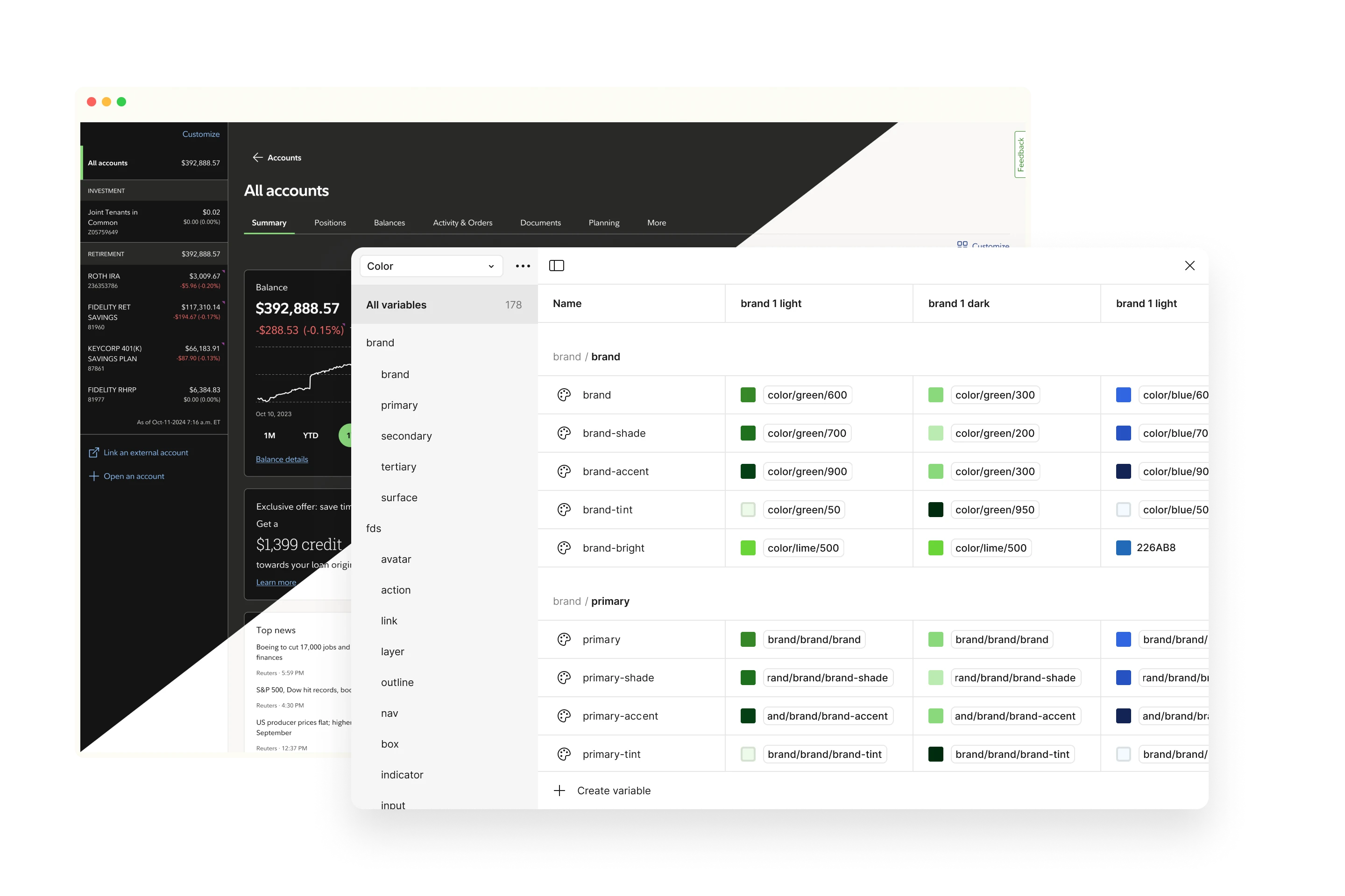
How might we create a scalable design system that evolves with our brand while maintaining a consistent user experience?

Timeline 6-months
My role Principal UX Designer
Deliverables design tokens, design kit and component library, documentation and catalog

Apologies for the incomplete picture.

Due to the secure nature of financial services and security to protect our clients, I am undergoing internal reviews to be able to share a bit more details publicly. Company branding has been omited per compliant requirements. More to come! โ€“Edward

Overview

Enterprise Design System (EDS) is a true design system for a financial firm, built from the ground up to support our entire digital ecosystem. EDS provides creators the resources and guidance they need to design consistent, accessible user experiences at scale. The system is flexible, adaptable, and will evolve as the needs of our organization does. With this integrated and systematic approach, we can maintain and project a unified brand identity.

Problem

Outcome

Inconsistent design standards The absence of a unified design system has led to inconsistent design standards across different products, creating confusion and a lack of brand cohesion.
Code and design parity Syncing design and development with our brand identity and accessibility standards significantly reduced duplicative efforts.
Increased maintenance costs Maintaining multiple versions of similar components across different projects increases maintenance costs and complicates future updates.
Consolidated cost and efforts Utilizing a centralized design system reduced duplicative efforts, allowing teams to focus on innovation and improvement.

Approach

Executive leadership support for the design system initiative resulted in funding to increase our team size with two specialized external agencies. I coordinated both agencies to bridge our design token strategy, the design development of our components, and overall contribution to our reference documentation site.

Methodology

Our team of 20+ members is organized into two smaller squads to break down the bulk of work into smaller increments. As an individual contributor, I worked across both the "Delivery" and "Enablement" squads, splitting my time 50/50.

Delivery focuses on operational component functions such as design tokens, design toolkits, and coded catalogs, while Enablement focuses on adoption efforts.

Key findings
  • Design toolkits and coded components lack parity, leading to accumulated tech debt with custom overrides across product teams.
  • The absence of a dedicated documentation site for Android and iOS is a gap between design and development.
  • Naming paradigms are not consistent across design systems such as card vs tile vs content block.
  • Our brand standards exist only as a 36-page PDF and primarily focus on marketing, not digital experiences.
  • Design tokens are not currently shared across design systems, leading to fragmented interpretations of our brand standards.
Recommendations
  • Prioritize information architecture to consolidate and improve findability across brand, channel, design tokens, and component documentation.
  • Define end-of-support documentation to discourage continued use of legacy systems and plan migration efforts in pilots.
  • Collaborate with accessibility partners to test components in context rather than strictly UI elements.
  • Partner closely with content strategy to expand messaging across content, design standards, and general communications regarding updates.
  • Set up support channels for adopting the design system to answer general questions regarding design and development, reporting potential defects, and new feature requests.

User Flow

Constraints

We had a total of 6 months to deliver a fixed number of components. Our ramp up went from announcement of enterprise initiative, to onboarding external agencies, to crowdsourcing use cases, to consolidation, design iterating, testing, developing, and finally releasing.

Critical

Limited scope per component

As a product team, we had to prioritize more common known use cases then individual product use cases. This became a challenge with initial reception and product teams impacted by priority were vocal.
High

Parallel efforts

Milestones weren't always immediately clear and created a bit of paralysis by process with being a team of 20+ contributors.

Ideation

In an effort to keep our visual language iterative, we defined minimum criteria ranging from background color, border radius and brand colors.

Features

To consolidate all of our design system output, we consolidated into one reference docsite internally known as design.fmr.com.

Documentation Site

Revamped information architecture to reflect the expanded offerings across our visual language, brand, and design components.

Design token pipeline

Single monorepo distributed across Android, iOS, Web and Figma

Title 3 FPO

Description FPO

Title 1 FPO

Description FPO

Title 2 FPO

Description FPO

Title 3 FPO

Description FPO

Title 4 FPO

Description FPO

Title 5 FPO

Description FPO

Title 6 FPO

Description FPO

Impact

Background FPO

Impact 1 FPO

Description FPO

Impact 2 FPO

Description FPO

Impact 3 FPO

Description FPO

Takeaways

I joined our design system team to combat growing needs across our enterprise. Being on the other side of the fence was a humbling and eye-opening experience in navigating the decisions involved in building a design system.
Lessons learned
  • Deepened my understanding of accessibility requirements and closely defining criteria to be AA compliant.
  • Collaborate with content strategy as documentation in guidance can be bridged across the enterprise.
  • Demos are critical to the success of instilling confidence in design adoption. The increased in design tool updates created a gap for consuming designers to navigate features integrating with iterative releases.
Some potential next steps
  • Expand pattern documentation efforts to be centralized across business units.
  • Refine data visualization guidance by leading with an emphasis when to use vs just a data table as well as expanding guidance to not rely soley on color strictly as visual distinction.
  • Continue to lean in and listen to design community feedback and dive deep into understanding component limitations not meeting their use cases.

More work

View all work