Sharon Public Library
How might we evaluate our current existing site content and improve finding information?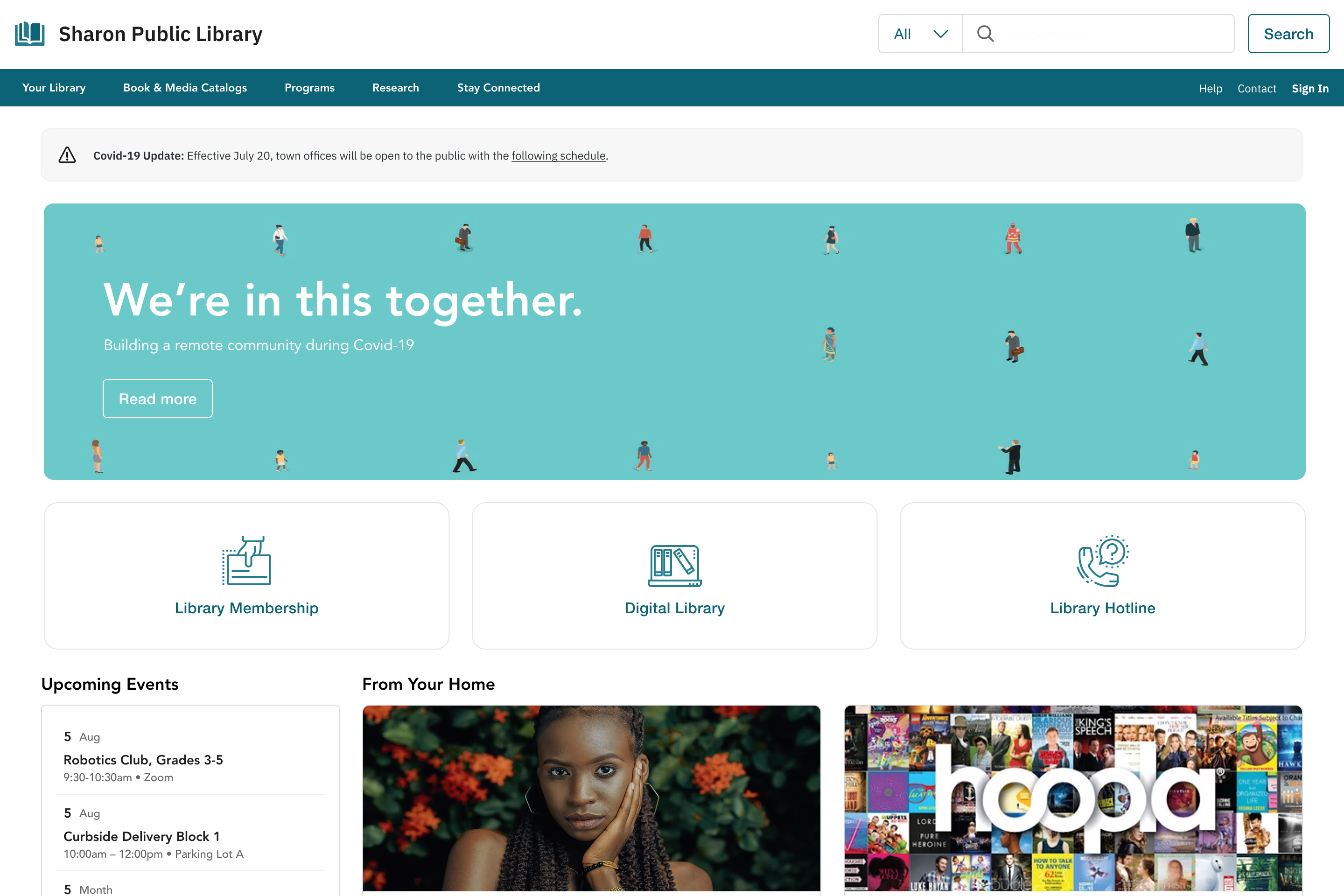
Overview
Sharon Public Library is a destination that serves as a civic space encompassing literacy, cultural arts, and community programming. The project aimed to evaluate site content and navigation to make it easier for patrons to find information and services.
Problem
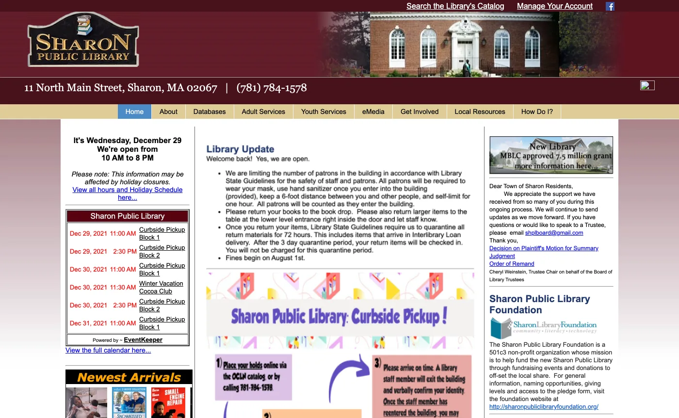
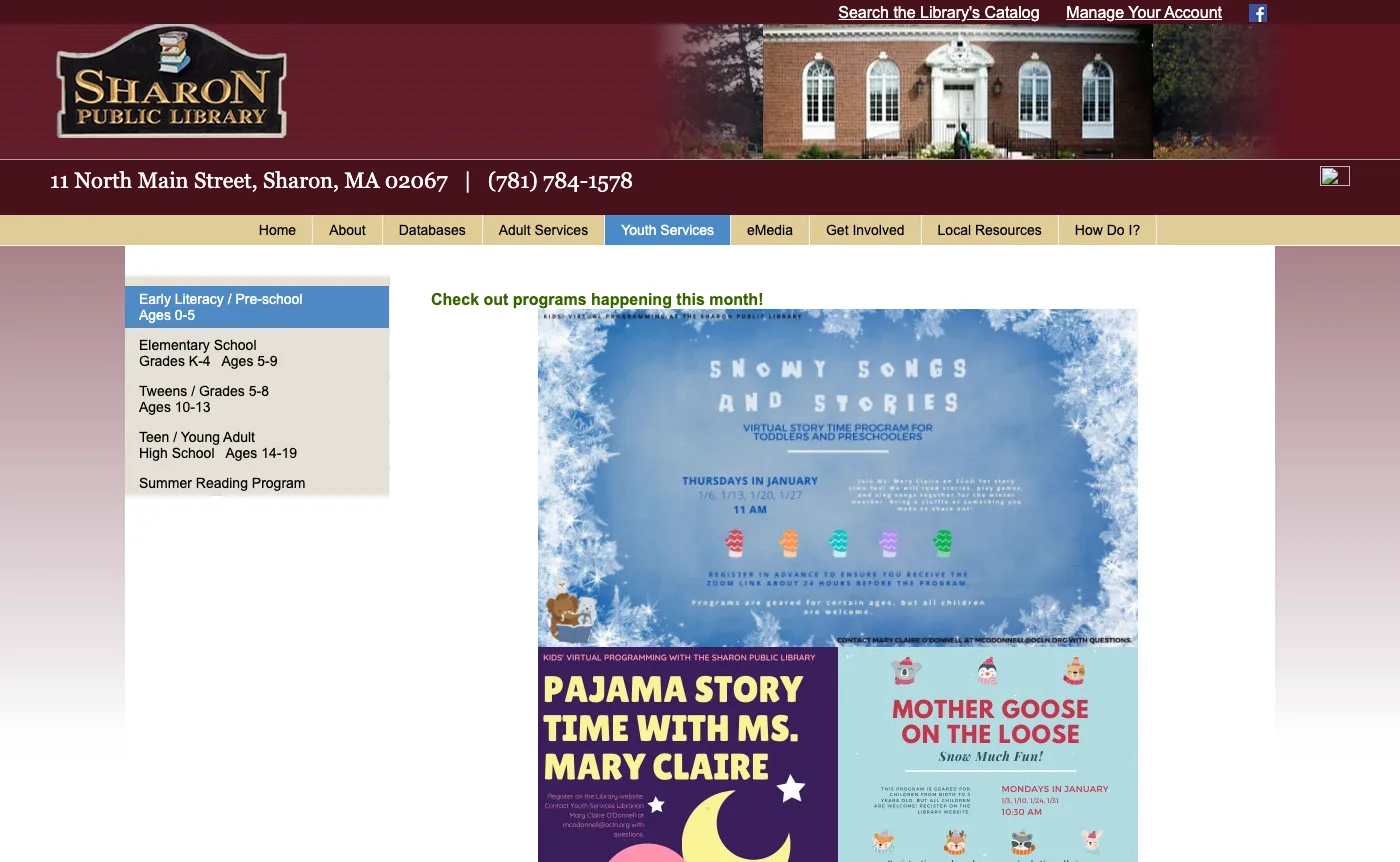
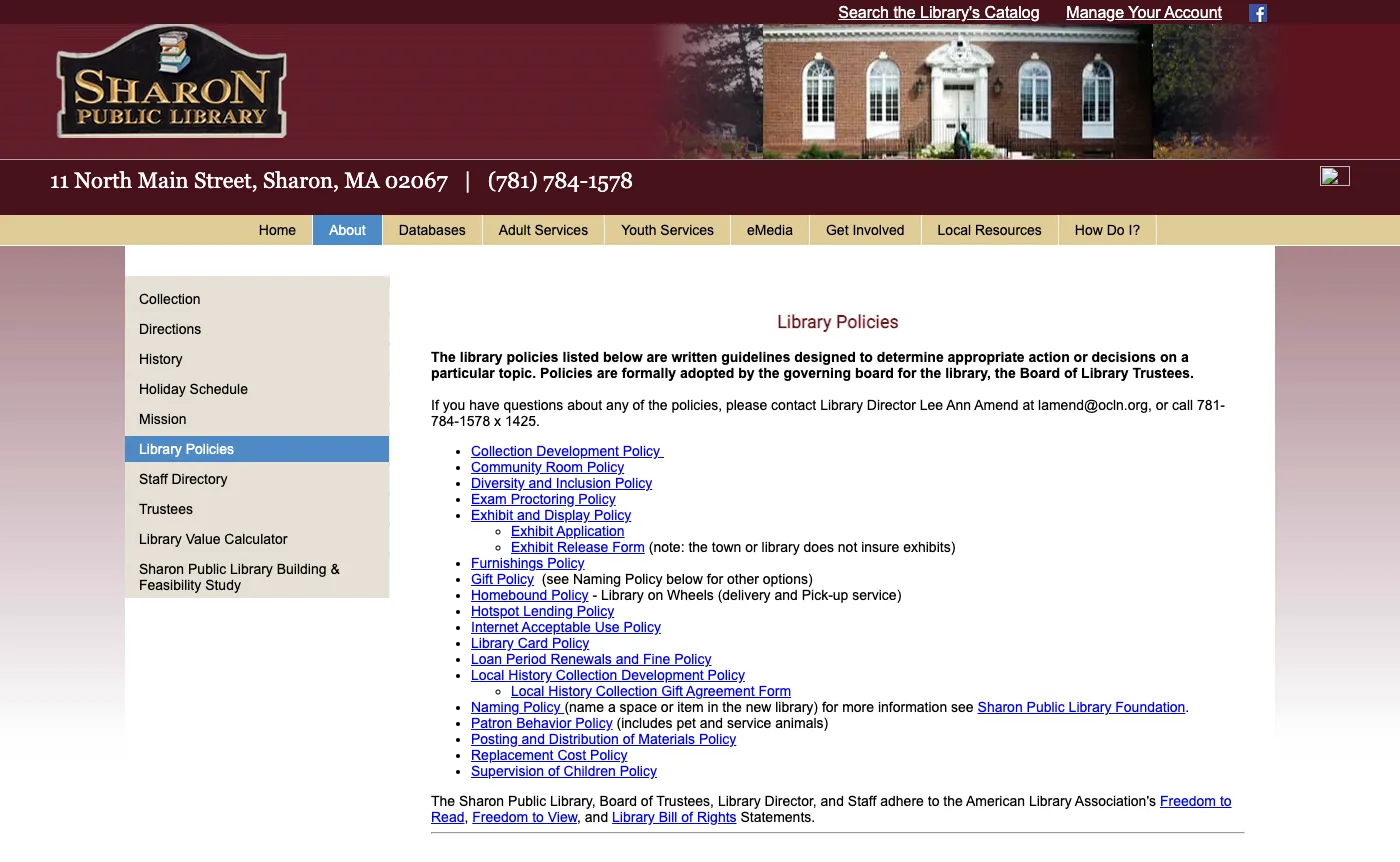
Over 2,000+ pages indexed created navigation difficulties; many links were outdated or no longer functioning.The website was not fully ADA compliant and lacked modern technical practices, creating barriers for users with accessibility needs.-
01Digital content overload
A large volume of pages and redundant content reduced discoverability for key tasks.
-
02Accessibility gaps
Outdated templates and PDF-heavy content presented barriers to users with assistive technologies.
Solution
Propose an improved information architecture, consolidate outdated content, migrate key pages from PDF to HTML, and introduce a lightweight design system to meet accessibility requirements.-
01Improved information architecture
Consolidated and pruned content to surface relevant pages and reduce navigation depth.
-
02UI and accessibility enhancements
Introduced consistent UI patterns and guidance to support ADA compliance and better usability.
Approach
To deepen understanding of patrons, conducted discovery, remote interviews, retrieval usability tasks, and content analysis to drive IA recommendations and prototype designs.- Technology comfort varies by age; older patrons showed lower digital literacy.
- Computer hardware and Wi‑Fi availability influence visits to the physical library.
- Content databases maintained manually can conflict with digital records, creating patron friction.
- HOOPLA and downloadable media are high-value services for patrons.
- Pandemic conditions increased reliance on digital resources and highlighted gaps in online services.
- Monitor content usage and archive stale pages older than ~5 years.
- Favor HTML pages over PDFs to improve searchability and accessibility.
- Consolidate navigation and adopt clearer labels informed by card-sorts and tree tests.
- Introduce signed-in experiences for personalized services (checkouts, reservations).
- Surface trending content and FAQs to reduce support load.


- Make it easier for patrons to navigate physical and digital channels.
- Promote diverse and inclusive programming.
- Rely on databases to find information
- Provide both physical and digital support
- Attend workshops to learn new skills
- Physical materials not matching digital listings
- Shared licensing limitations for electronic services
- Patron complaints about website discoverability

Ideation
Co-creation of IA recommendations and wireframes was informed by tree tests and card-sorts; ideation focused on consolidating labels and reducing cognitive load.
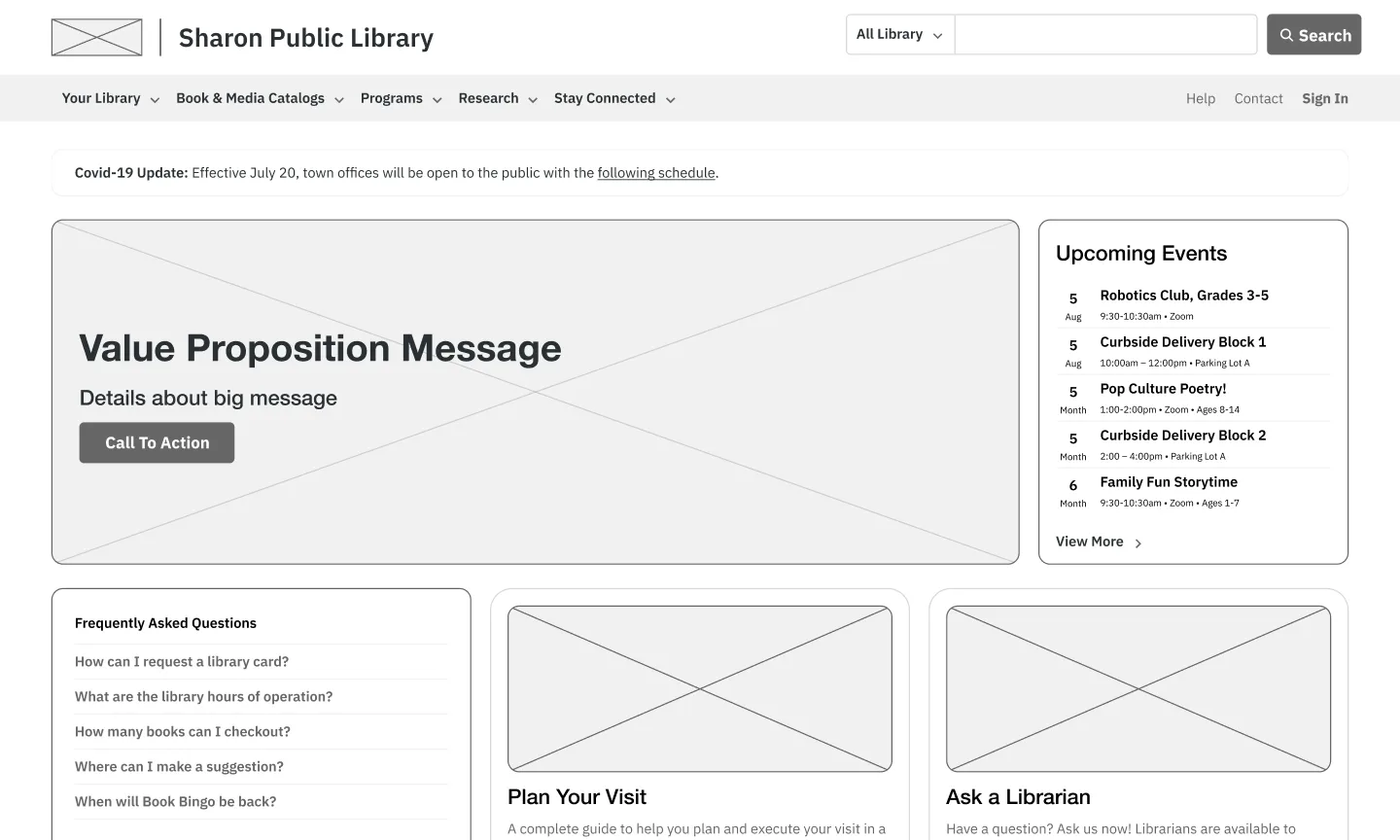
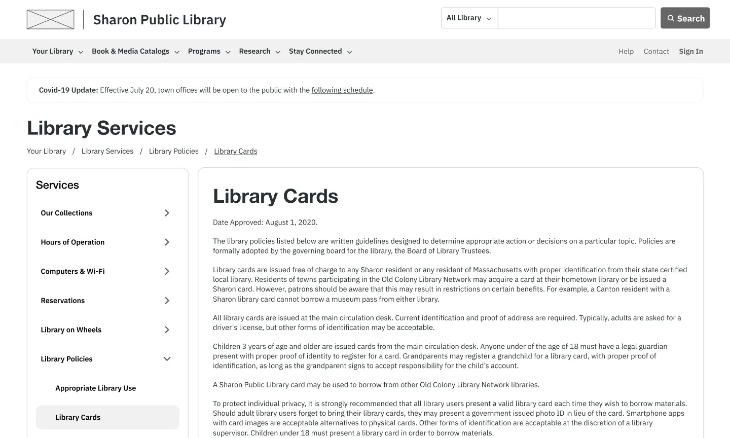
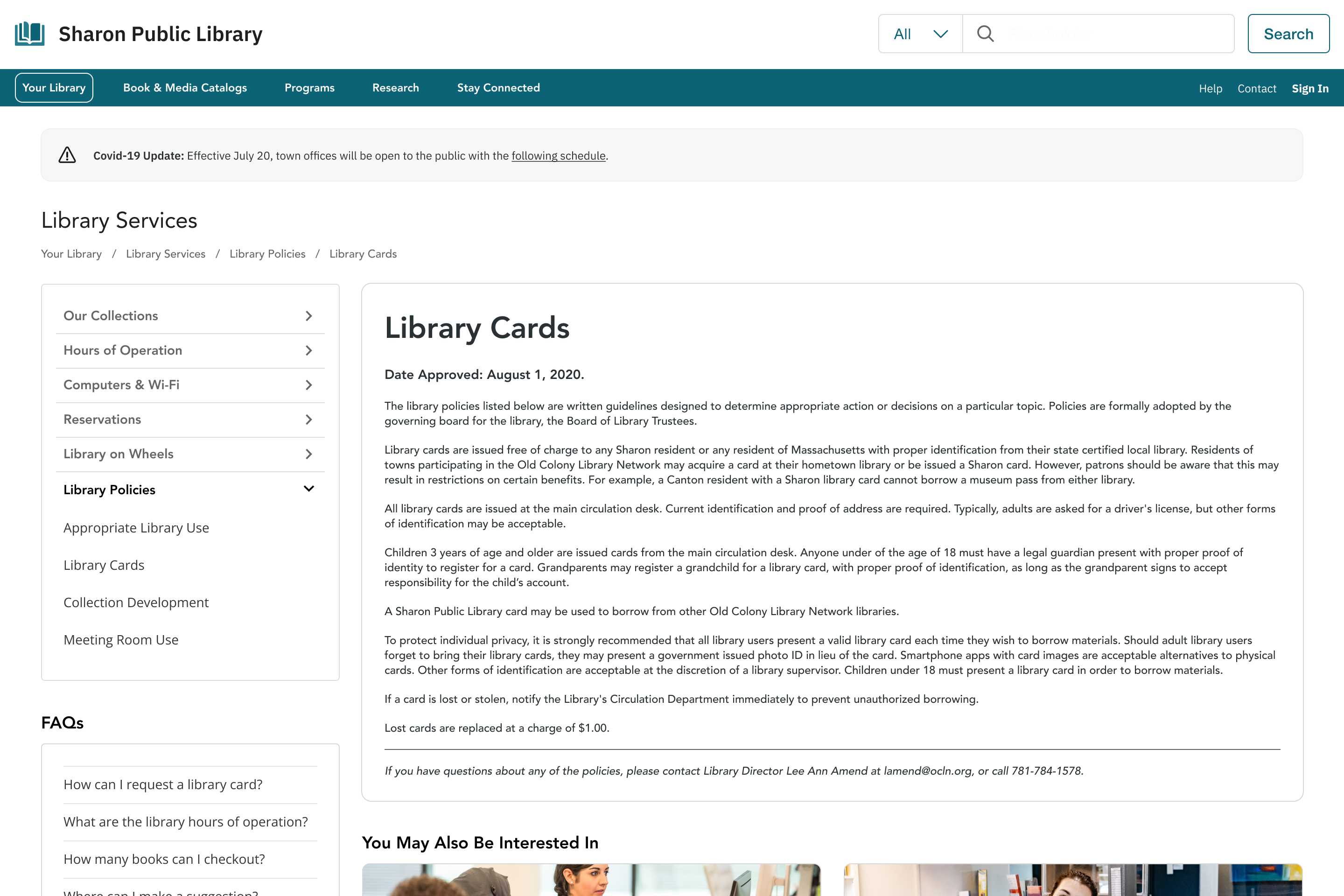
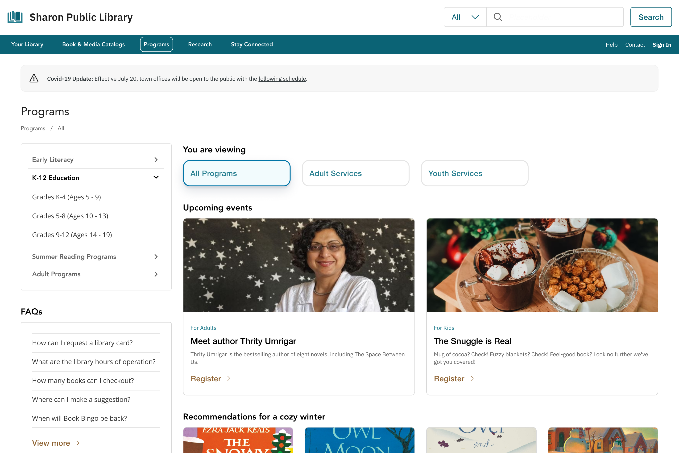
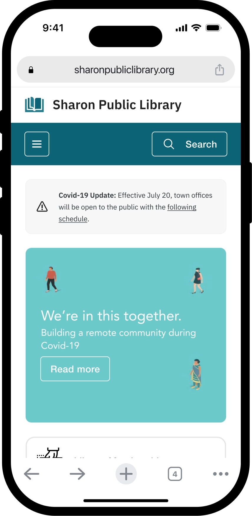
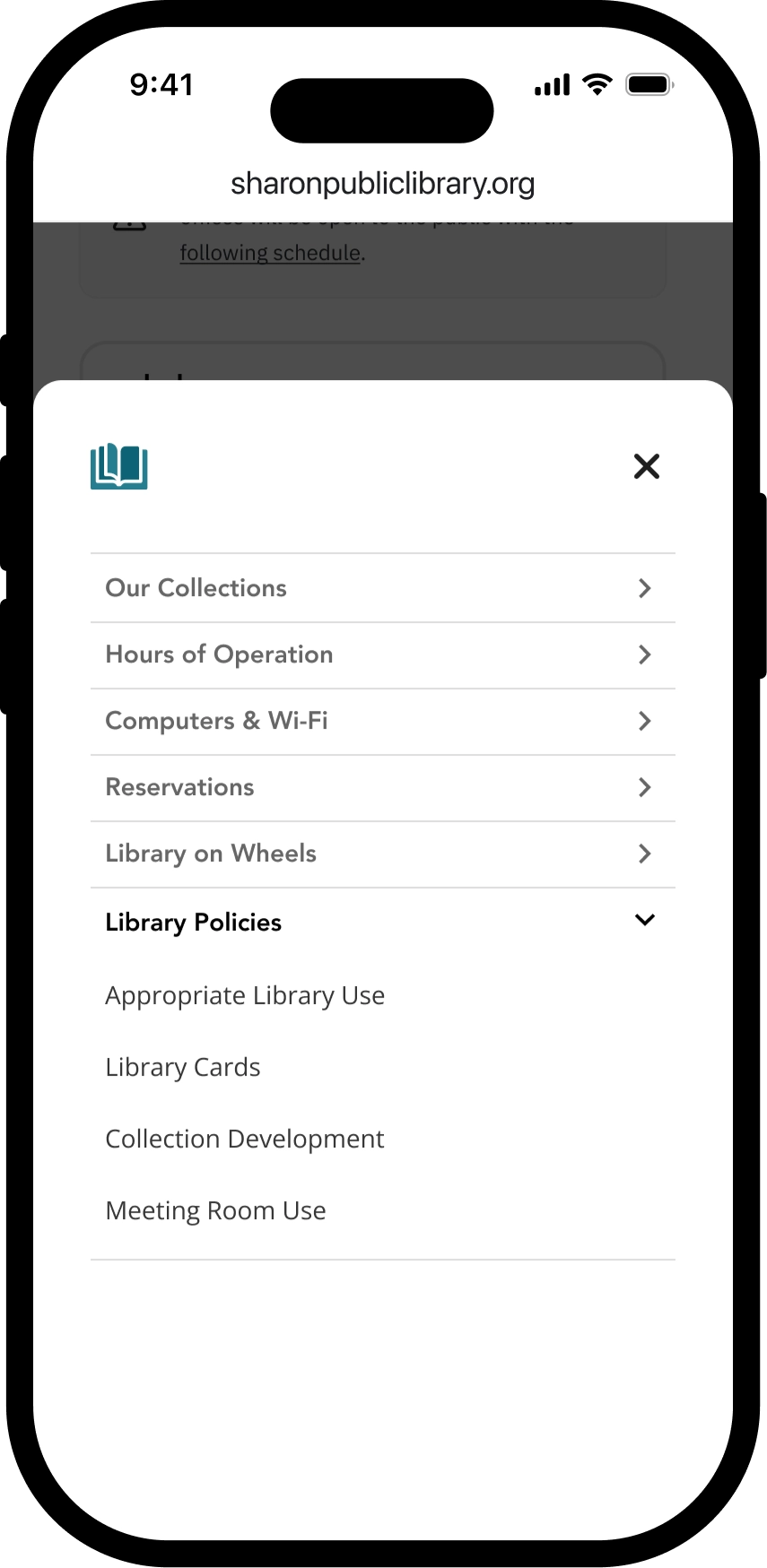
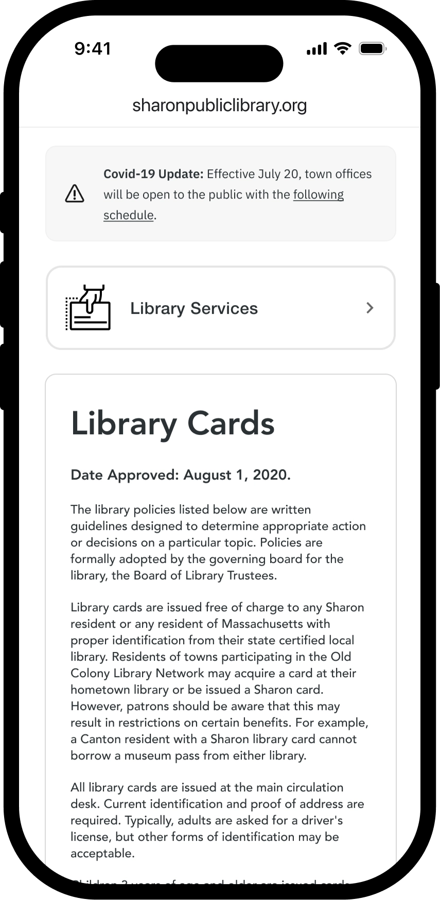
Wireframes
Wireframes visualize new navigation patterns, homepage optimizations, and streamlined content pages for easier retrieval.
Takeaway
Information architecture is critical; prioritize user feedback and iterative testing to refine navigation and accessibility.- Advocate for user feedback and iterate based on insights.
- Start with user-centric IA and validate with testing before visual design.
- Remain flexible; out-of-scope items may be future opportunities.
- Conduct user testing for both web and mobile.
- Evaluate third-party integrations and accessibility fixes.
- Ideate personalization to focus on sentiment metrics.