Fidelity Investments
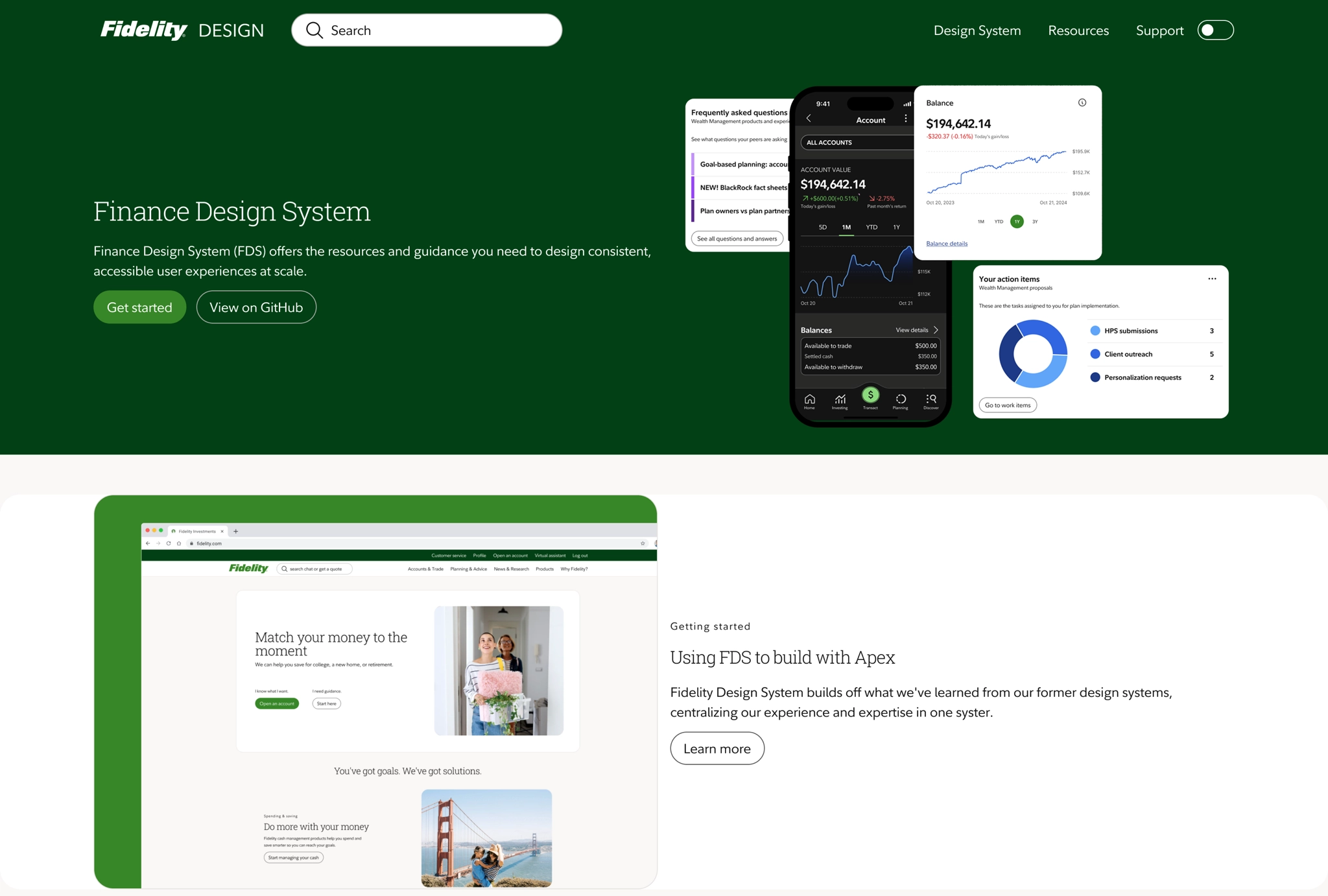
Fidelity Design System
How might we create a unified design system that ensures consistent experiences across all our platforms and brands?
Role
Principal UX Designer
Channel
Android, iOS, Web
Timeframe
6 months
Overview
Fidelity Investments launched a fourth-generation design system to improve scalability and cross-platform consistency, enabling multi-brand theming and density modes for Android, iOS, and responsive web. The effort aimed to align design and code, reduce redundant component maintenance, and accelerate delivery across products.
Contribution
Led design system evolution, aligning accessibility, theming, and component workflows. Coordinated design and engineering efforts to establish token pipelines, component libraries, and documentation to increase adoption and consistency.
Problem
The lack of a unified design system caused inconsistent standards across products, brand fragmentation, and higher maintenance costs due to duplicated components and ad-hoc overrides.
Hypothesis
By establishing a single source of truth through token-based architecture with design-code parity, we can reduce duplicative maintenance effort, accelerate cross-platform delivery, increase design system adoption, and ensure consistent brand experiences that meet accessibility standards across all touchpoints.
Overview
Fidelity Investments launched a fourth-generation design system to improve scalability and cross-platform consistency, enabling multi-brand theming and density modes for Android, iOS, and responsive web. The effort aimed to align design and code, reduce redundant component maintenance, and accelerate delivery across products.
Problem
Inconsistent design standards across products created confusion and fragmented brand identity.High maintenance costs and duplicated effort due to multiple component versions and token pipelines.-
01Inconsistent design standards
The absence of a unified design system led to fragmented UI patterns and inconsistent implementations.
-
02Increased maintenance costs
Multiple versions of similar components increased upkeep and complicated updates across teams.
Solution
Establish a single source of truth for design tokens, components, and documentation to align design and engineering practices across platforms.-
01Code and design parity
Sync design and development artifacts to reduce duplicative efforts and improve component reliability.
-
02Token architecture
Define token tiers and naming standards to support theming, density modes, and cross-platform distribution.
Approach
Coordinated cross-functional squads and external agencies to develop token pipelines, component libraries, and an internal reference docsite while prioritizing accessibility and adoption.
Insights
- Design toolkits and coded components lacked parity, creating tech debt and custom overrides.
- Documentation gaps existed for Android and iOS, creating a disconnect between design and development.
- Naming paradigms were inconsistent (card vs tile vs content block).
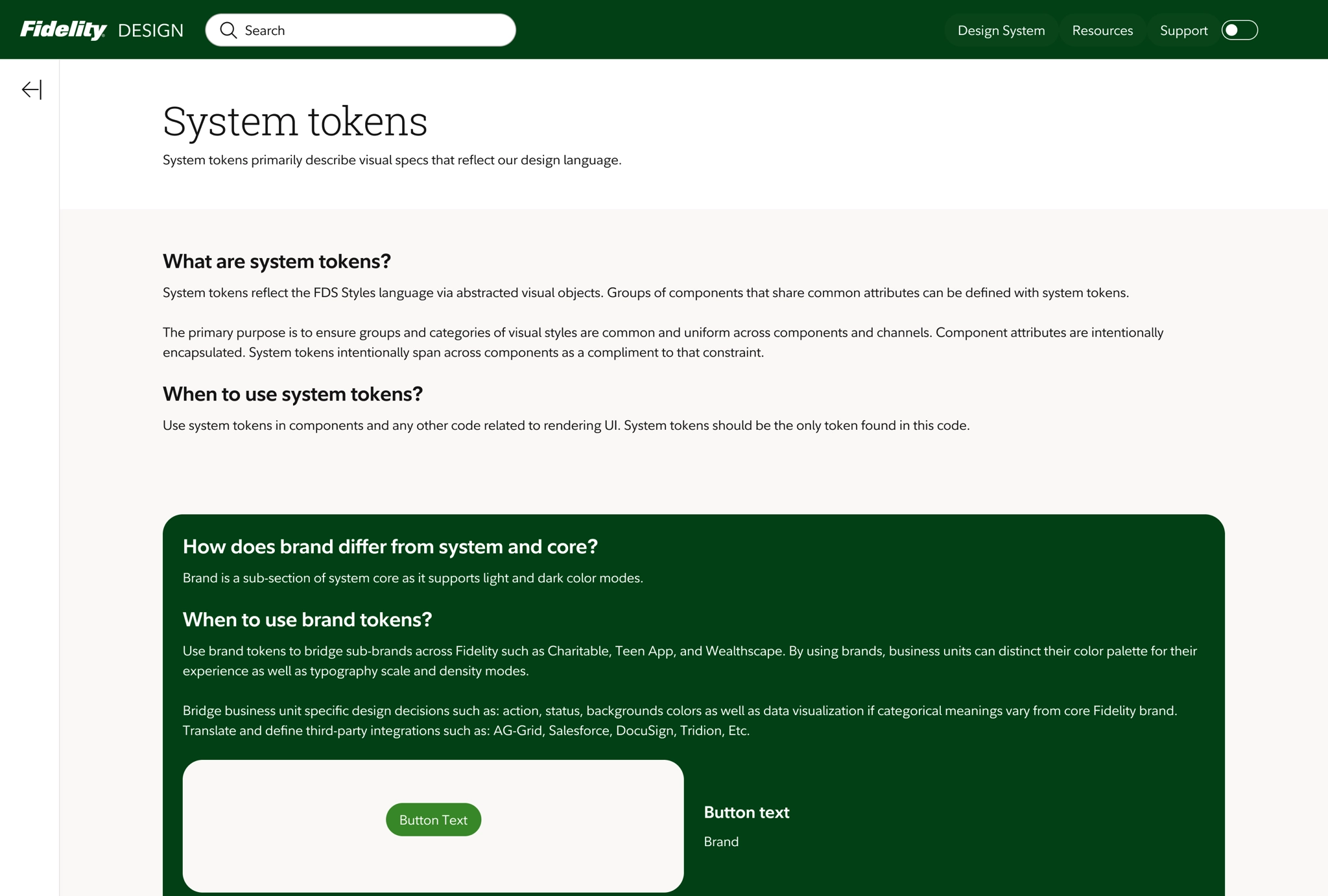
- Brand standards were primarily marketing-focused and not optimized for digital experiences.
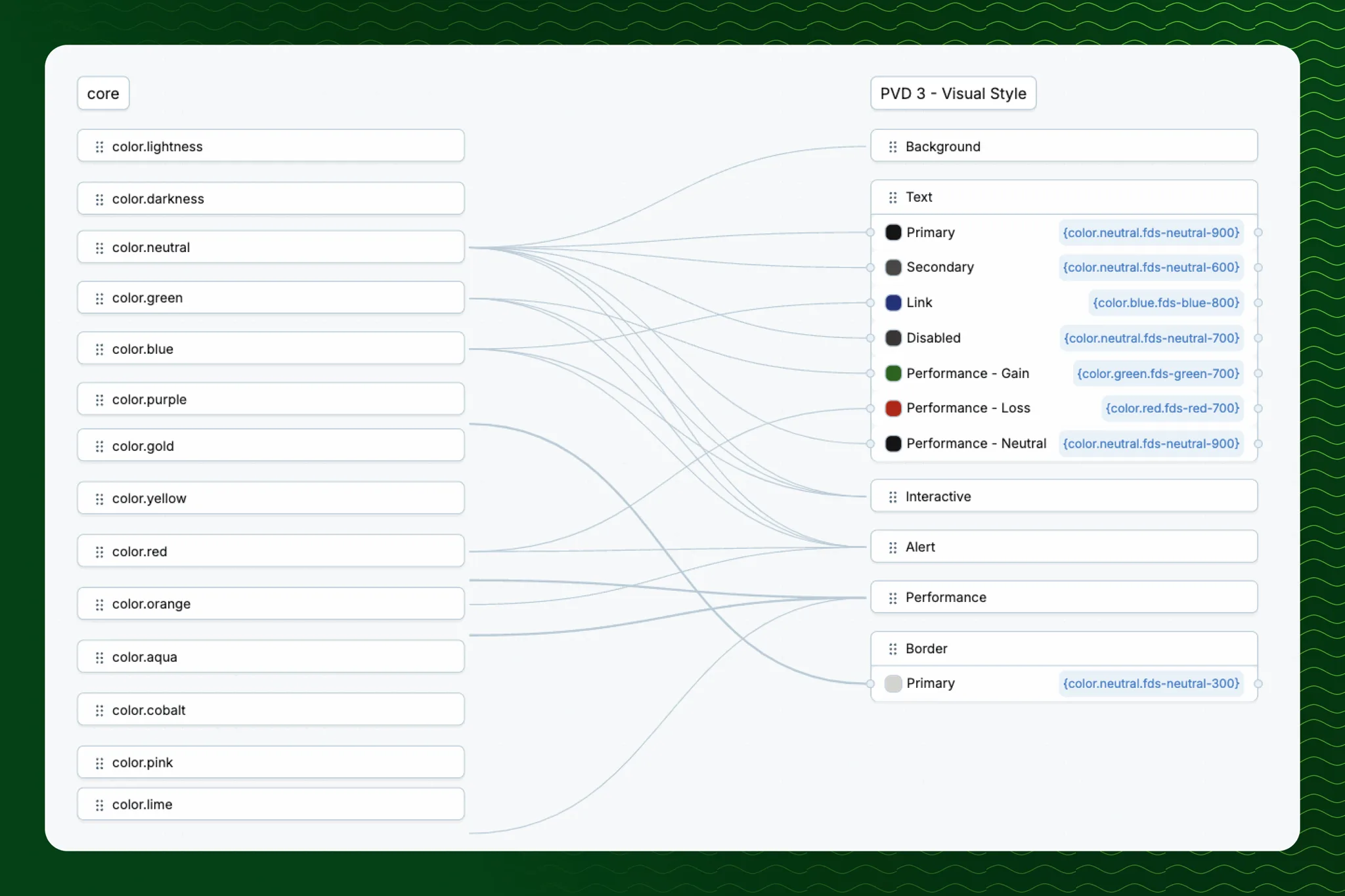
- Design tokens were fragmented and not shared across systems.
Recommendations
- Prioritize IA for consolidated documentation of tokens, components, and brand guidance.
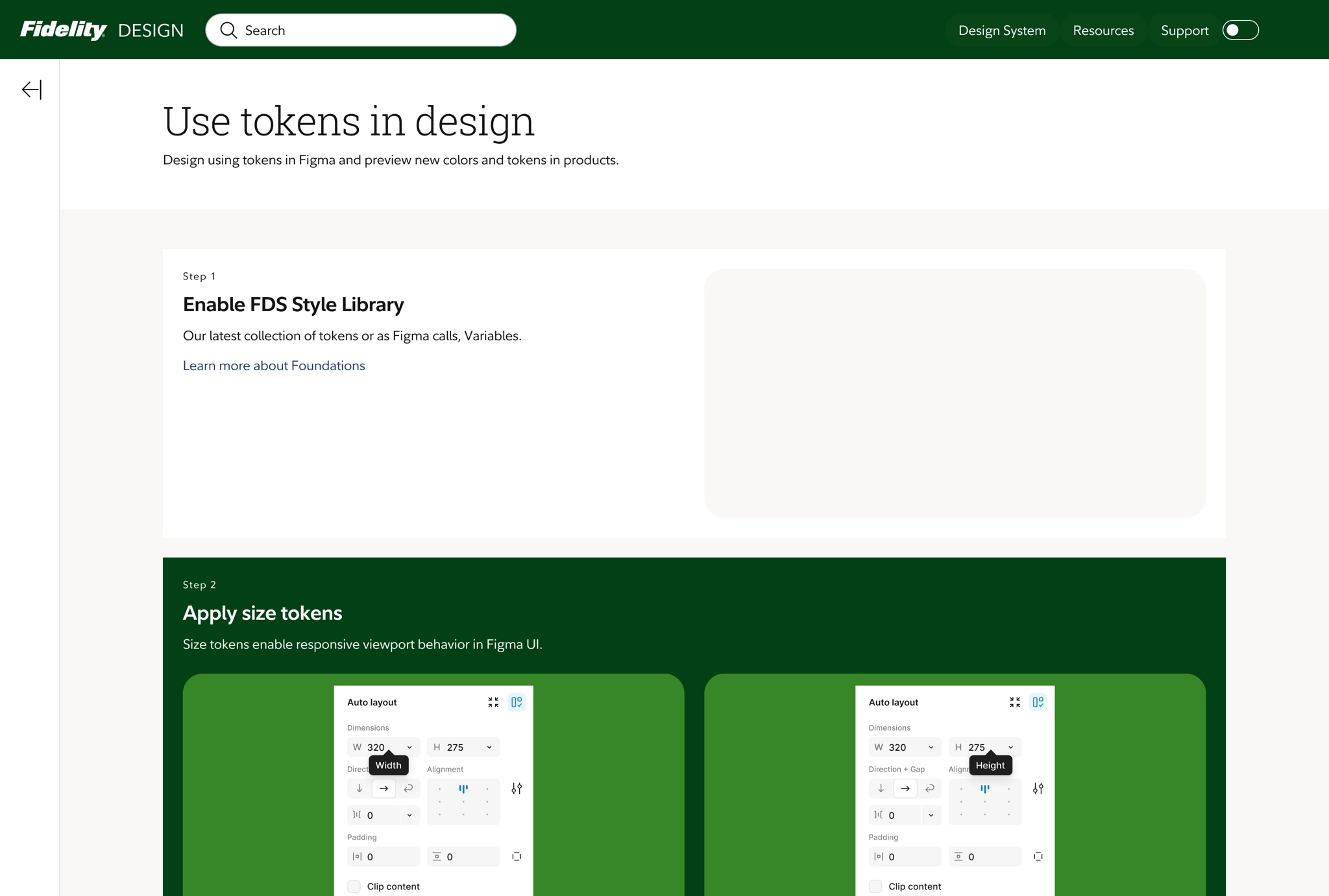
- Define token naming conventions and transformation pipelines (e.g., Style Dictionary) for multi-platform sync.
- Partner with accessibility teams to validate components in context.
- Provide adoption support and demos to help teams integrate the system.
- Pilot token mapping and implementation examples to demonstrate value.
Ideation
Distinction of system from user preference is a critical path to define when it comes to mapping tokens to themes.
System preference
My phone has dark mode enabled, show the dark mode version of your app.
User preference
My web browser font size is set to very large, please don't make me zoom my page.
Token naming standard
Classify token names to scale namespaces, properties, variants, and modifiers.
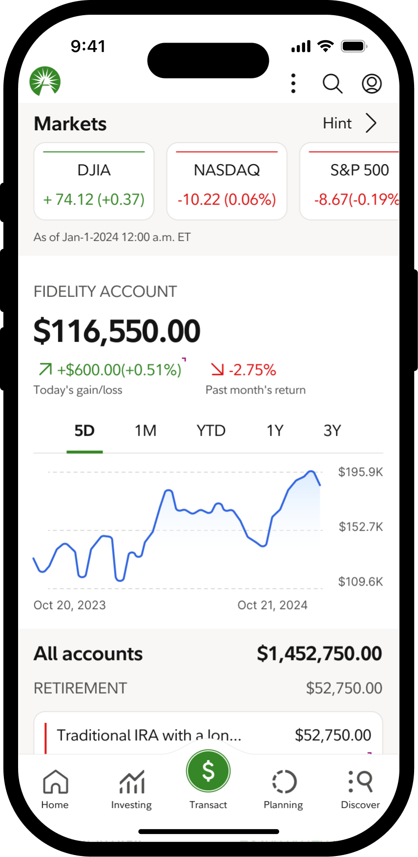
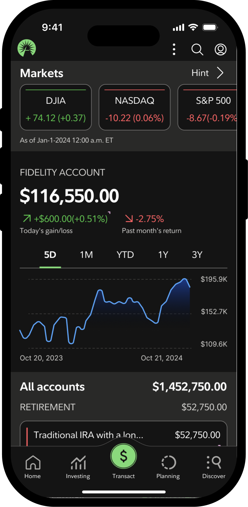
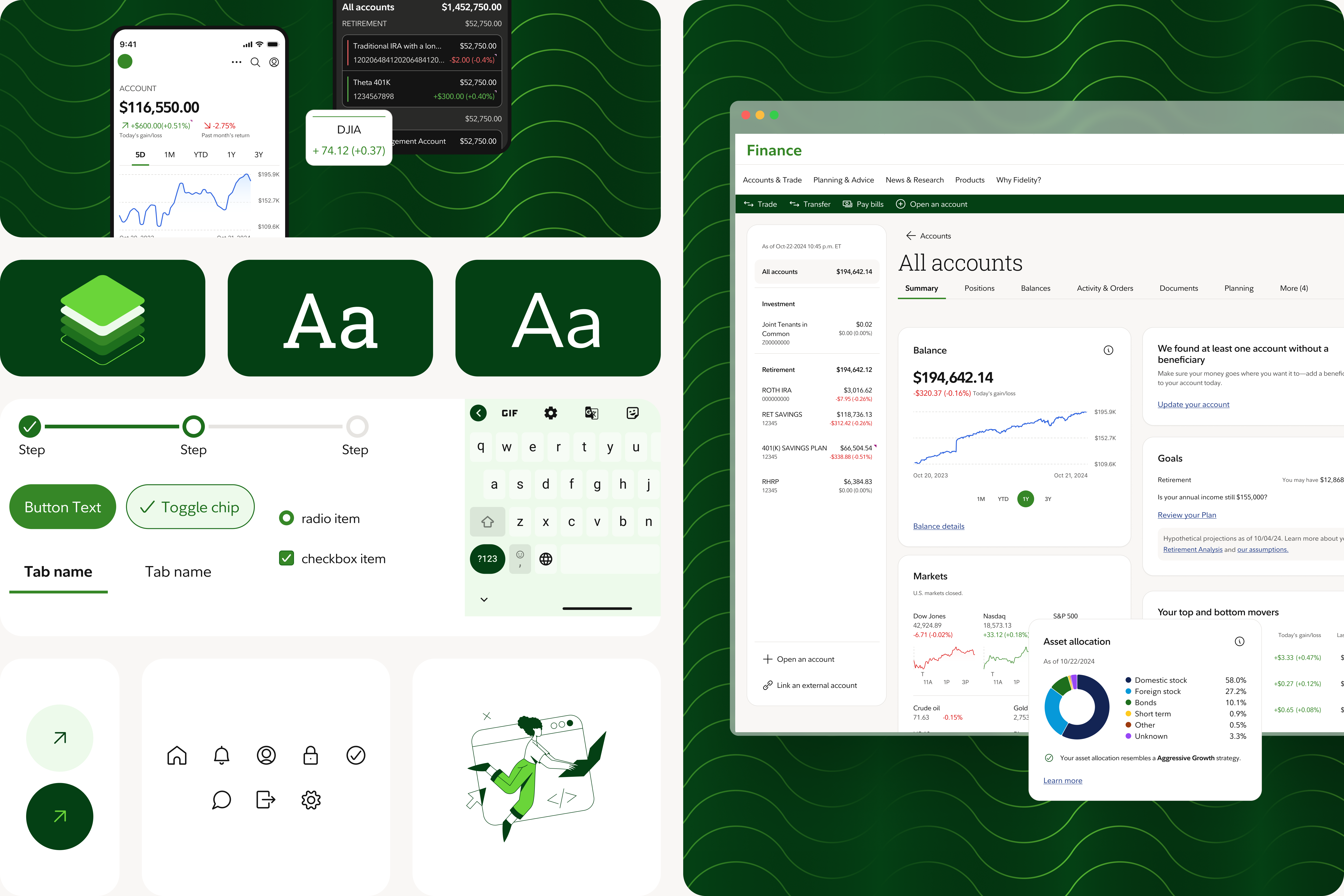
 Color modes
Support light, dark, and high-contrast palettes for accessibility and preference.
Color modes
Support light, dark, and high-contrast palettes for accessibility and preference.
 Density modes
Provide compact mode to reduce spacing and fit more content while maintaining accessibility.
Density modes
Provide compact mode to reduce spacing and fit more content while maintaining accessibility.
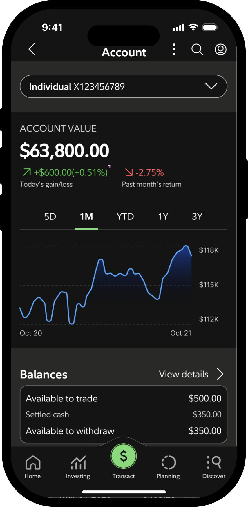
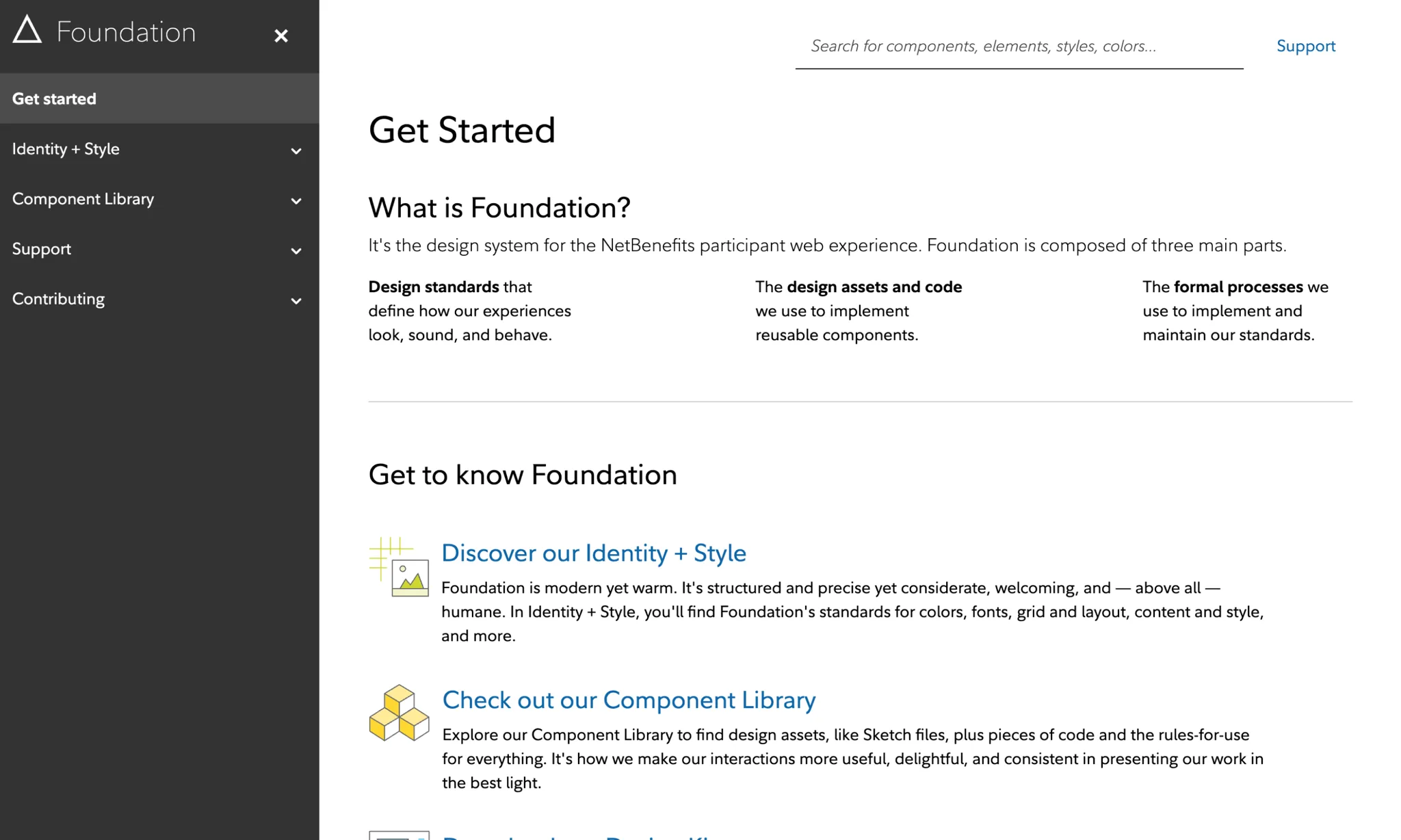
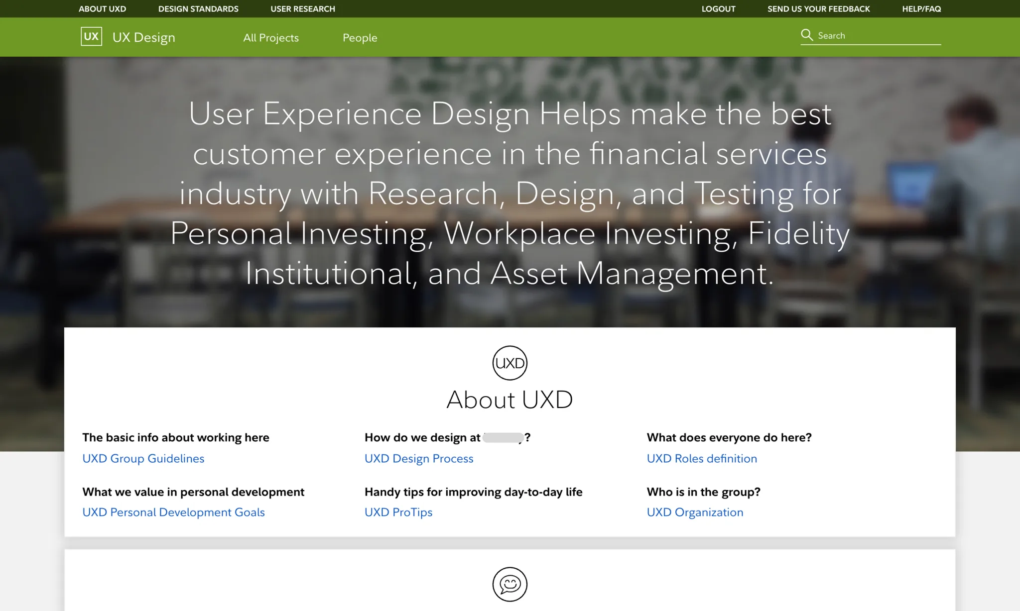
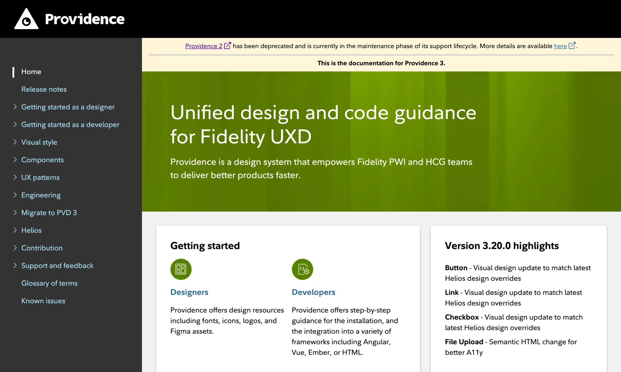
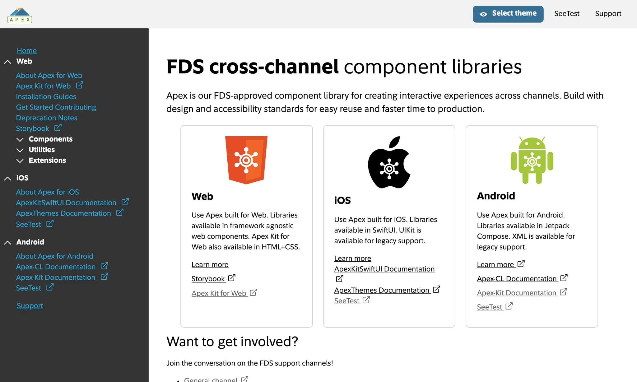
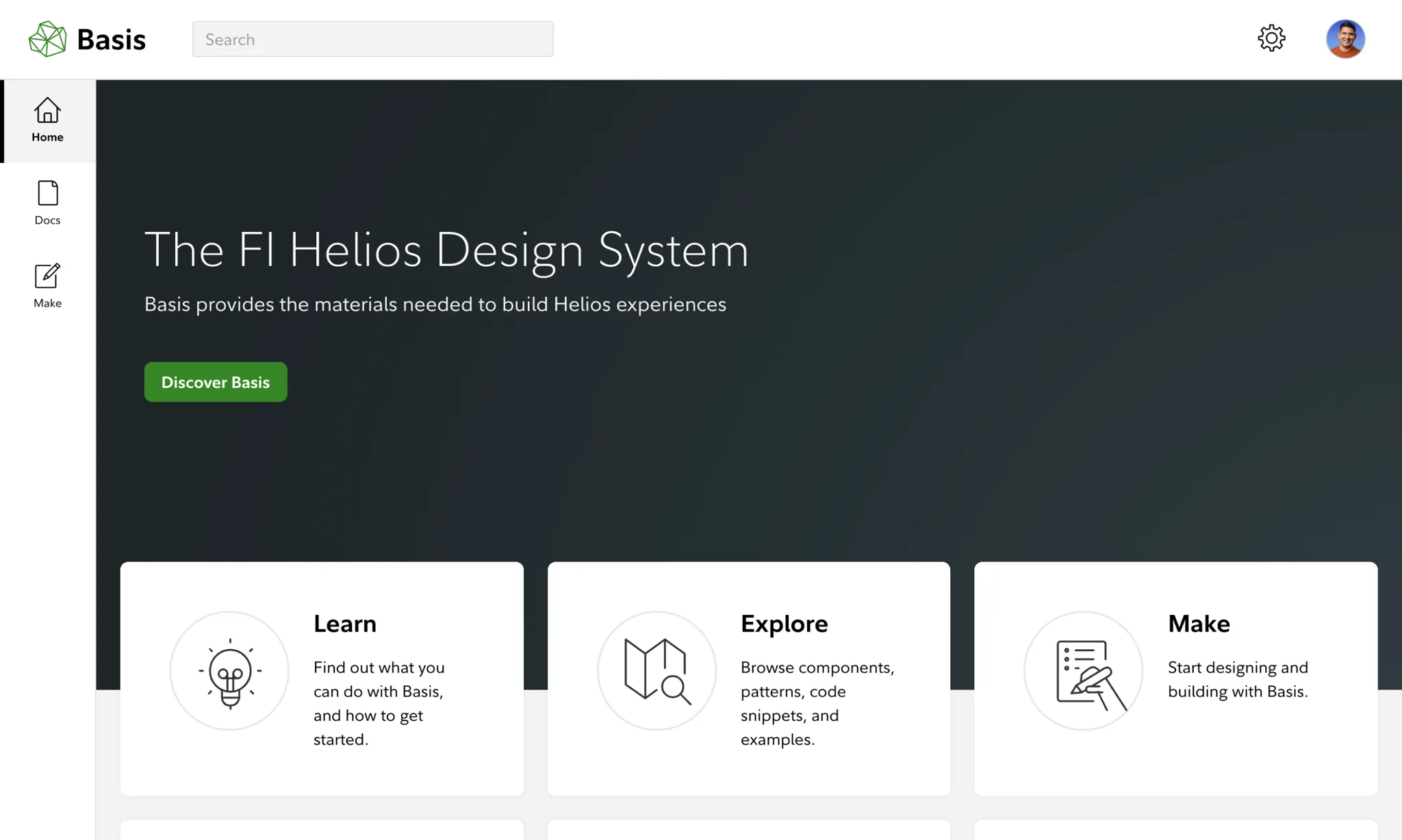
Wireframes
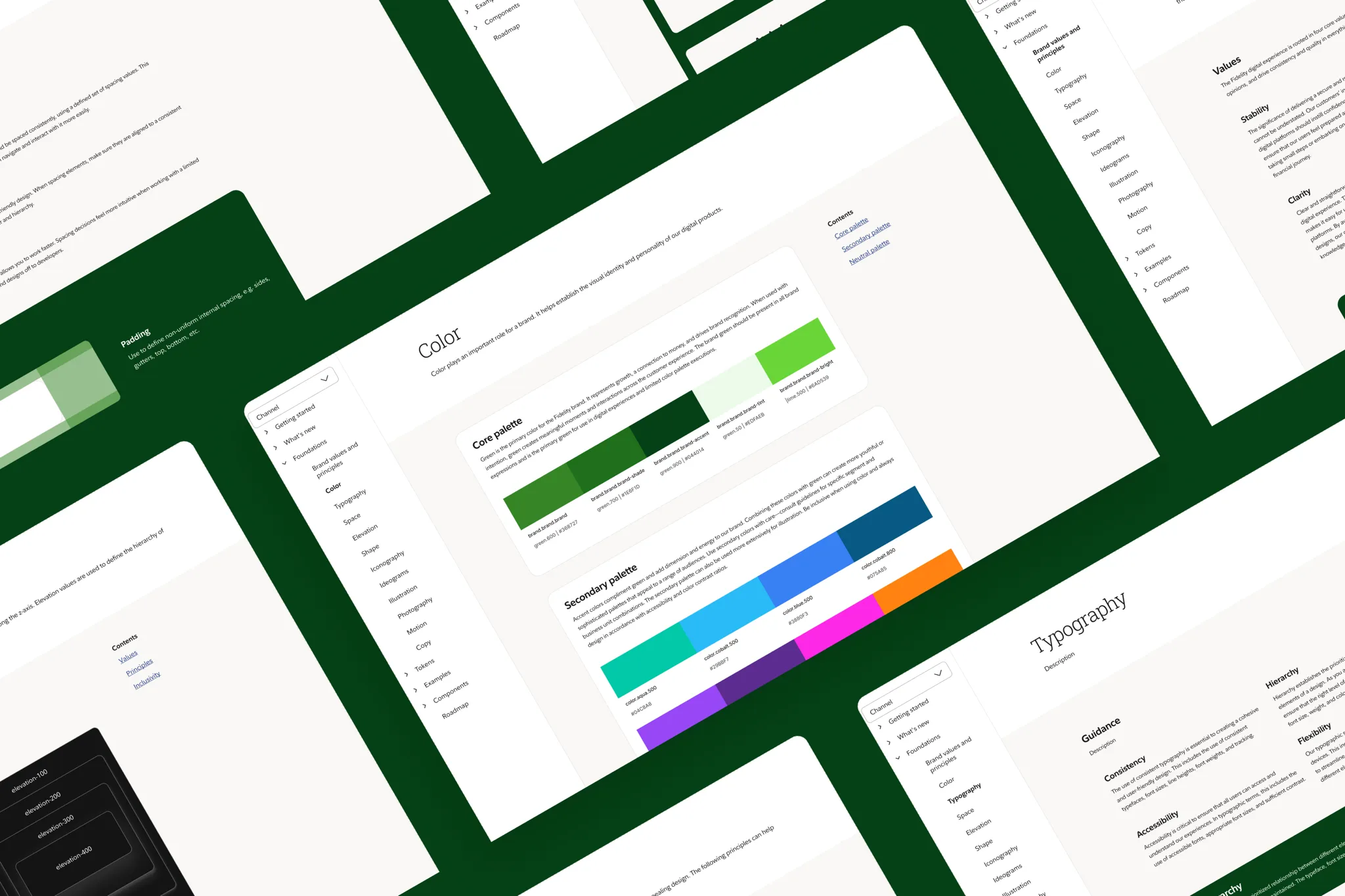
Documentation website
Documentation sitedesign.fmr.com
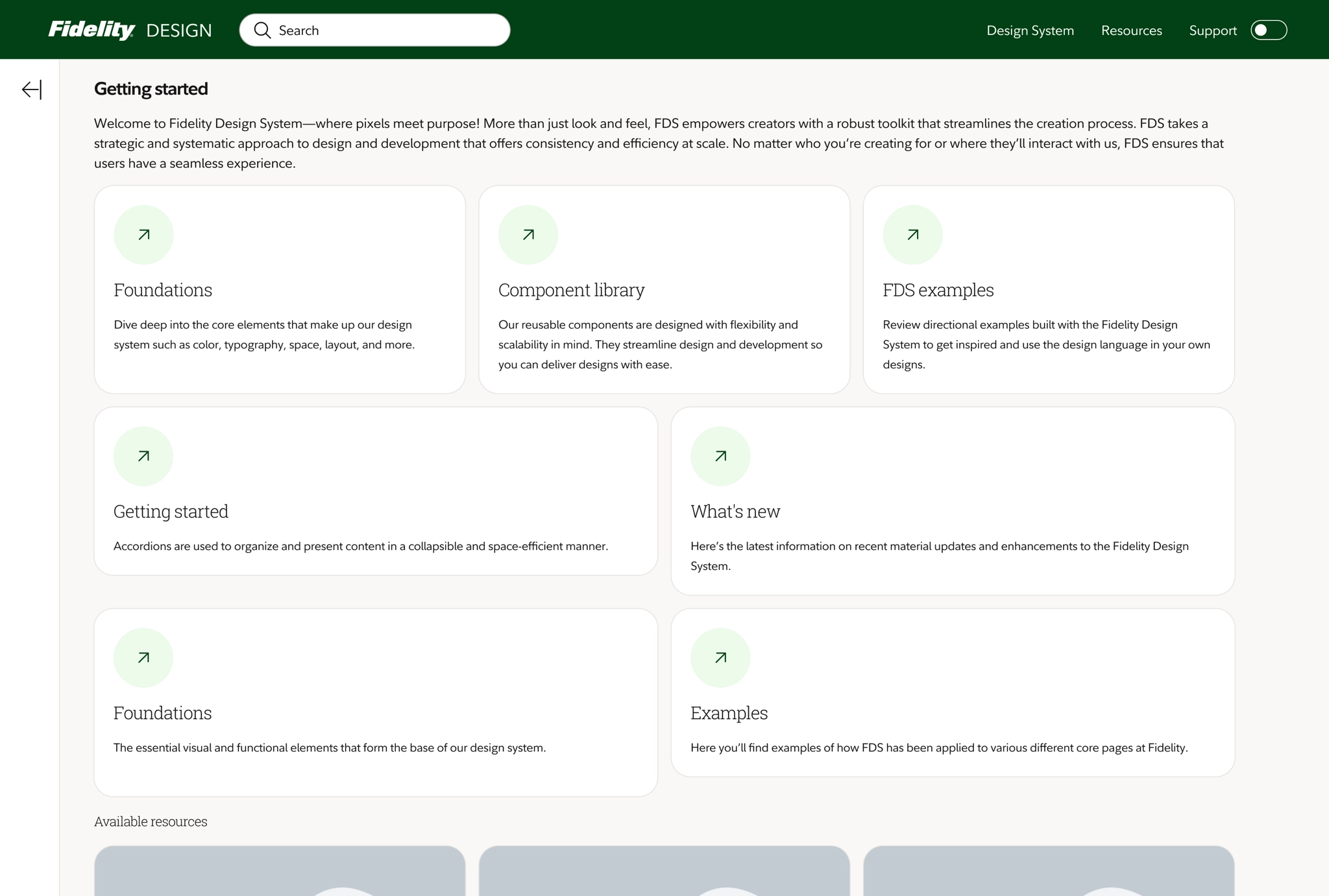
Getting startedLanding page
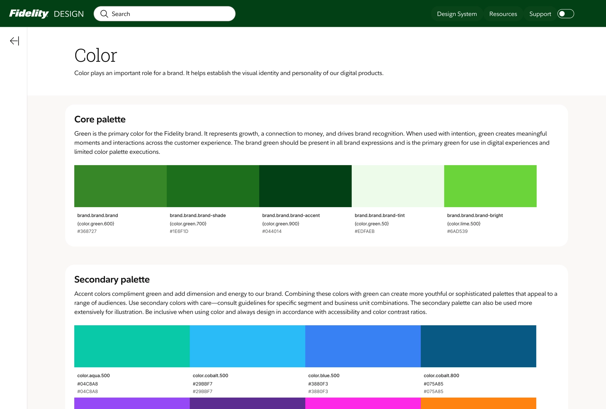
Design foundationsColor palettes
Impact
Measuring successAnnual cost savings in UX improvements
$12.5M
Adoption across app
71.43%
Takeaway
I joined our design system team to combat growing needs across our enterprise. Being on the other side of the fence was a humbling and eye-opening experience in navigating the decisions involved in building a design system.
Lessons learned
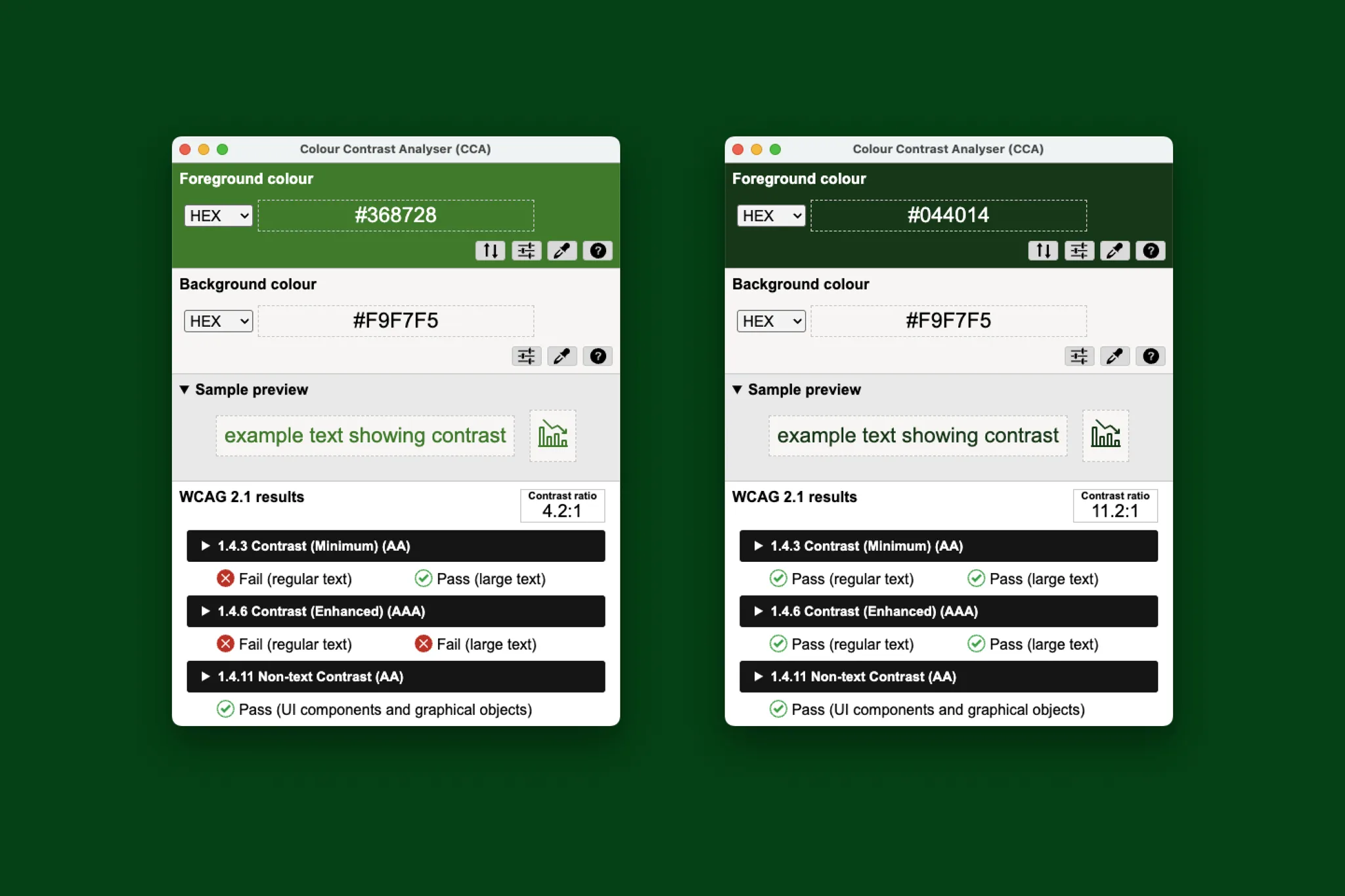
- Deepened my understanding of accessibility requirements and closely defining criteria to be AA compliant.
- Collaborate with content strategy as documentation in guidance can be bridged across the enterprise.
- Demos are critical to the success of instilling confidence in design adoption. The increased in design tool updates created a gap for consuming designers to navigate features integrating with iterative releases.
Potential next steps
- Expand pattern documentation efforts to be centralized across business units.
- Refine data visualization guidance by leading with an emphasis when to use vs just a data table as well as expanding guidance to not rely soley on color strictly as visual distinction.
- Continue to lean in and listen to design community feedback and dive deep into understanding component limitations not meeting their use cases.