Medical Mutual
Member Experience
How might we bridge web and mobile experiences to deliver a cohesive digital journey for Medical Mutual members?
Role
UX Lead
Channel
Android, iOS, Web
Timeframe
3 months
Overview
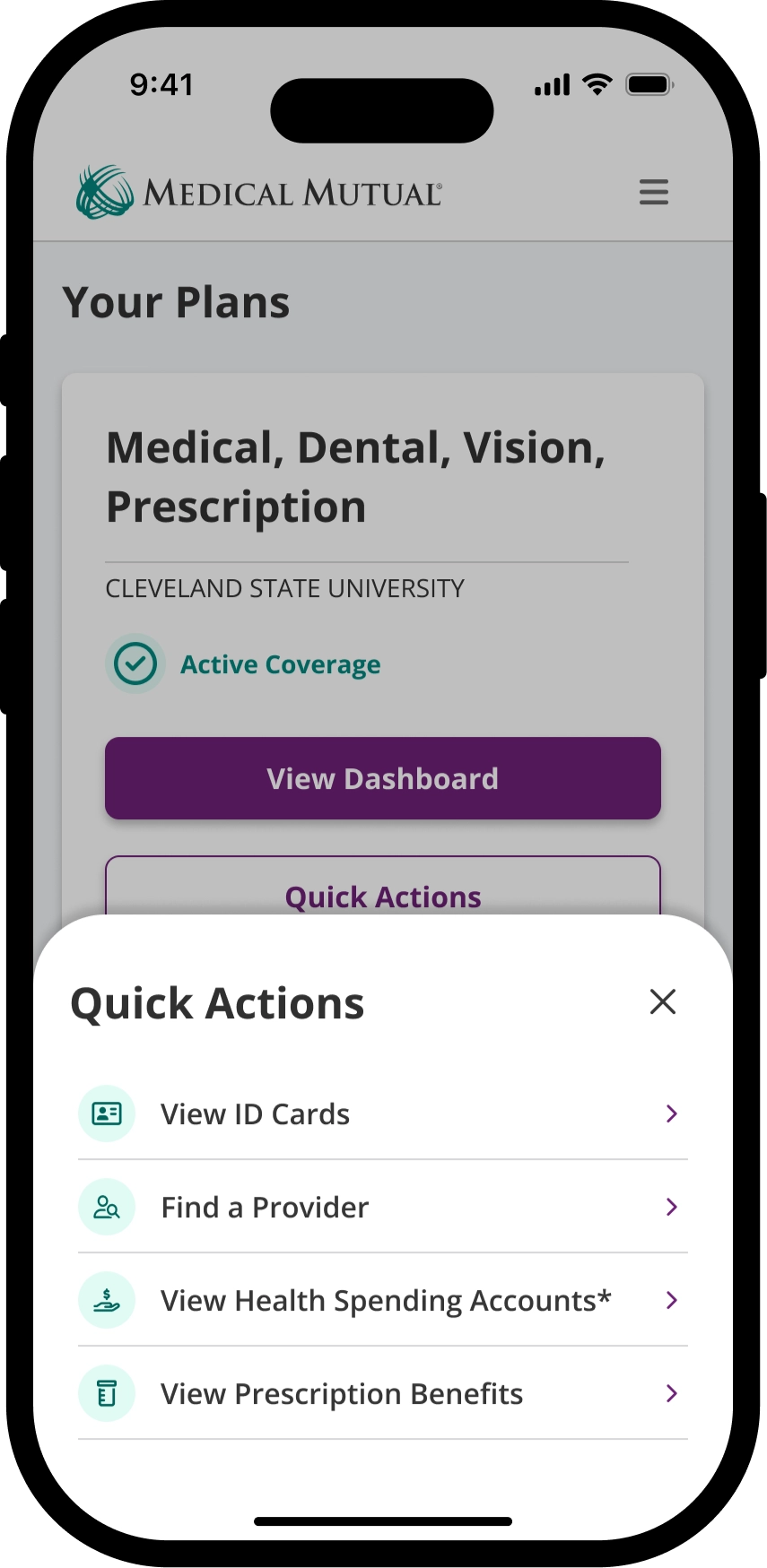
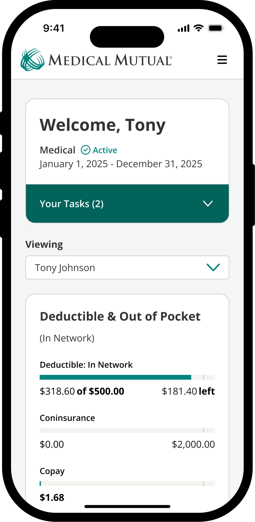
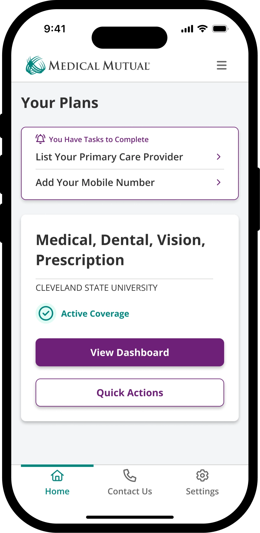
The MedMutual mobile app by Medical Mutual of Ohio helps users manage their health plan easily. It provides instant access to insurance details, lets users find in-network providers, check treatment costs, and track healthcare spending.
Contribution
I worked as Lead UX Designer, navigating multiple platform migrations while stabilizing internal tools and consumer-facing experiences across a healthcare insurance ecosystem.
Problem
Medical Mutual of Ohio's mobile platform sees the highest user engagement, yet lacks key features that are available on desktop. Maintaining separate systems increases operational complexity and raises management costs, creating inefficiencies that impact users and administrators. Consolidating platform functionality could improve accessibility, reduce expenses, and streamline the user experience.
Hypothesis
By unifying mobile and web experiences through a scalable, framework-agnostic platform with enhanced tracking capabilities, we can reduce member friction in accessing care information, decrease operational overhead from maintaining parallel systems, and enable data-driven personalization that improves member confidence in understanding their benefits and making informed healthcare decisions.
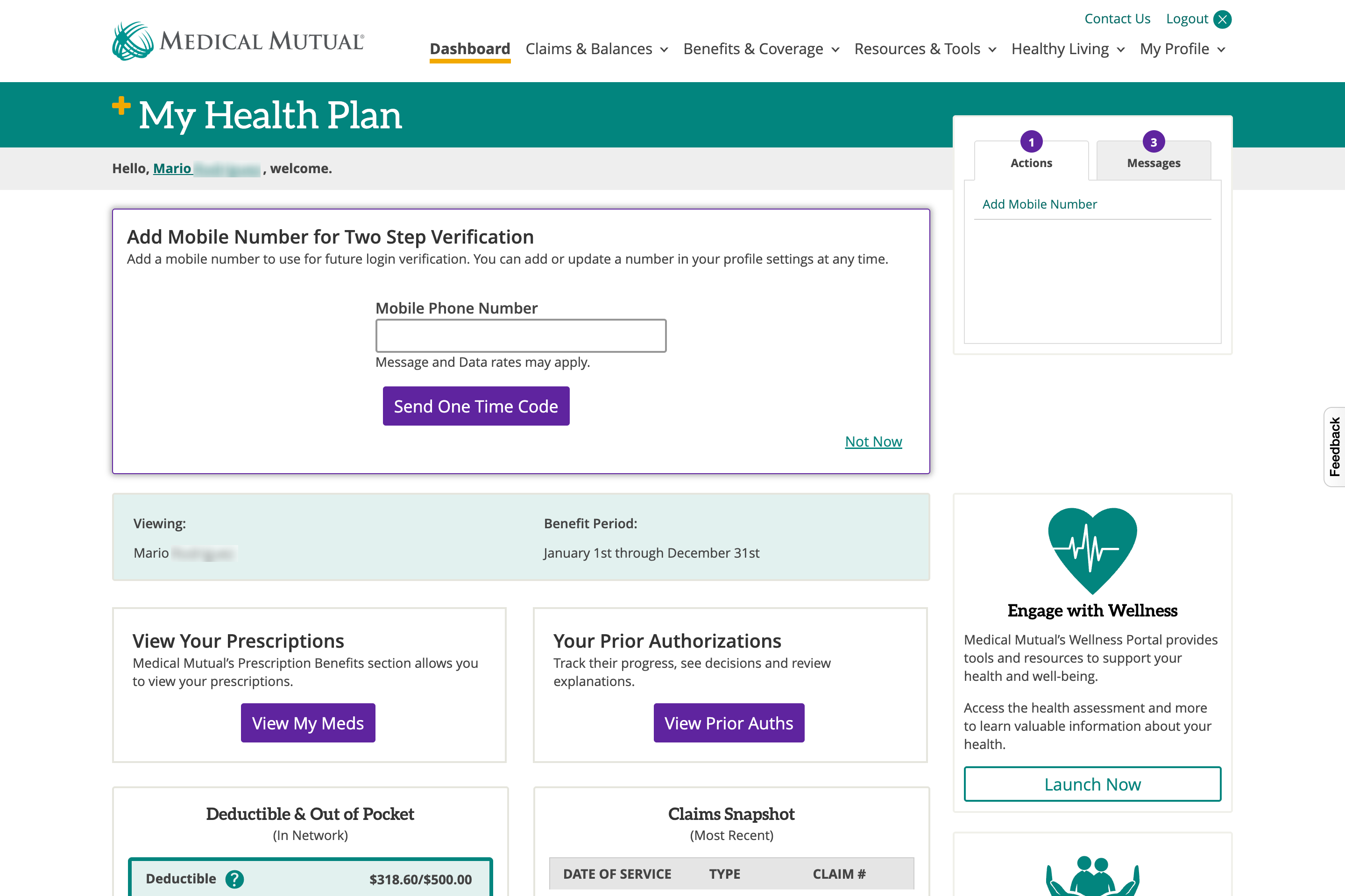
Overview
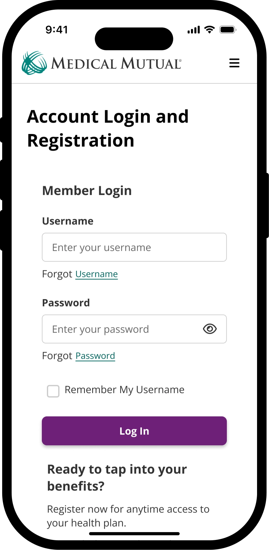
The Mutual Experience Application (MXA) makes it easy for our customers to understand and utilize their insurance coverage, contributing to a sense of value and peace of mind around personal health and financial wellness.Members currently have two distinct experiences as Medical Mutual, our current web experience for My Health Plan and mobile app, MedMutual. As a UX Lead, I lead ideation and high-level exploration to pave a path forward for mobile-to-web scale up efforts with usability testing. The work reflected in this page are not a reflection of a final product in market, but more of a concept to closely support data analytics and user research insights.
Problem
-
01Fragmented access
Products and services exist in separate code repositories, creating challenges for mobile-to-web parity.
-
02Limited personalization
Current tracking and analytics are limiting the creation of a data-driven personalized group experience.
Solution
Establishing a structured messaging framework to ensure consistent language across all channels, improving communication clarity and alignment between mobile, desktop, and customer service interactions. Redesigned the benefits and claims experience for mobile-first accessibility, enhancing usability and efficiency.-
01Unified services
Improve user experience by simplifying our navigation and integrating services to create a cohesive omnichannel experience.
-
02Personalized platform
Be the most trusted navigator for our members by tailoring our experiences to meet diverse needs and preferences.
Approach
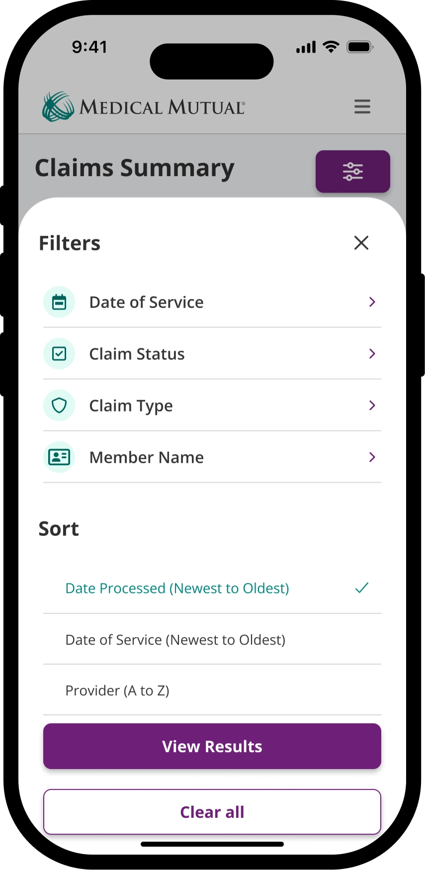
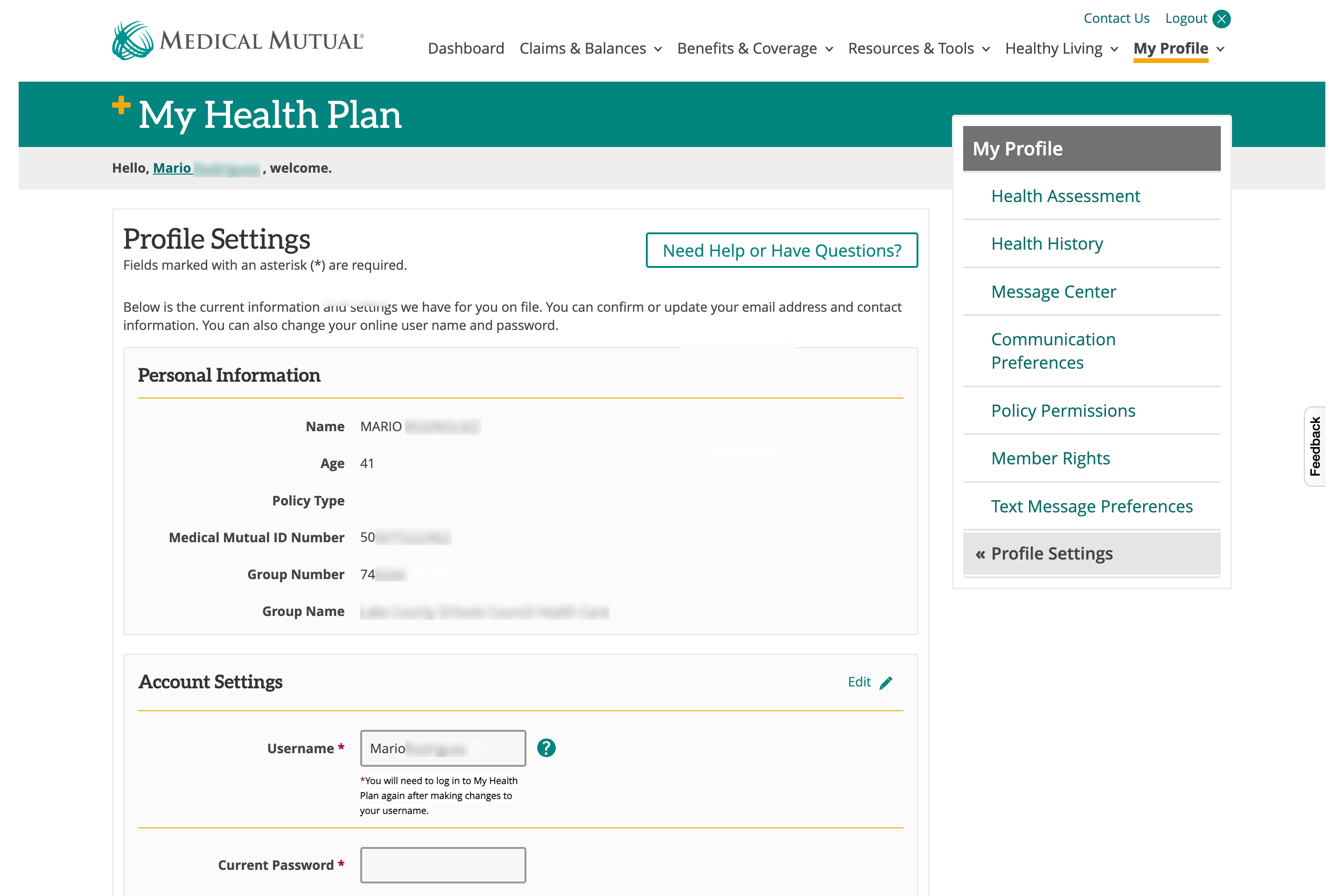
In order to scale our experience, we decided to take a mobile-first approach to iterate and explore complex data sets and then scale for larger viewports. We set out to increase awareness of page regions' importance, enabling UX to iterate with a modular approach as we simultaneously prepared to conduct further navigation card sort studies.Before I joined Medical Mutual, previous contract UX designers from G2O conducted interviews, content audits, and initial sitemap proposals to narrow problem areas to help Medical Mutual plan our mobile-to-web scale-up efforts.Using page regions, we took a low-fidelity wireframe approach to create prototypes that translate interaction behavior with our Claims and Benefits experiences.
Insights
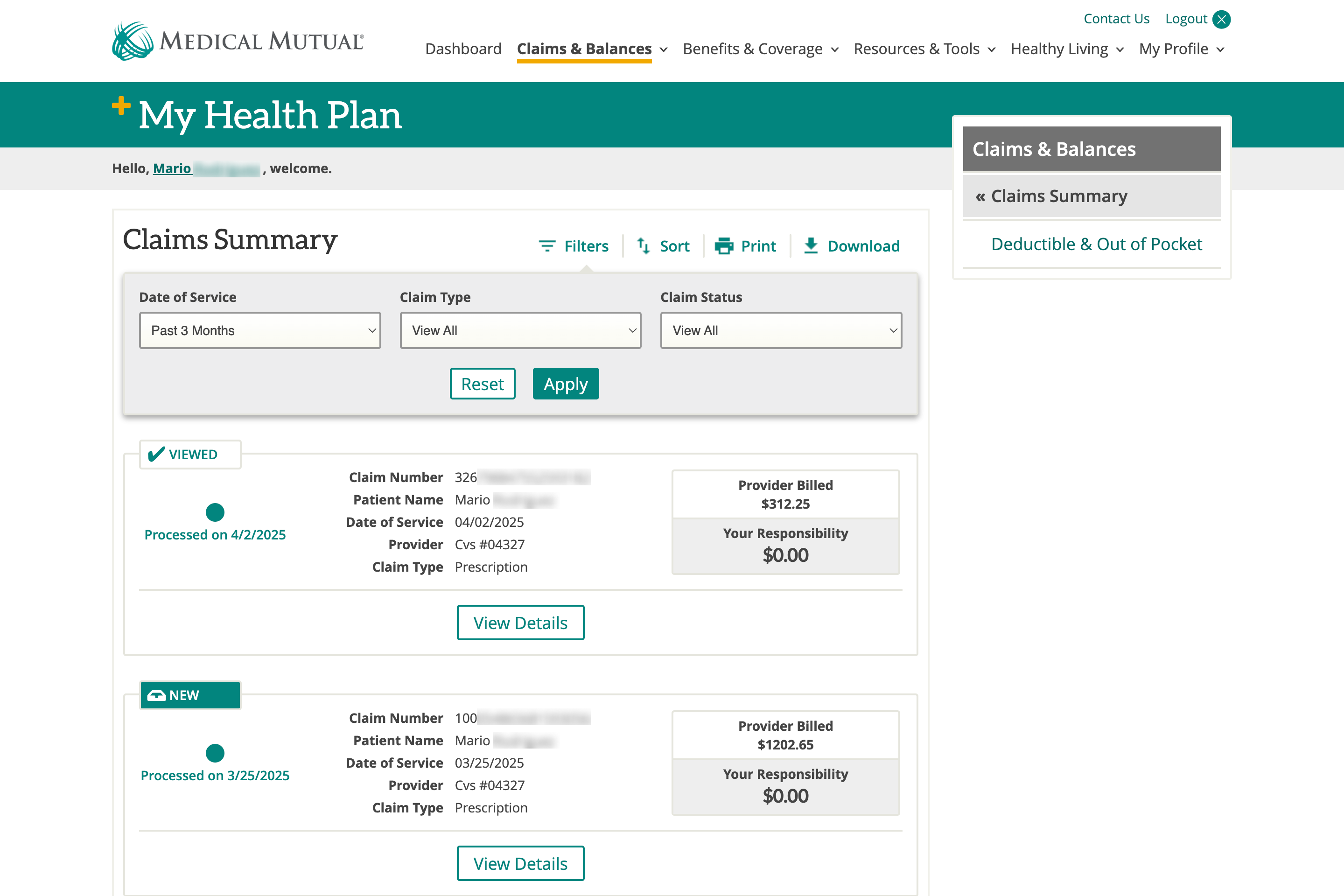
- Members face difficulty locating claims mentioned in email notifications.
- They require clear identifiers for claims, such as service date, doctor's name, and treatment type.
- Notifications are preferred only for completed claims, not for initial processing or dispute updates.
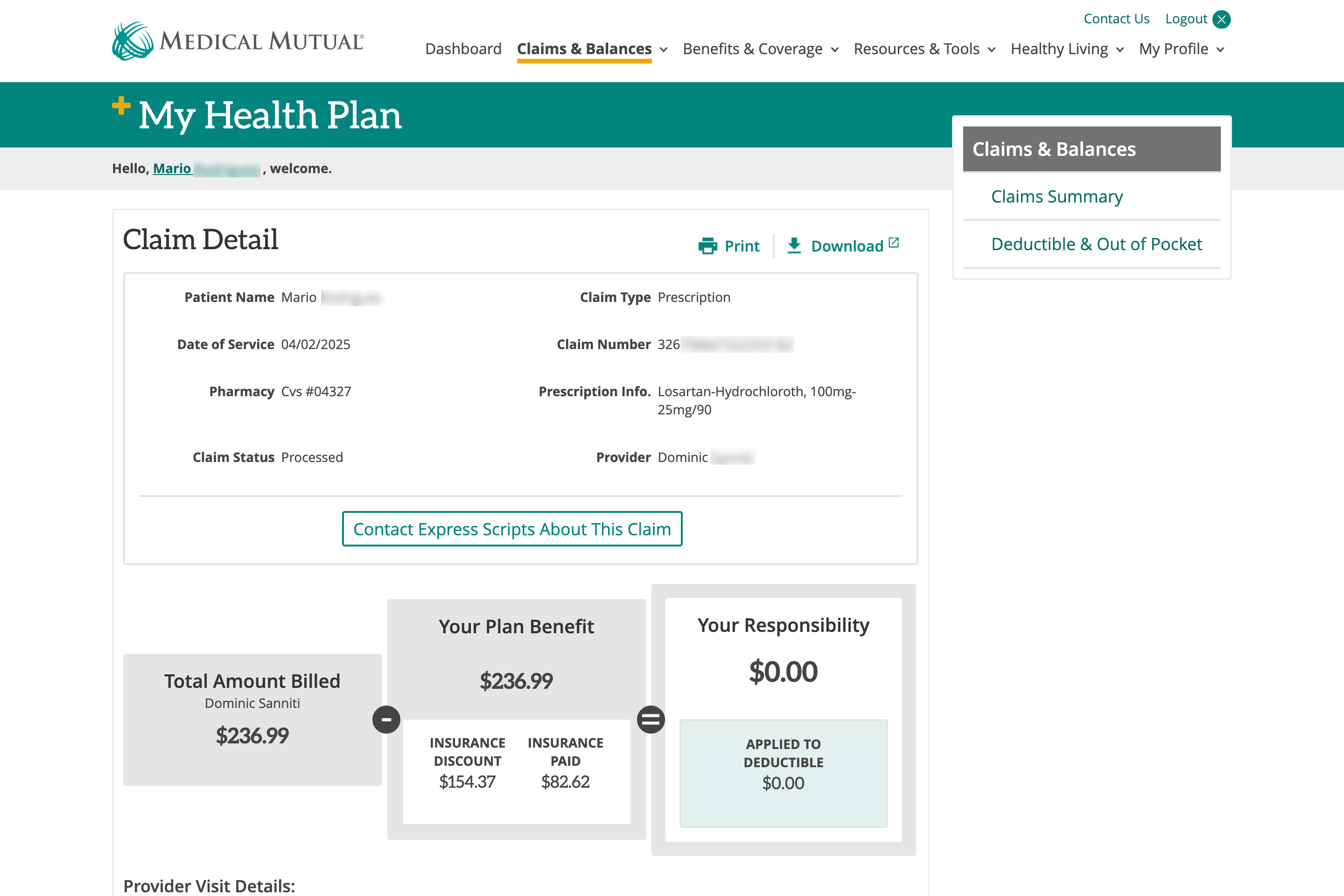
- Detailed cost breakdowns, coverage explanations, and real-time plan usage summaries are critical.
- While members value access to cost details, data must be presented in a structured, easily digestible format to avoid feeling overwhelmed.
Recommendations
- Keep members updated on claims so they can identify follow-up requirements and feel prepared.
- Help members understand claim status, what to expect, and who to contact.
- Make claim summary information scannable so that members can find specific claims confidently.
- Provide members with a concise cost breakdown with enough facts to spot challenges and make educated care decisions.
- Explain claim outcomes to help members plan future care and coverage decisions.

Ideation
We examined two main opportunities to enhance wayfinding and omnichannel experience by diving into solutions to improve navigation design and content delivery.
Navigation
Designed wireframe navigation by translating the information architecture into intuitive pathways, ensuring clarity and usability.
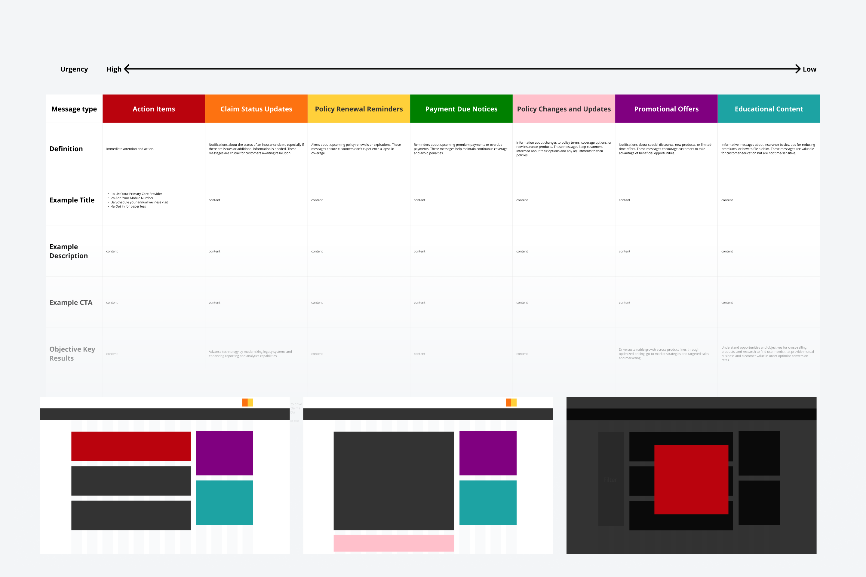
Content Strategy
Developed a message prioritization framework to streamline and scale content delivery across multi-channel platforms.
Wireframes
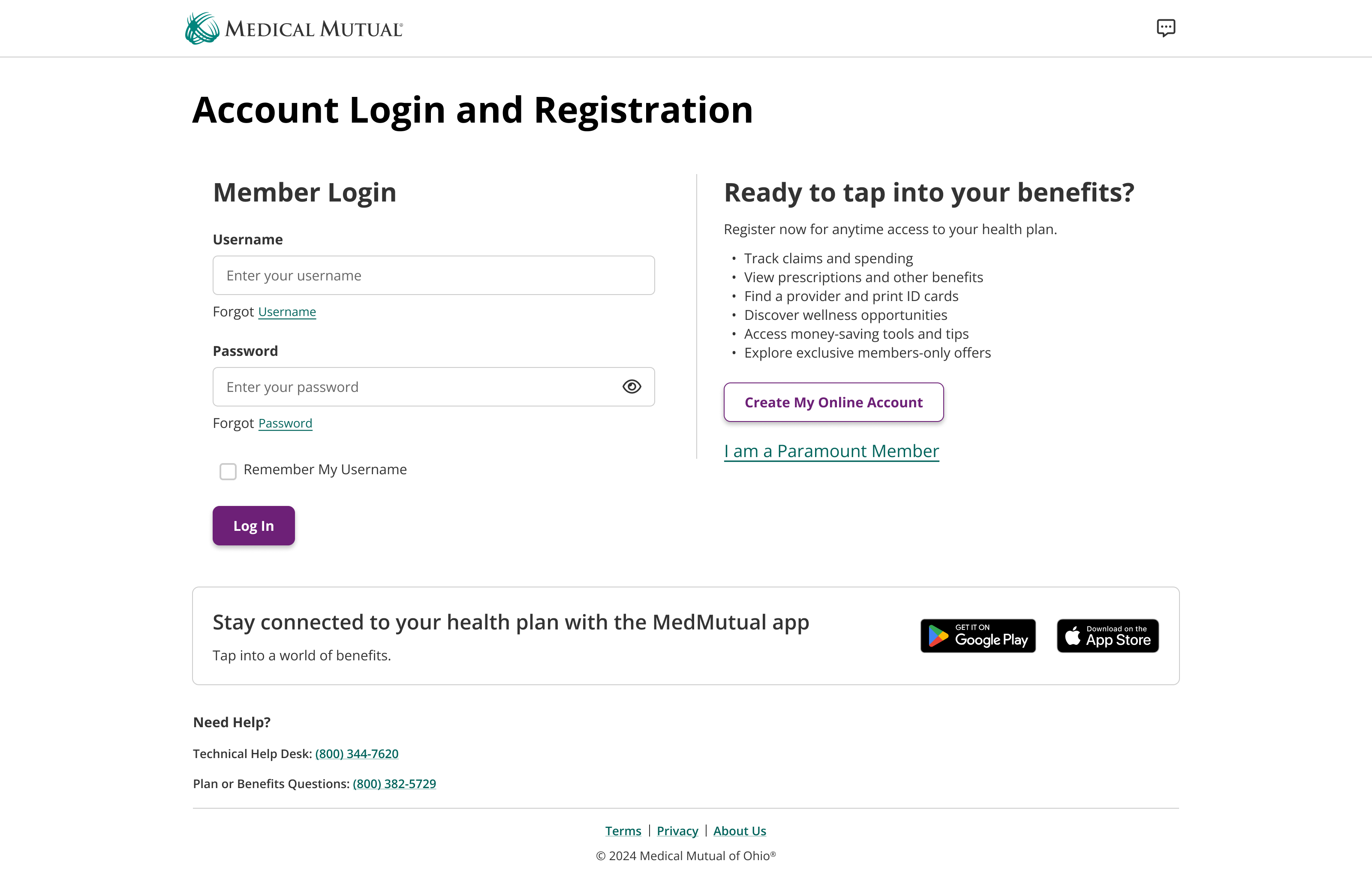
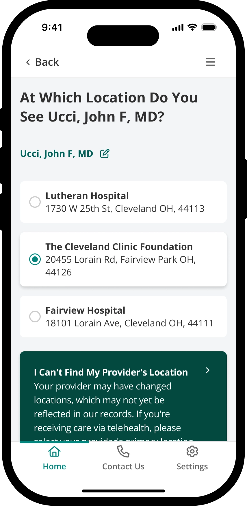
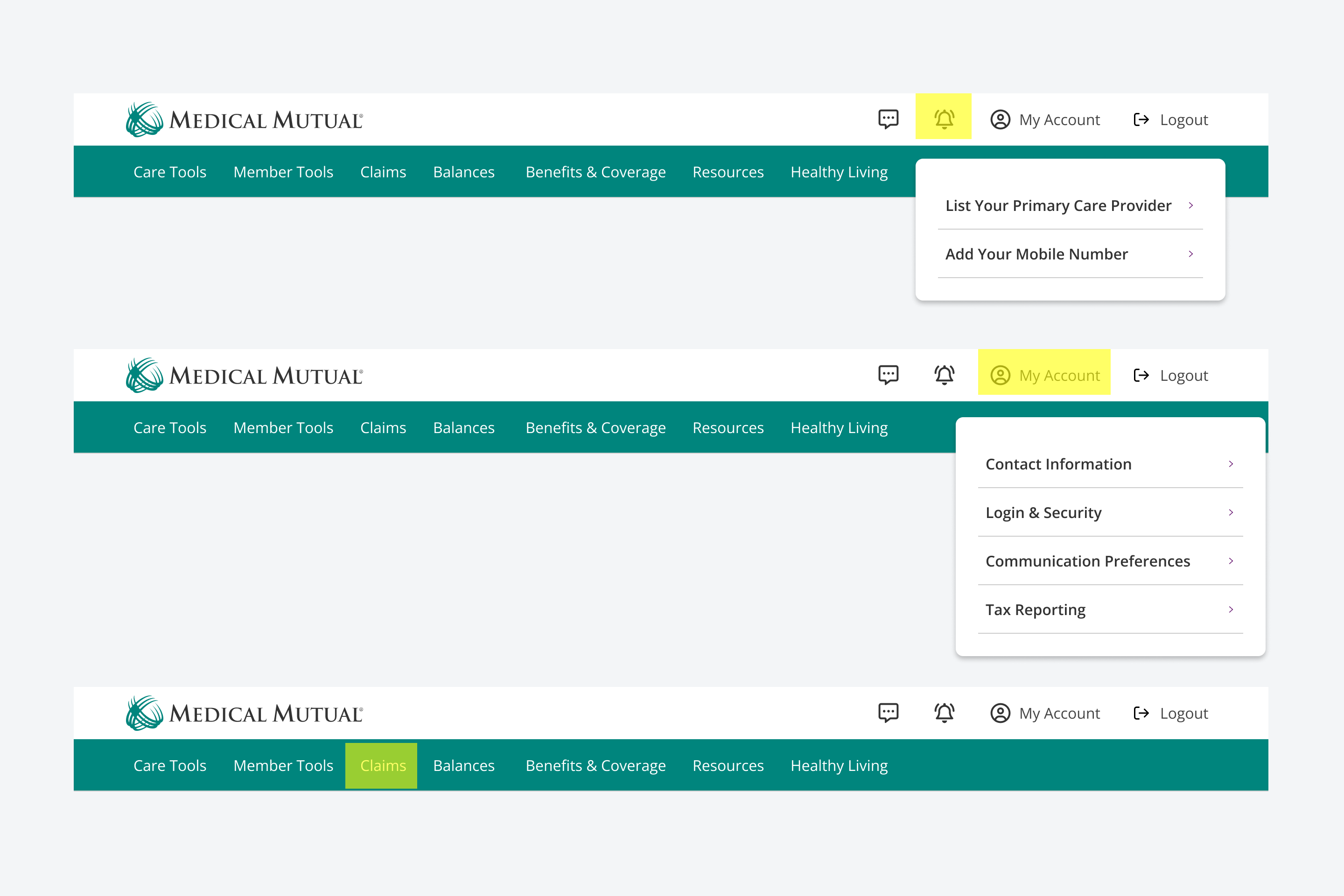
Identity serviceAuthentication login experience shared across member experiences.
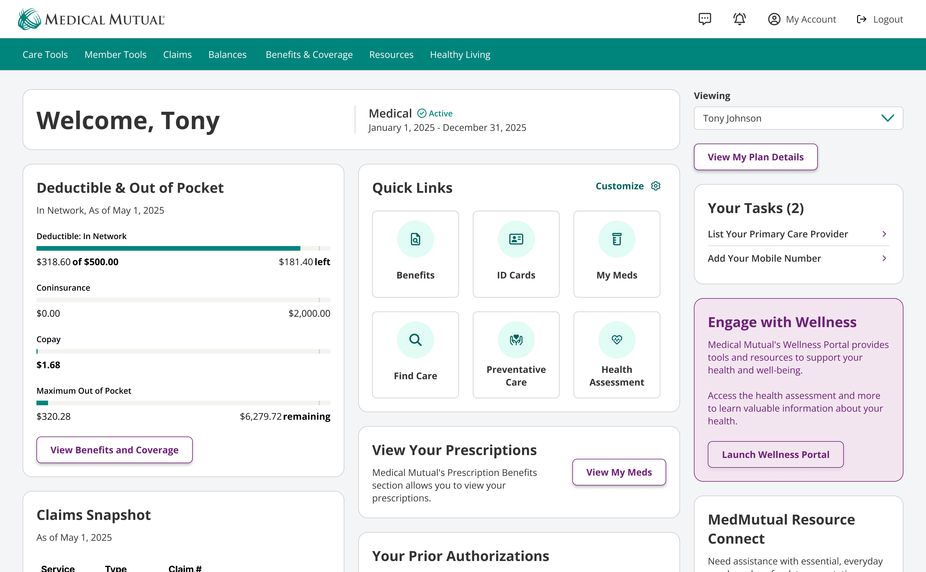
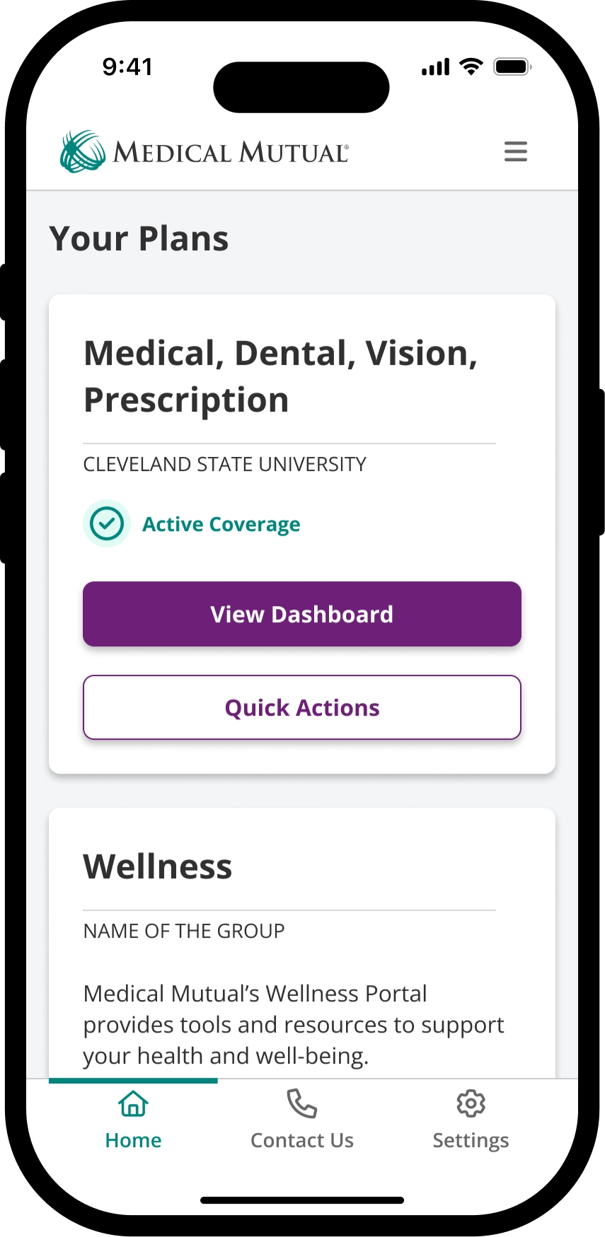
Plan DashboardWidgets for top 30 page features, designed to streamline access to critical information.
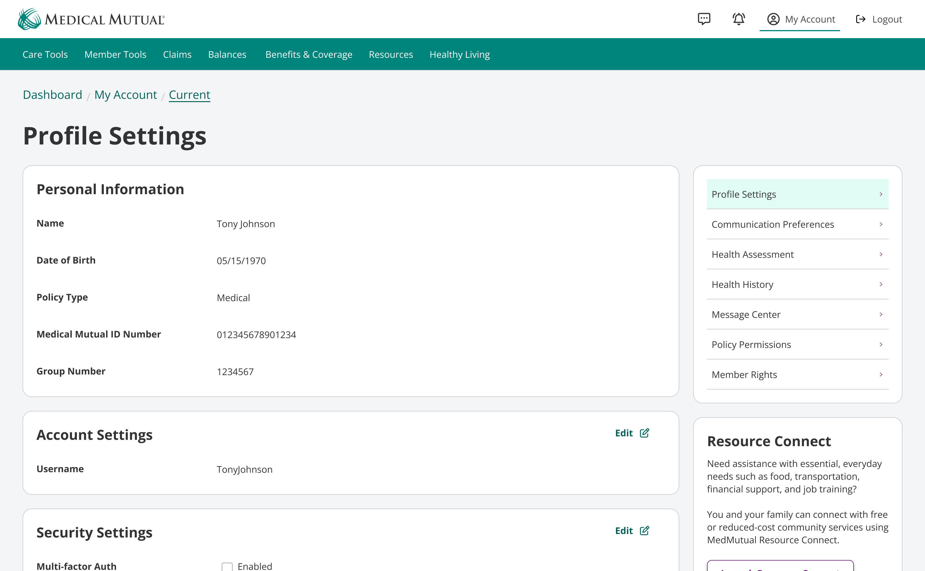
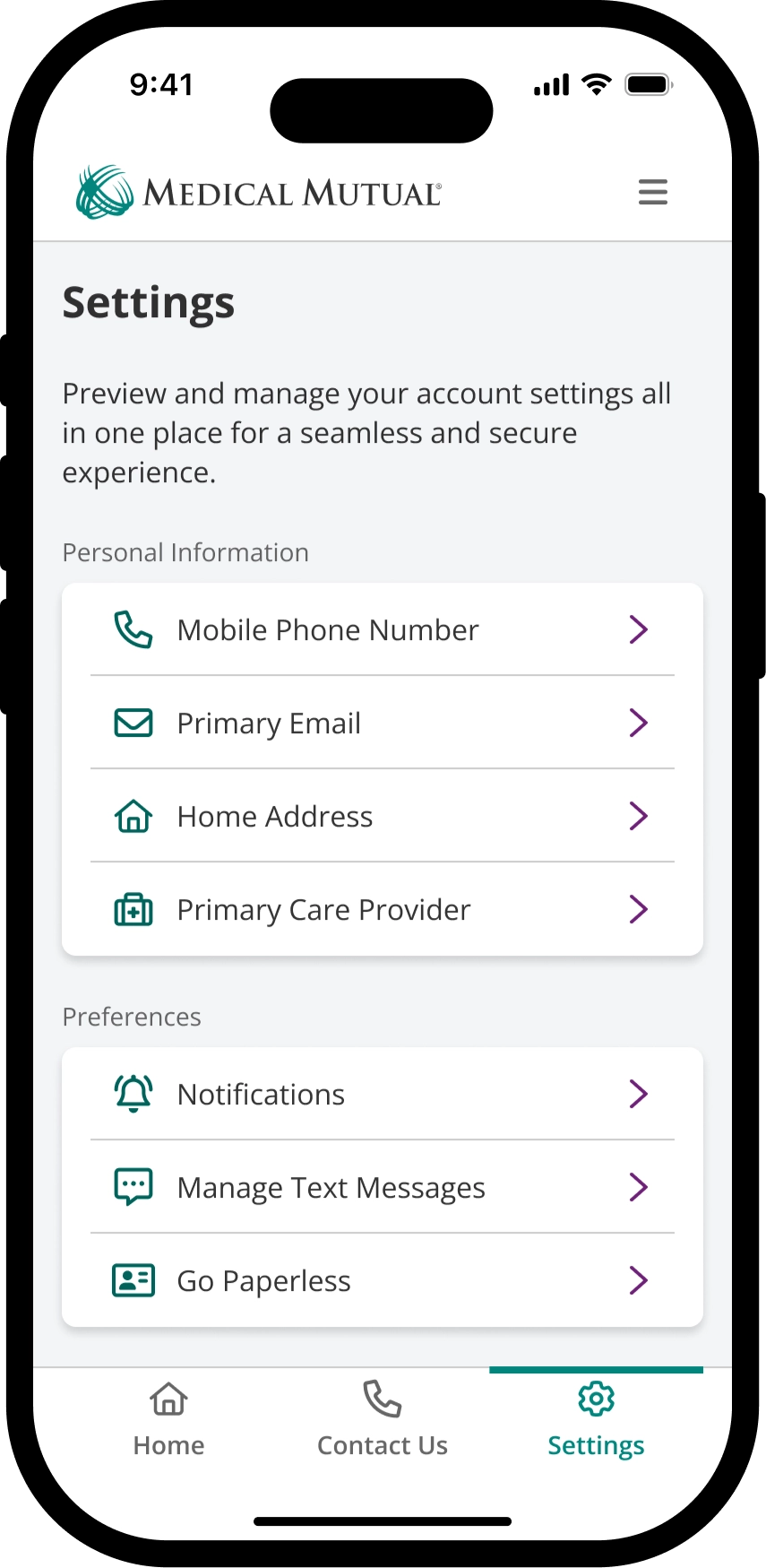
Account Profile SettingsManage personal information, preferences, login, and security.
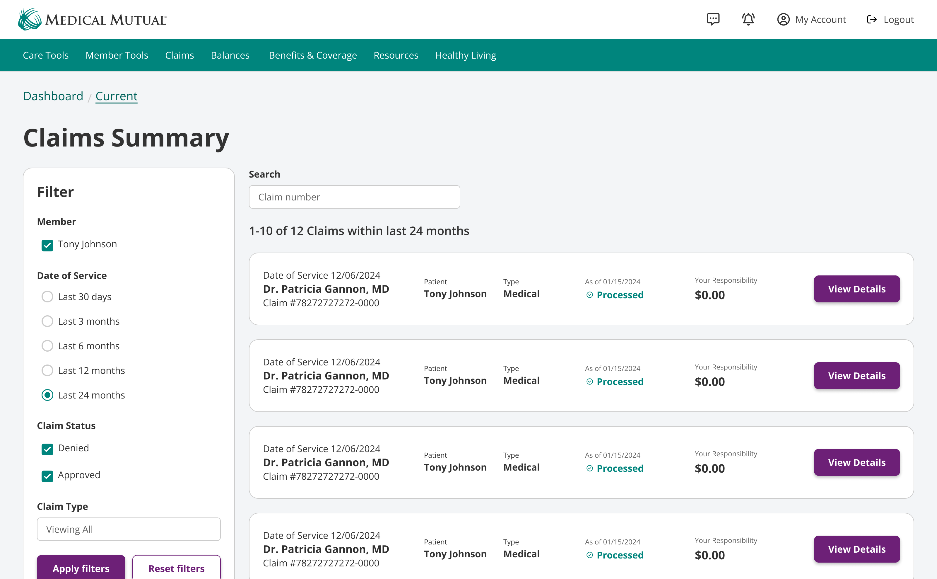
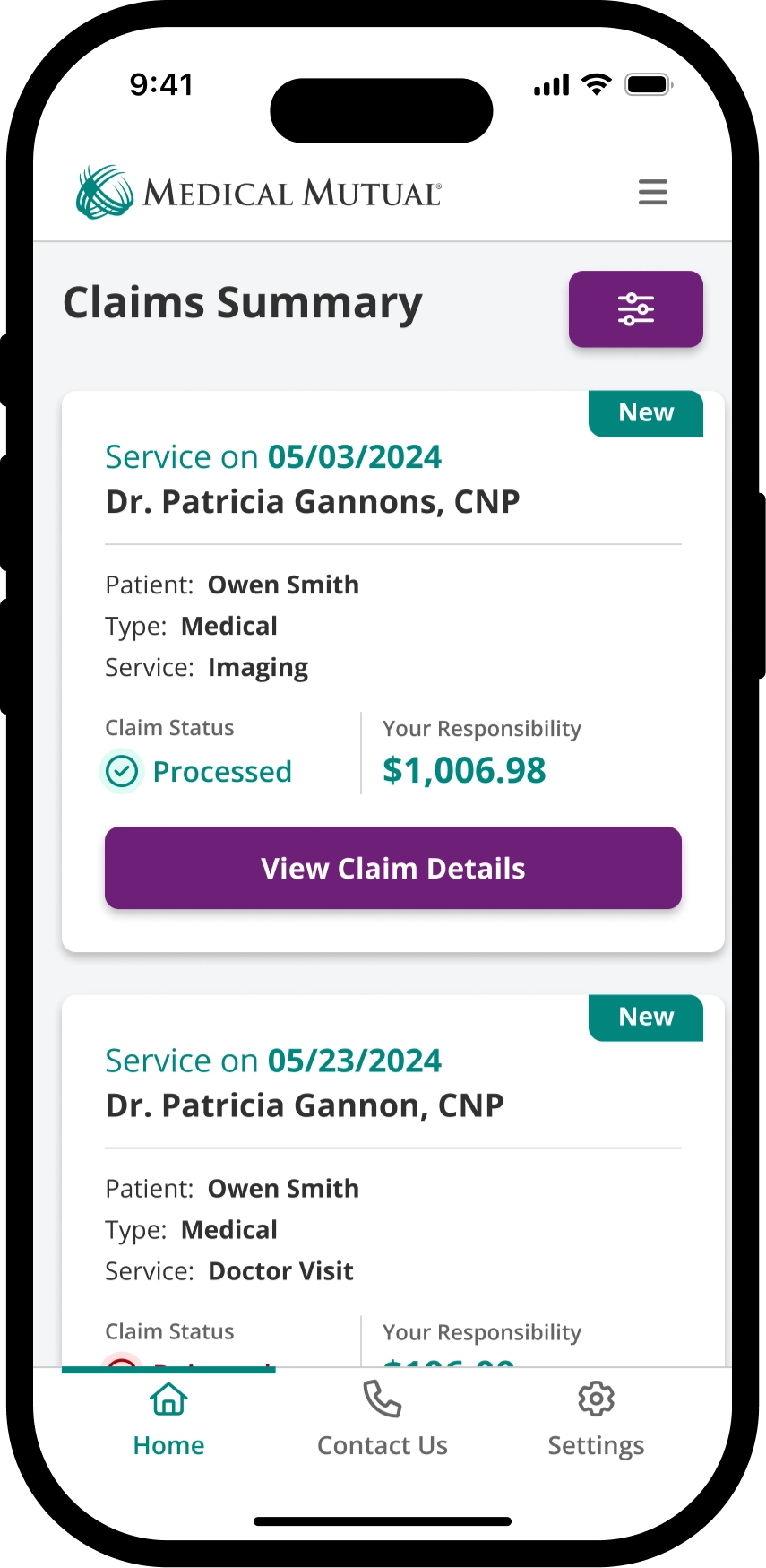
Claims SummaryFind a claim by enhanced identifiable information.
Takeaway
While my role was affected by organization restructuring, I am grateful to have been introduced to working directly in health insurance with talented individuals in a complex yet rewarding space.
Lessons learned
- It's okay to say you don't understand a technical flow because of the services involved. Clarity is an opportunity to level set with the entire team to ensure you have a shared understanding of the work and who exactly it impacts.
- Documentation is critical, especially when inheriting other designers' work. Advocate for a common practice to onboard and help others understand your discovery, ideation, and insights from research and/or business partners.
- As an adult dependent on a spouse's insurance, this was a wake-up call to deepen my understanding of my benefits before a life-changing event like growing future dependents in our household.
Potential next steps
- Information Architecture and Navigation: Evaluate navigation labels and the top 30 critical pages in new UI concepts to understand the usability of proposed design solutions.
- Expand message prioritization framework: Determine how we might sync content between our content management systems and channels like native mobile, responsive web, and Figma.
- Design System: Advocate for a design token pipeline to maintain visual language parity across various frameworks to contribute to a cohesive user experience.