Artful Home
How might we simplify our product discovery and modernize our digital transaction experience?Overview
Artful Home is an online and print retailer that brings exceptional works of fine art, craft, apparel, and design to your home.
Artful Home helps artists get exposure by curating and selling their work to ship directly from their studios to your home.
Approach
I partnered with our Marketing Director to conduct ten unmoderated user interviews with 5 participants for our apparel and decor segments. We conducted surveys to understand our customers' interests in apparel and decor to narrow down known competitor brands based on customer interests.
Our screening criteria focused on women over 35 years, living in a household income greater than $150K, who have experience ordering online, and are interested in artist-made products. We focused on discovering customer insights regarding product discovery, descriptions, images, reviews, themes of shipping, and basket checkout with usertesting.
-
Key findings
- Themes: size, style, type, sleeve length, fabric & care, fit, return policy
- 3 of 5 users clicked on primary navigation apparel & shoes - dresses.
- 2 of 5 users refined their search by sleeve length, collection, size.
- "It gives you different views, so that's good, color swatches, fabric, which was my concern, care instructions, fit & sizing."
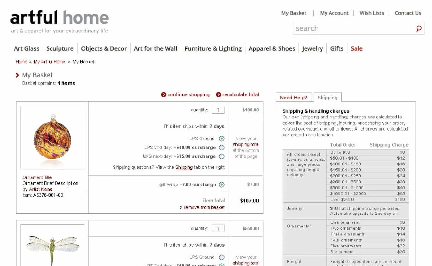
- "Shipping is a little on the high side. I’ve never understood shipping rates by what you order (the amount). Do free shipping at this price."
-
Recommendations
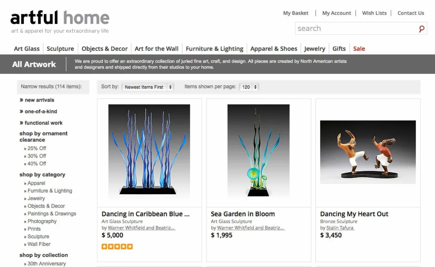
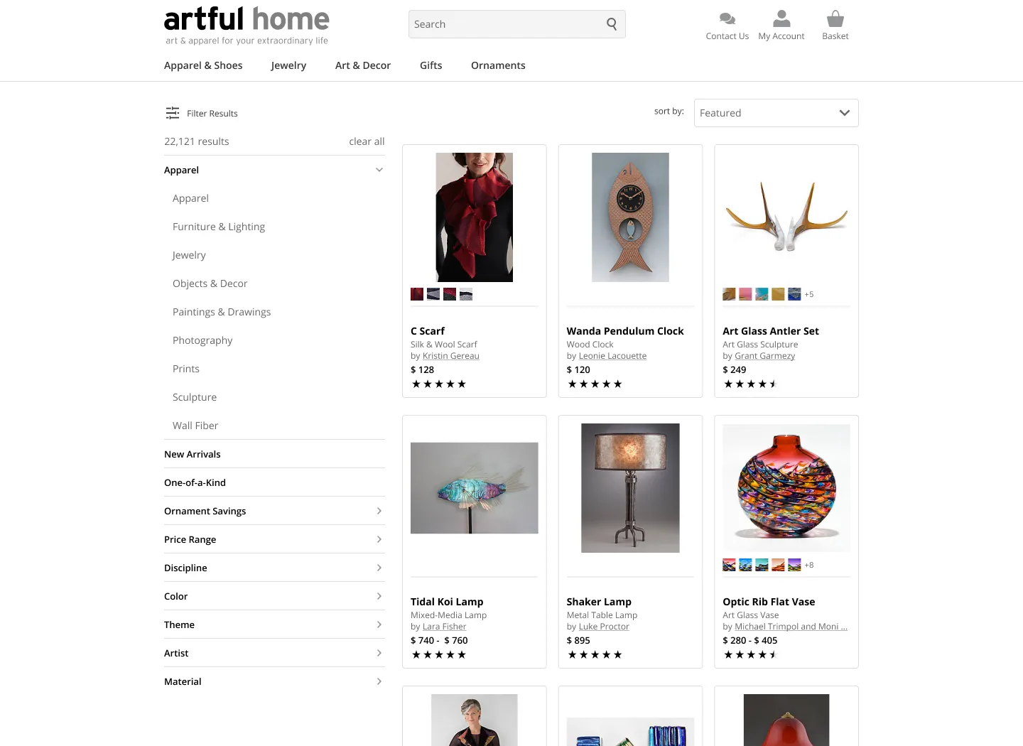
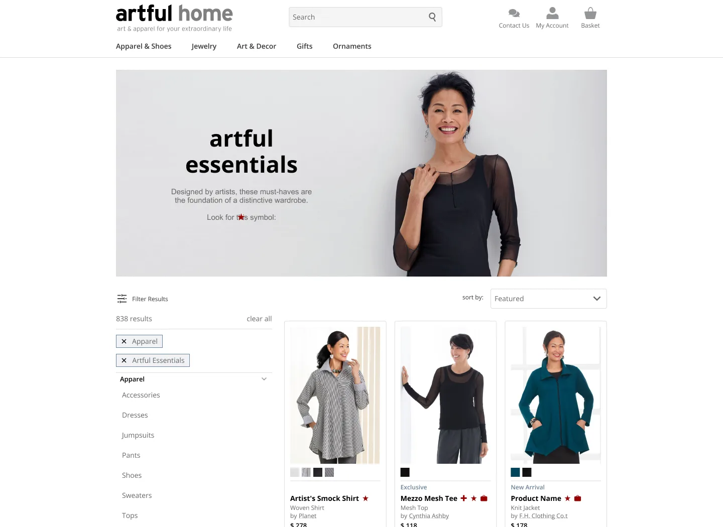
- Redesign existing filters to be more dynamic based on category type rather than showing all filters expanded.
- Create sub-categories for filtering that distincts apparel from decor.
- Consider creating more curated landing pages per categories.
- Revisit slider design for price range.
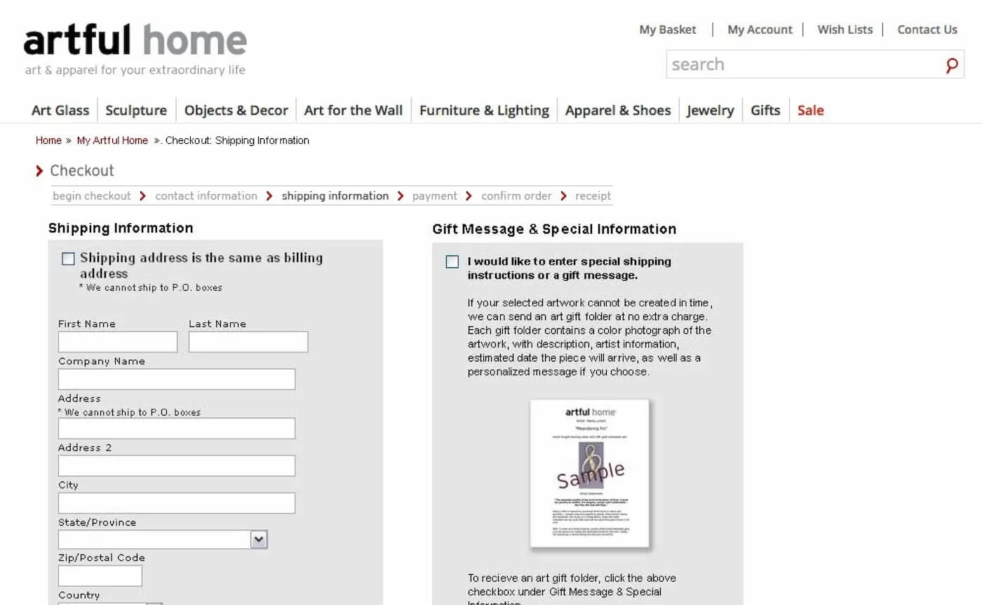
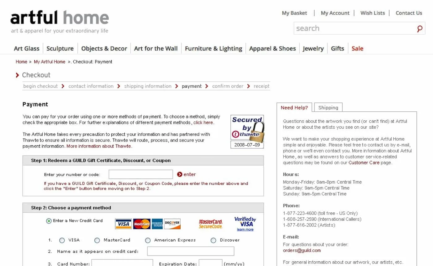
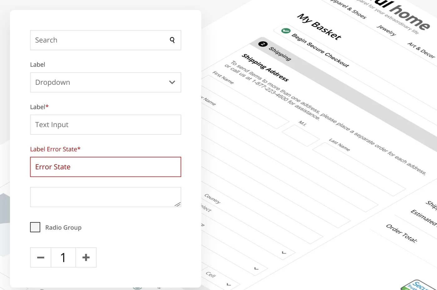
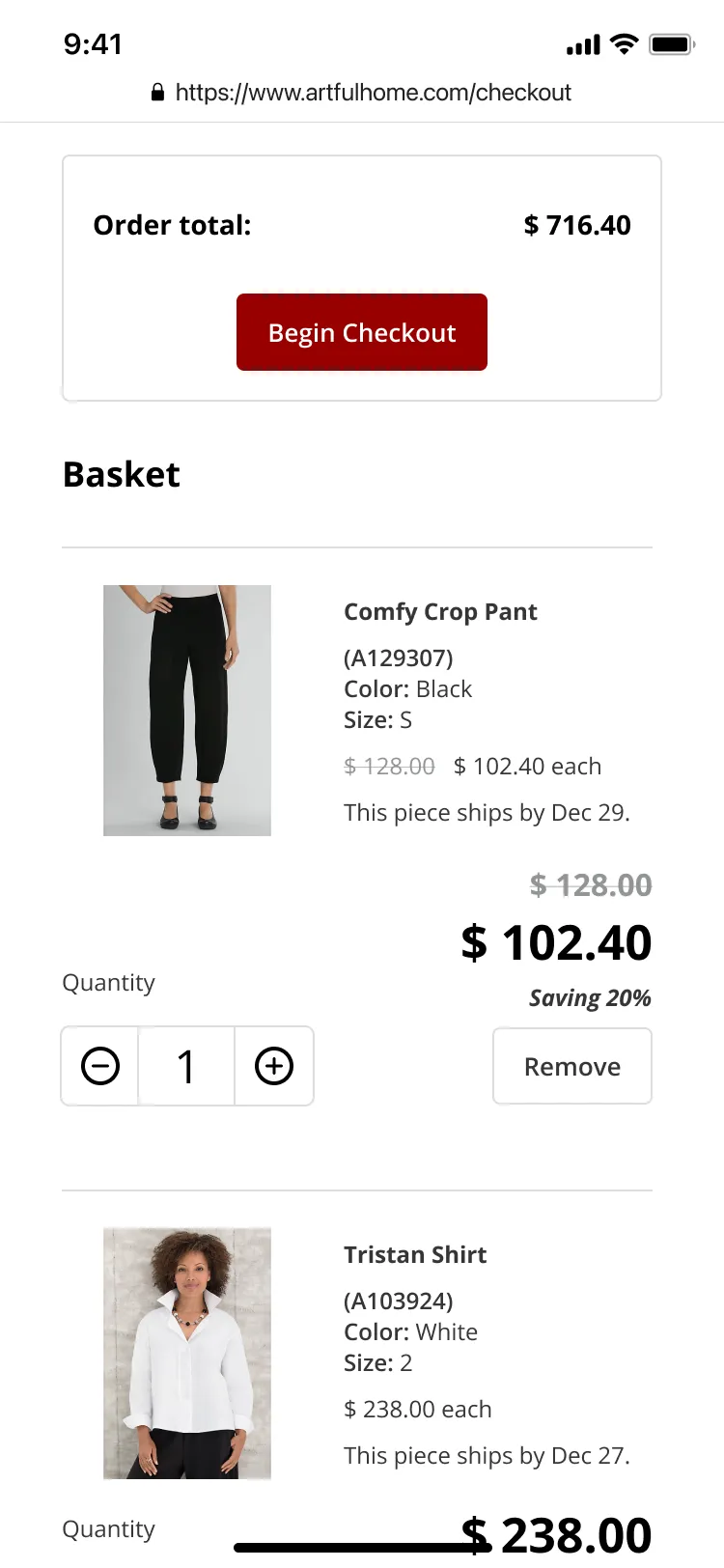
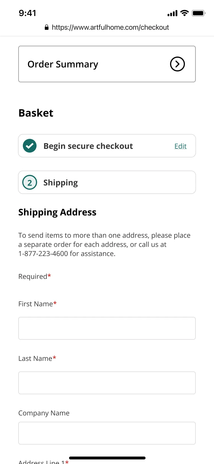
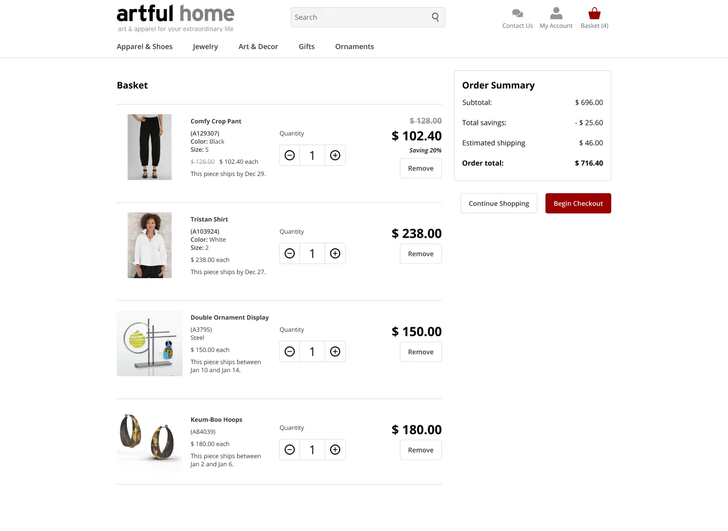
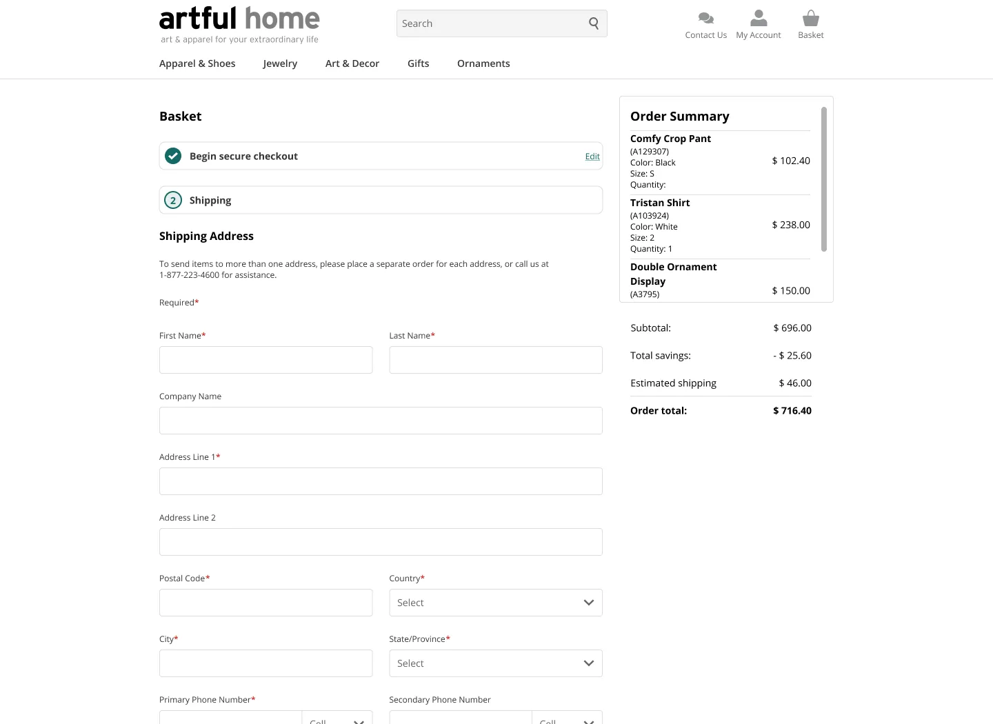
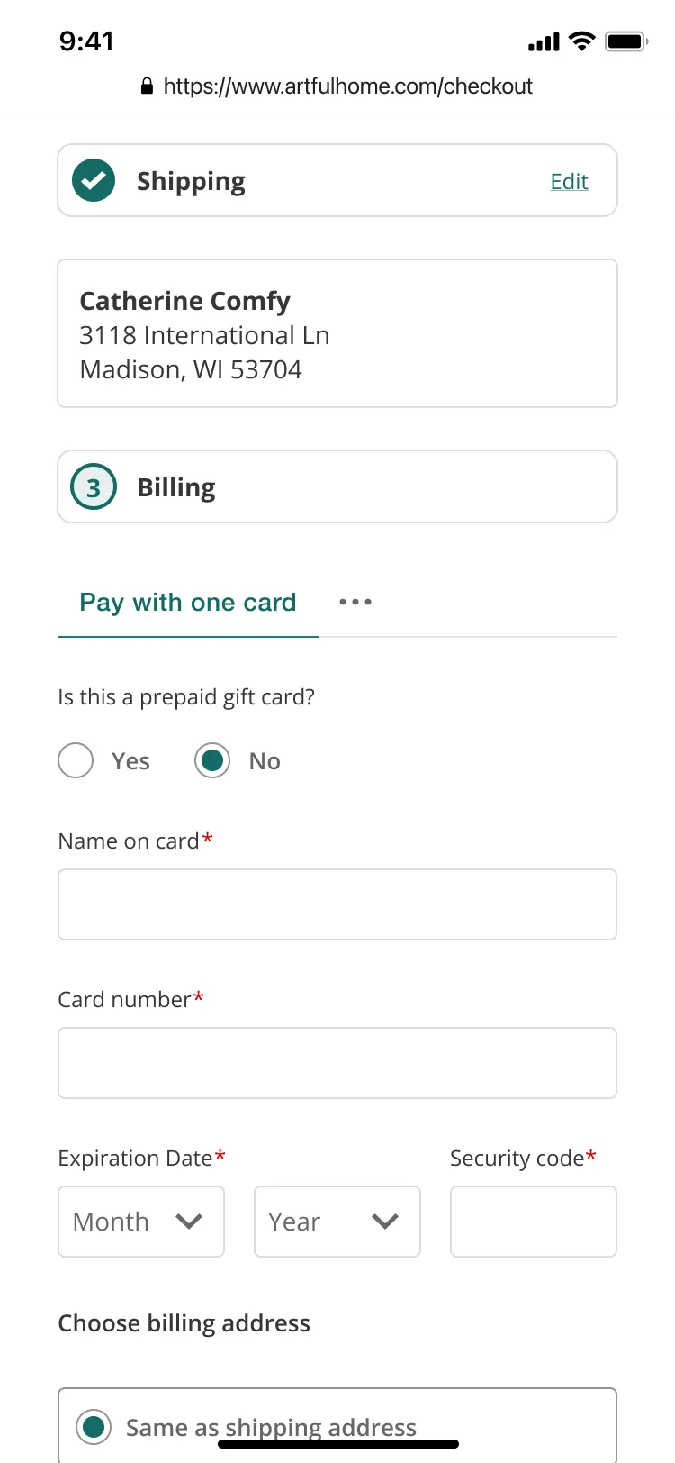
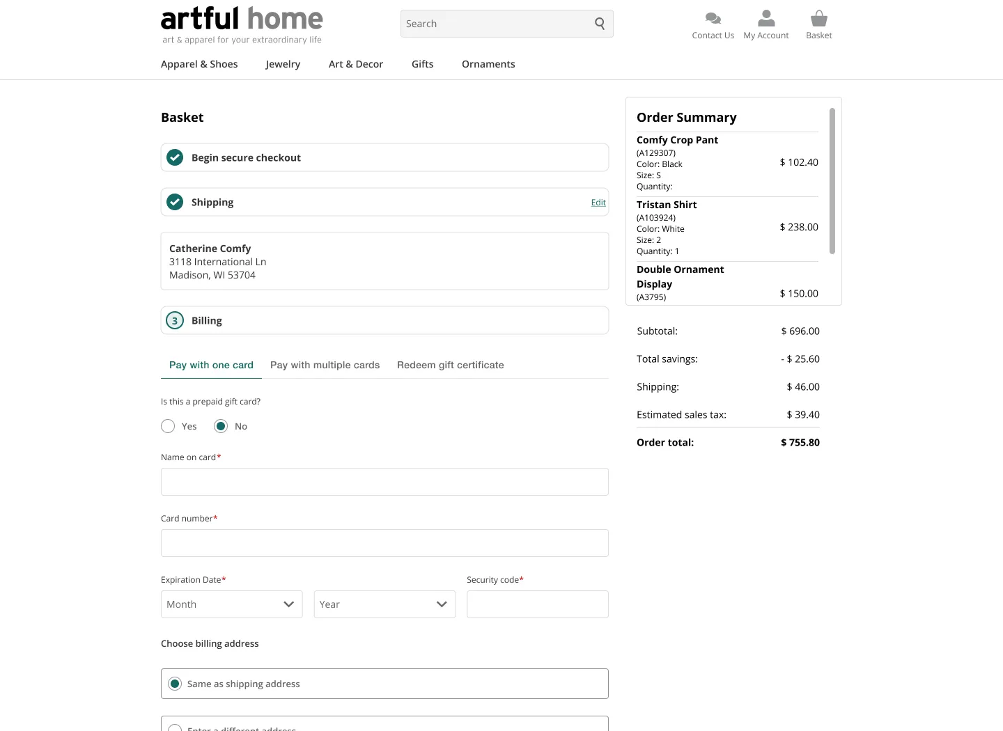
- Redesign basket checkout to summarize selections.

Catherine Rose
"I like clothes that are not only stylish but relaxed and extremely comfortable."
60 years old
California
Art Dealer
- To find new products that catch her attention and are handcrafted and unique.
- To be able to review fabric and care instructions before purchasing clothes.
- To be able to find clothing that is easy to pack and travel.
- Browse for decor and apparel artwork with both images and navigation.
- Reads reviews and return policies to determine purchase.
- Return clothes that didn't match color or fit wasn't flattering.
- Not enough images and details on models to imagine what a dress would look like on her physique.
- Shipping cost should be part of pricing since she does not understand the fixed price with the product’s weight.
- The colors in person don't match what she thought she ordered.
Constraint
As a graphic designer, I was navigating my first introduction to accessibility with digital experiences. It was a learning curve to dive into learning more about the Accessibility for Disabled People Act and applying what I was learning to design recommendations.
Gallery
Ideation
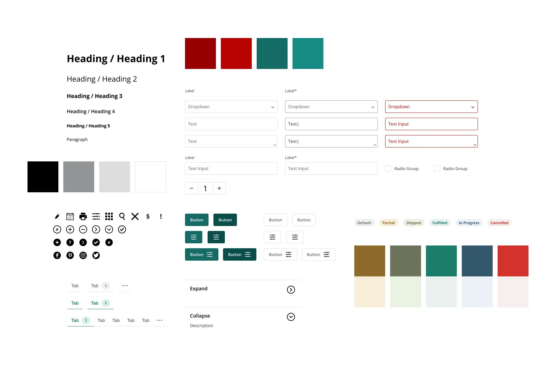
Our visual language needed a cohesive look and feel by revisiting our styling for Bootstrap.
Features
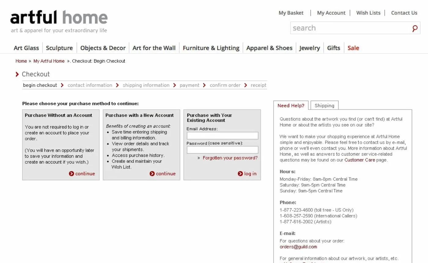
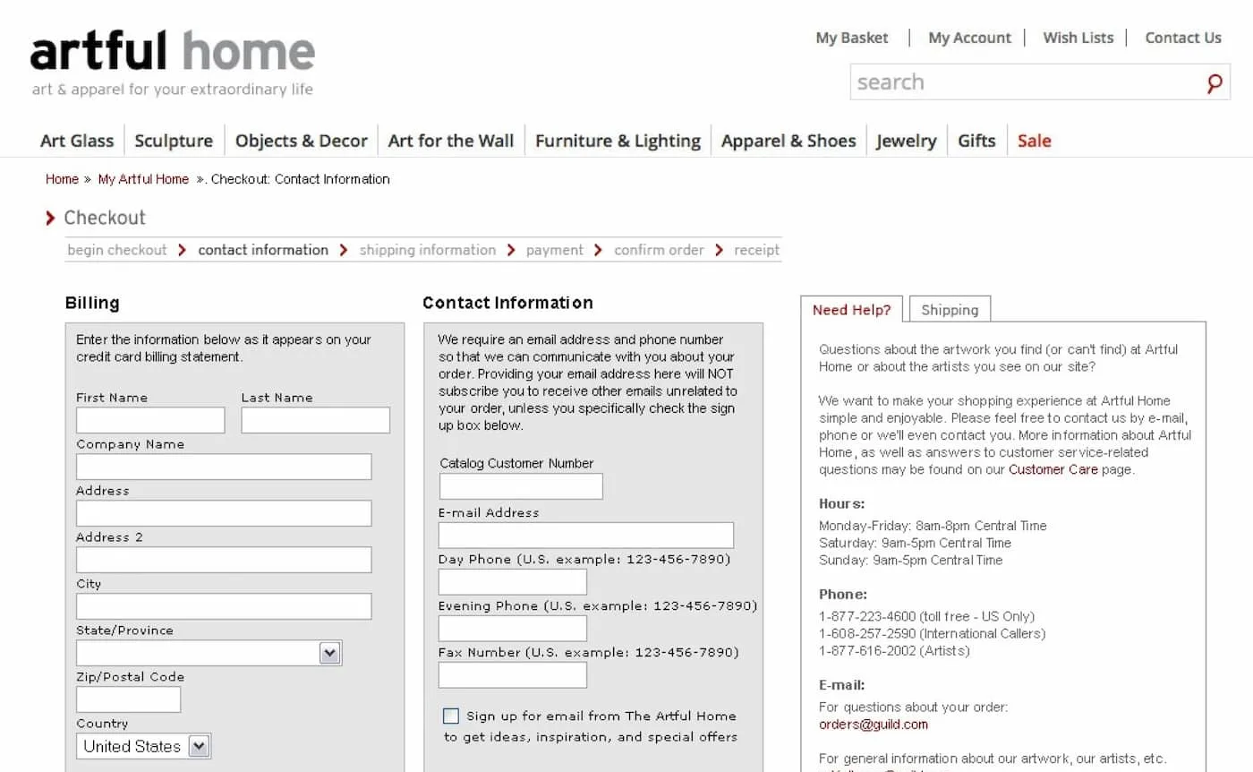
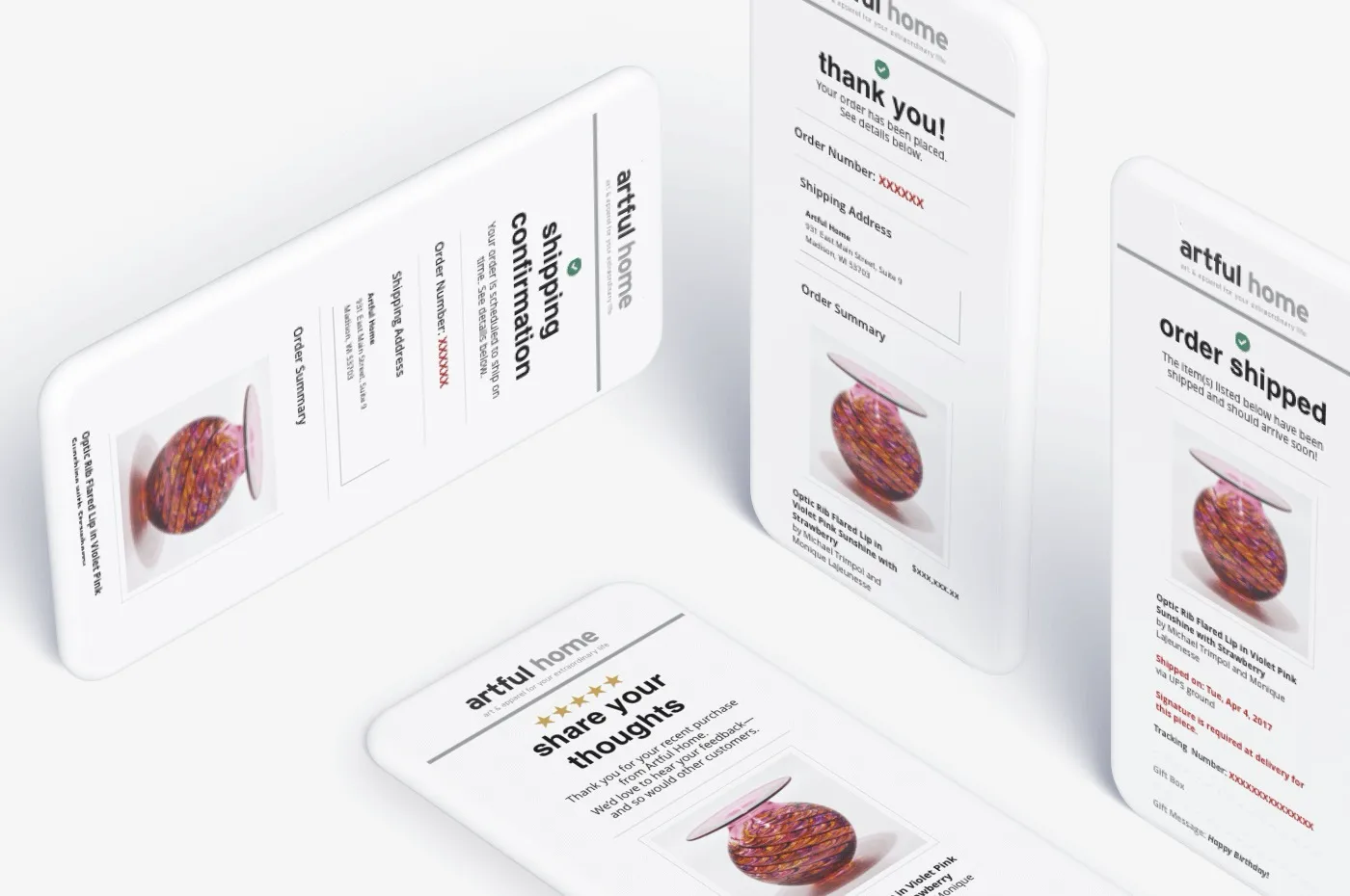
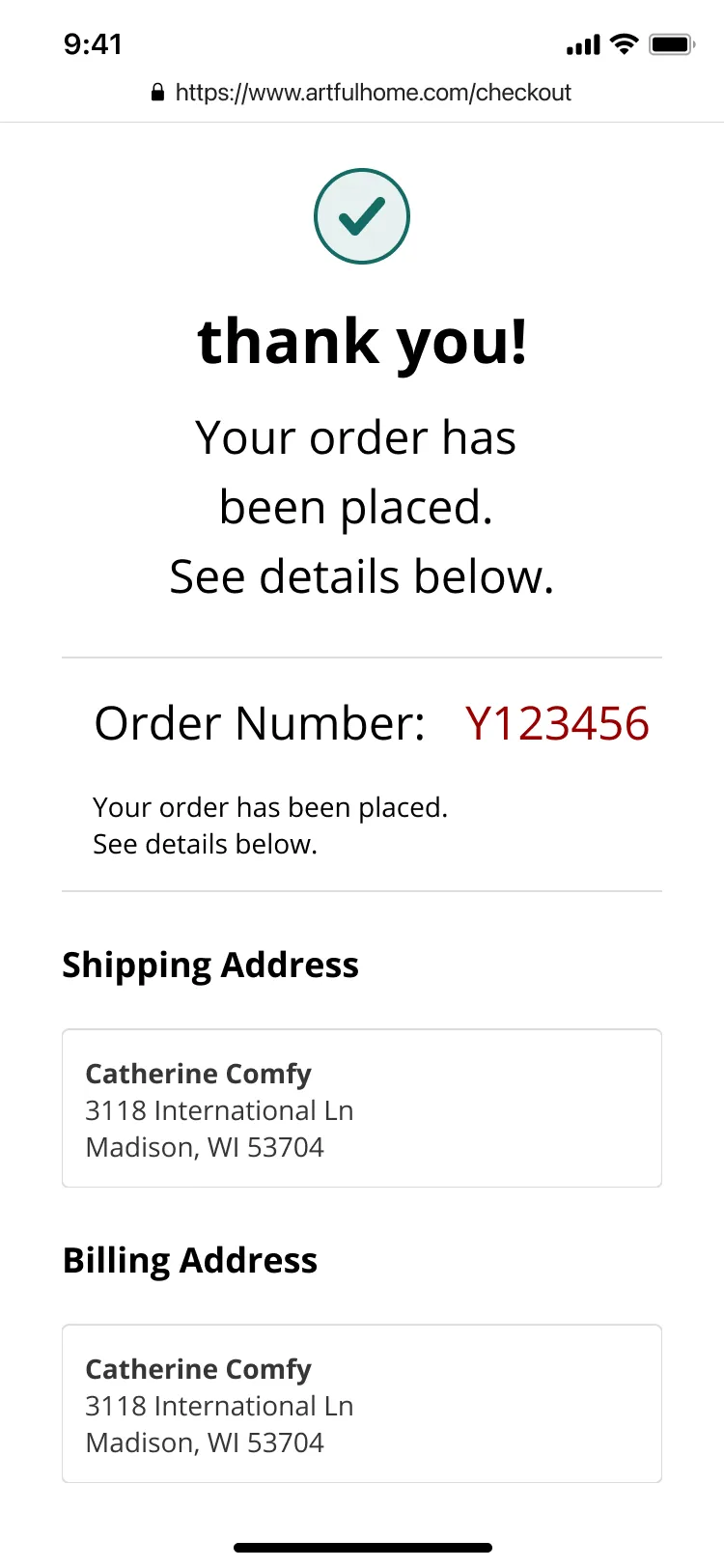
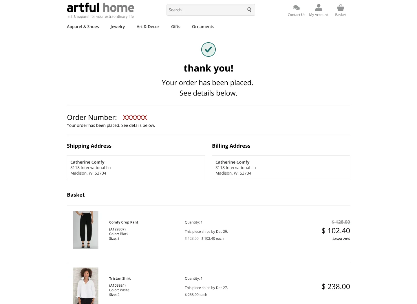
Majority of our enhanced featured focused on accessibility, improving our filtering experience, and transaction experience.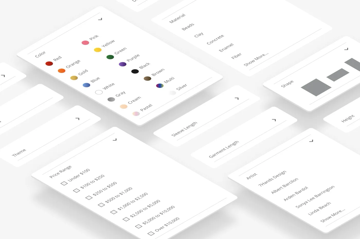
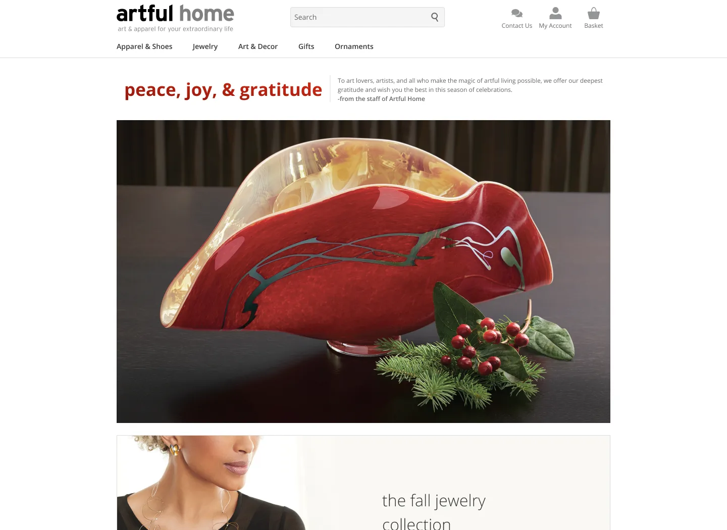
Key screens

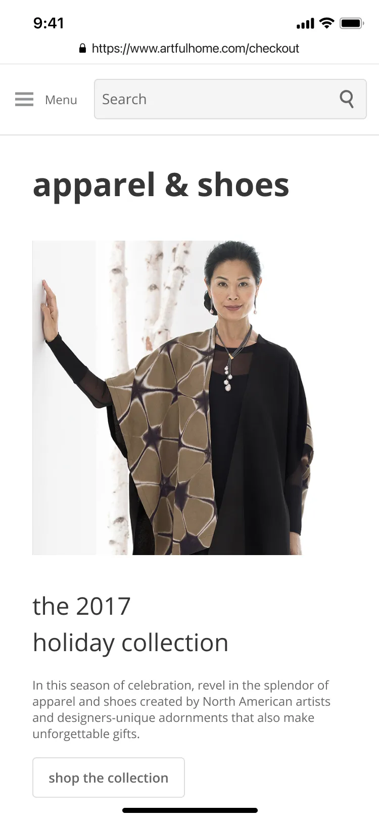
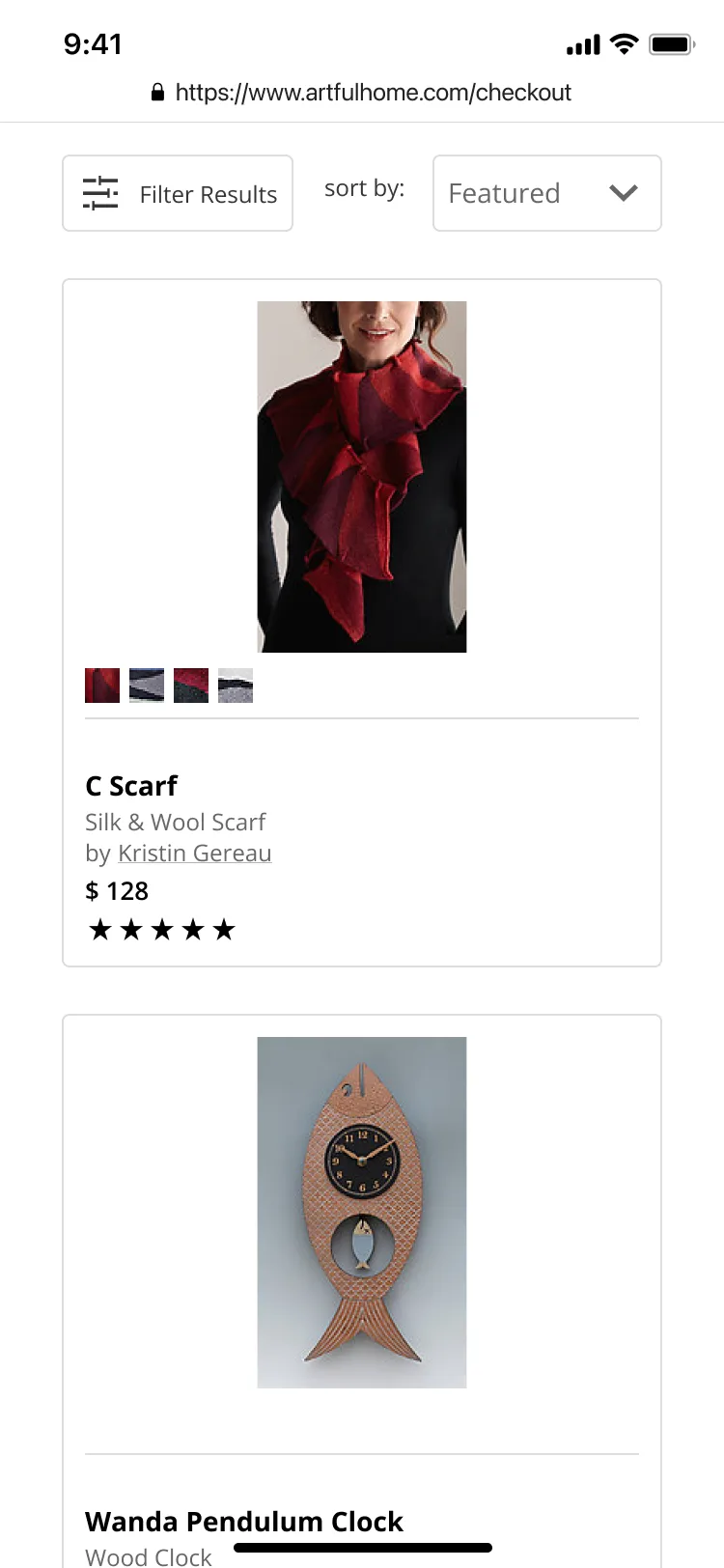
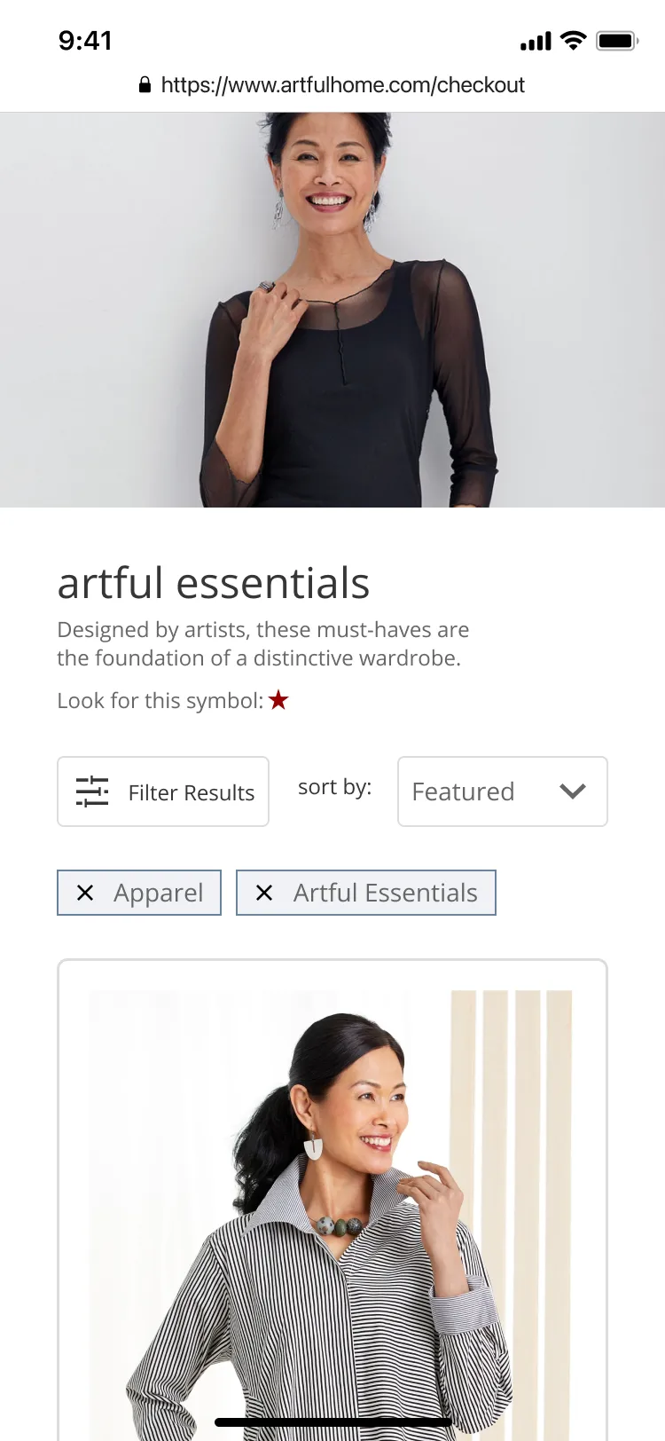

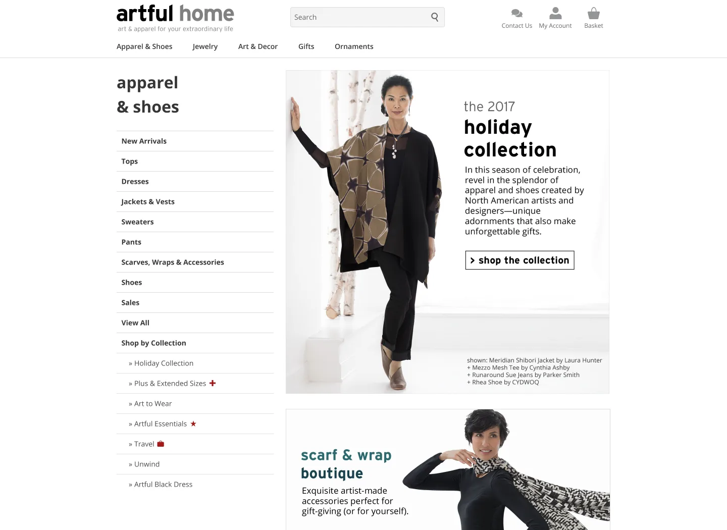





Takeaway
This role opened my eyes and interest to the world of user experience and not just user interface. I'm eternally grateful to this experience as I developed an interest in learning more and genuinely enjoyed learning with practice.- Working closely with front-end and engine developers was educational in terms of finding value in wireframes to help communicate requirements.
- I learned the importance of the Americans with Disability Act and our role in producing a digital experience.
- I conducted my first user interviews, which allowed me to see how actual users perceive your work through their experiences.
- Request as much existing usage data as possible to guide discovery and analysis for new scope on unmet user needs.
- Maintain an active competitor analysis to propose A/B tests for ongoing enhancements for competitive advantages.
- Documentation is critical to maintaining alignment between customer needs and business goals, especially with competing priorities.
