Electronic Medical Record
How might we simplify the data entry process for nurses gathering and reviewing patient information for physicians?Overview
The work on this page is part of a design exercise for a private healthcare software company that creates electronic records for medical professionals and patients.
Due to the secure nature of healthcare services, I removed company and branding as a design candidate. The work on this page demonstrates my thought process in a short, fixed timeframe.
Constraint
Assumptions needed to be made to test and validate due to limited context on current experience being evaluated.
Approach
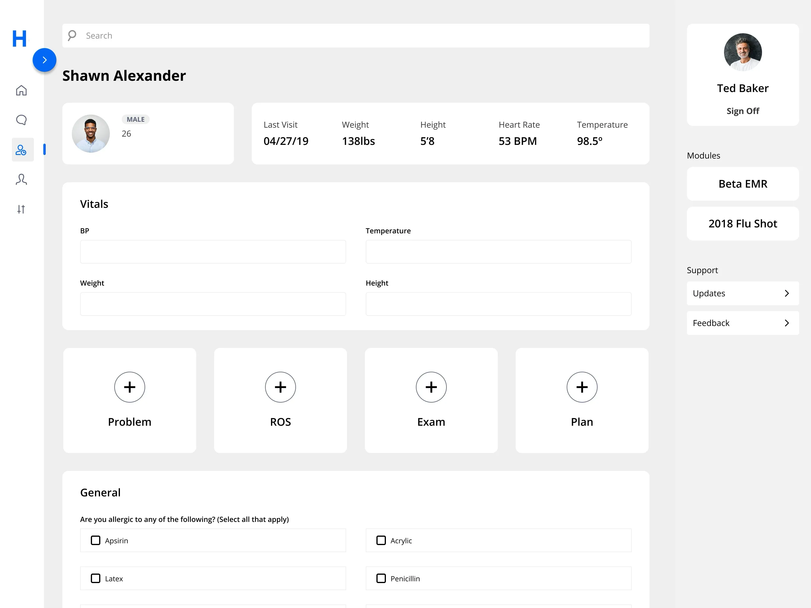
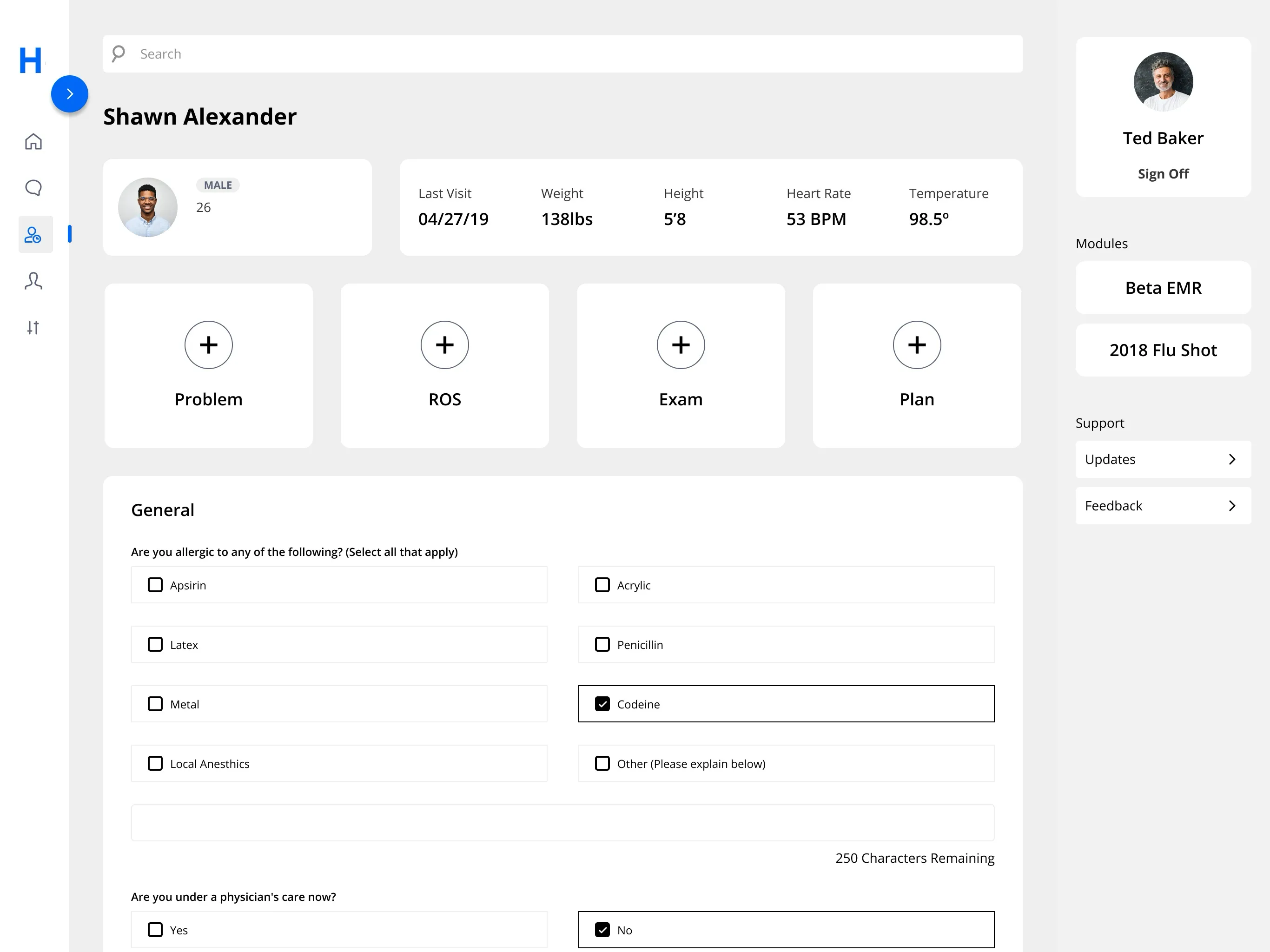
My primary user is a nurse role collecting information from a patient to prepare for a physician. Key areas to focus on gathering include, but are not limited to current and past health records, immunization and childhood diseases, and family history.
Ideation
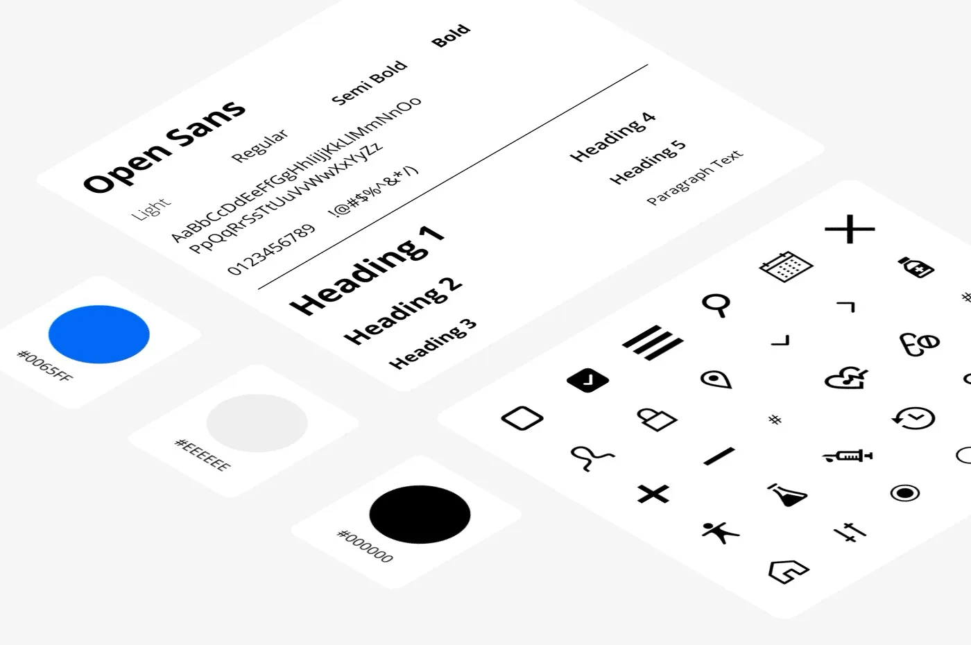
Initial exploration for user interface layout based on analysis from looking at competitor experiences and grouped information.


Features
For this design challenge, responsive and interaction design were critical considerations. I needed this interaction to be mobile and an immediate form of validation to confirm that the required fields of data were captured.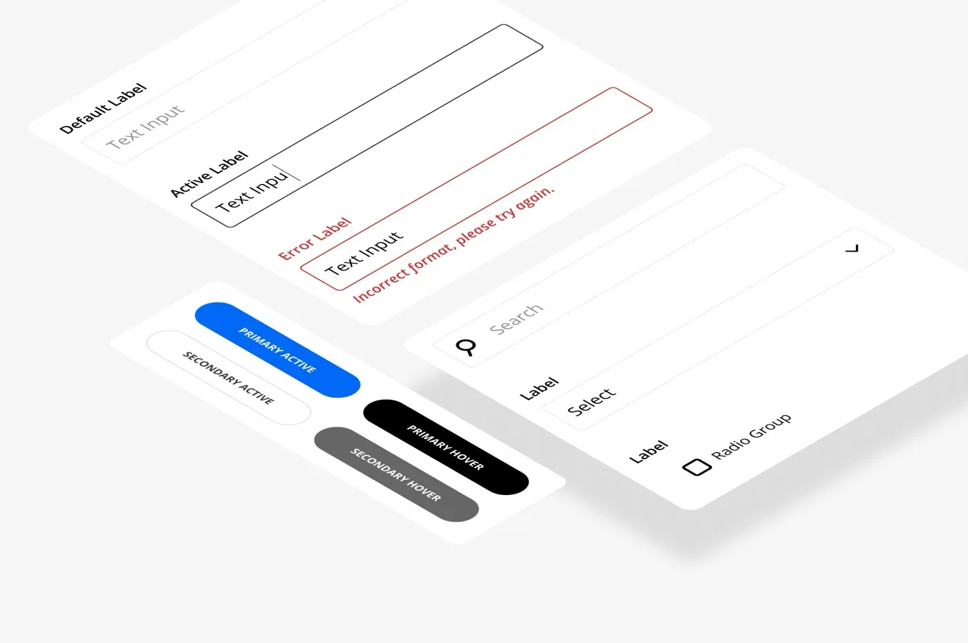
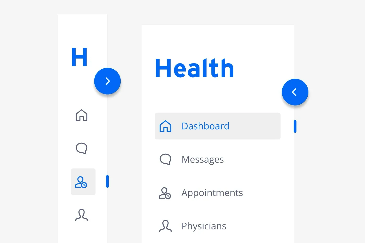
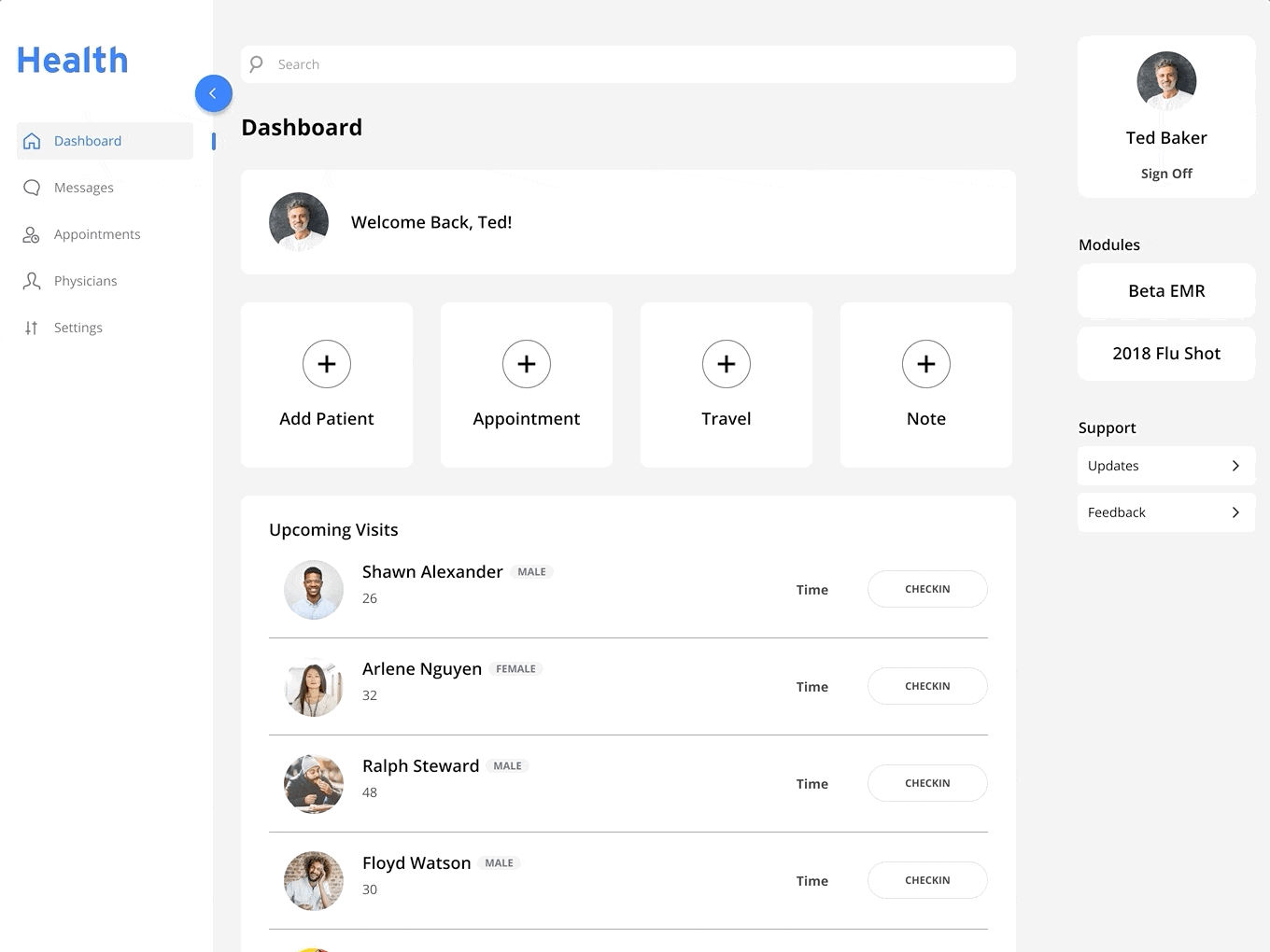
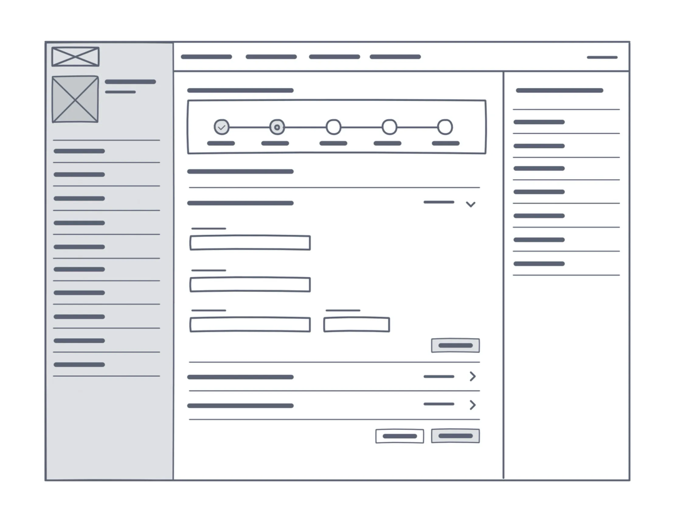
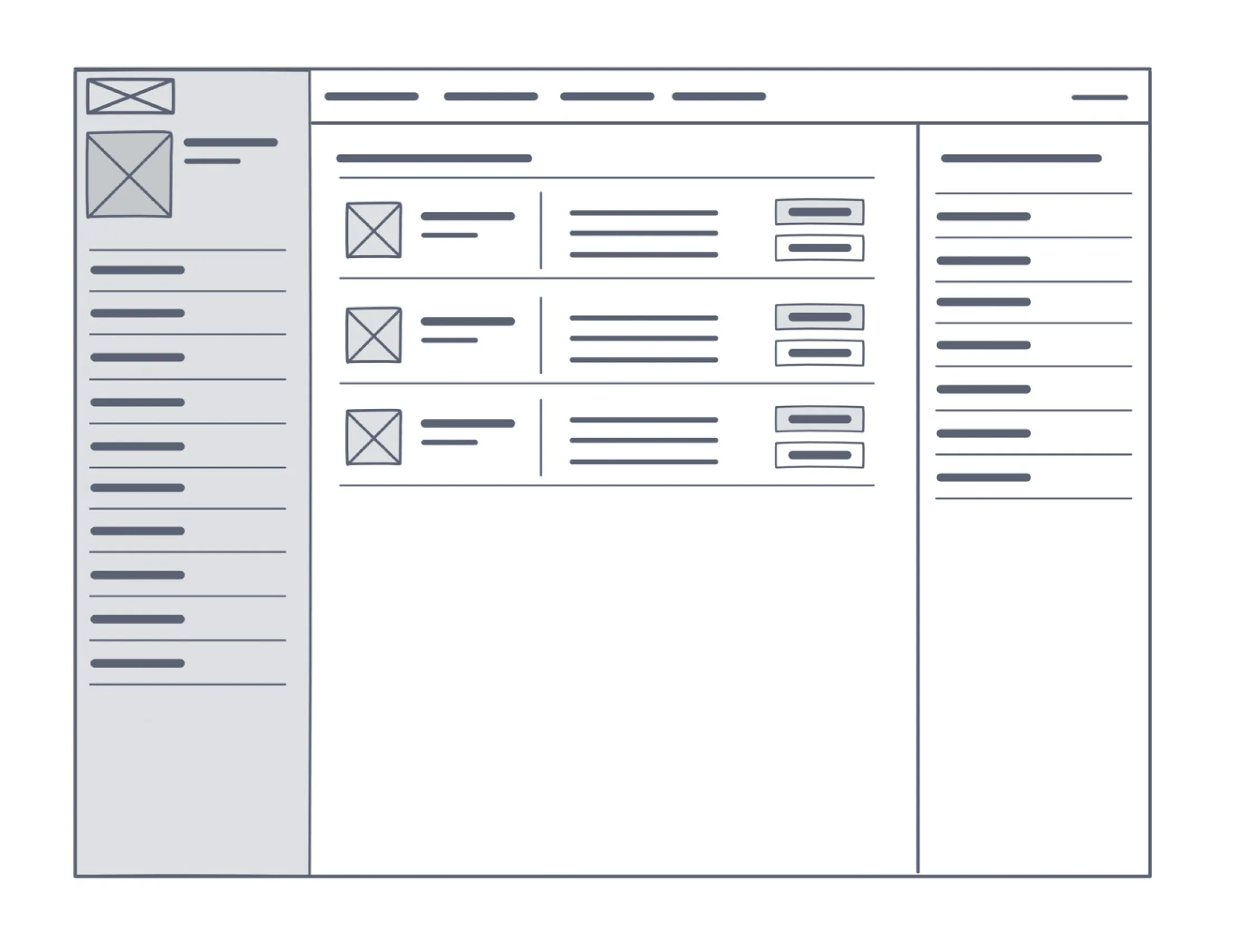
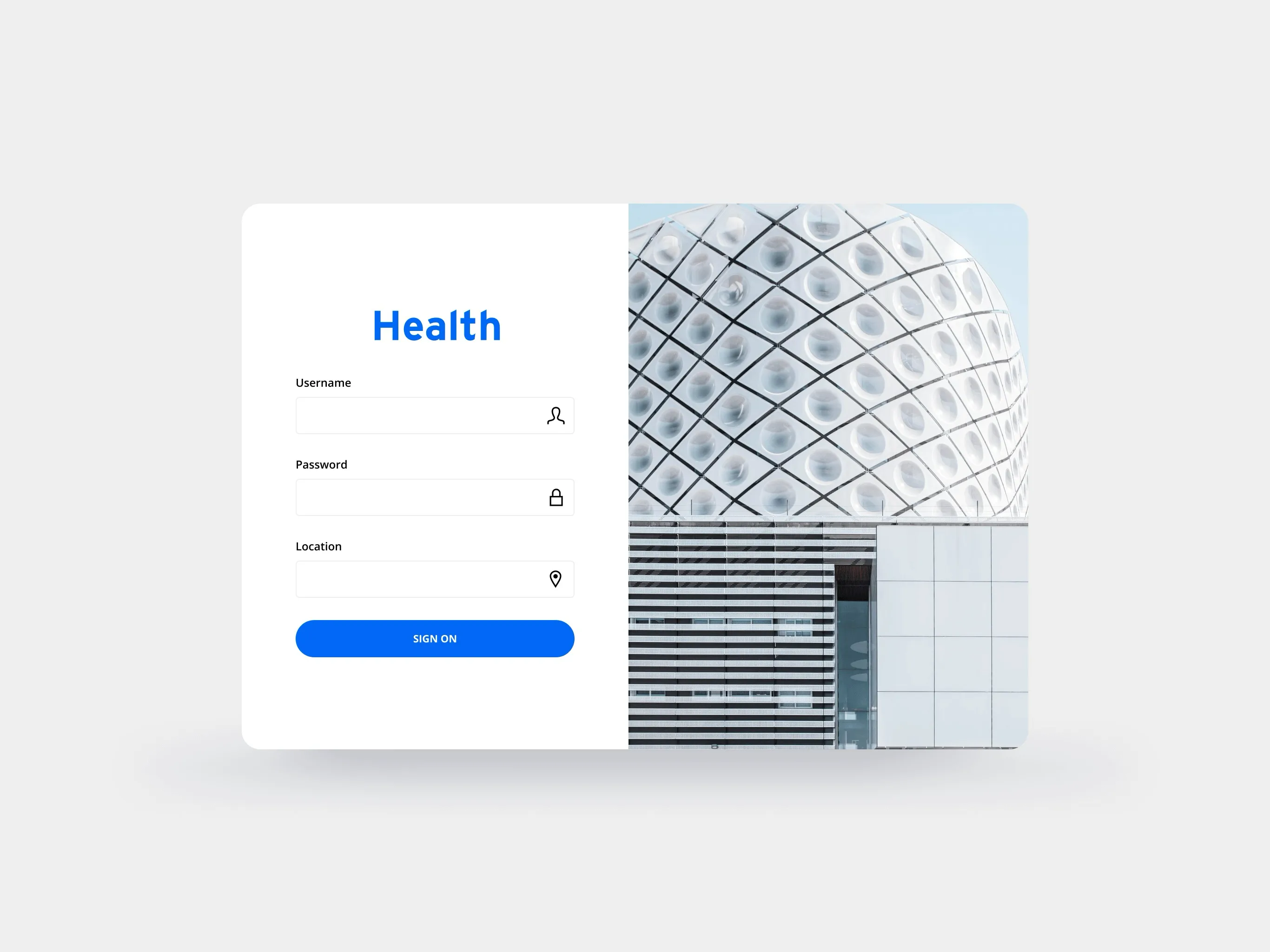
Key screens

Takeaway
This design exercise was one of my first introductions to using prototyping to convey behavior beyond interactive states. The opportunity to regain screen real estate allowed me to start expanding my deeper understanding of spacing principles in user interfaces.- Ambiguity is a normal reality when navigating a problem space and areas to focus on to address with iterative updates.
- Focus on context, user goals and tasks before investing too much time on visual design that may not solve user painpoints.
- There is a distinction outside of mobile first foundations when it comes to designing for native iOS and Android and not just responsive web.
- Conduct a moderated usability test to define user insights and additional areas for improvement.
- Test and iterate until design interactions are meeting goals presented by stakeholders.
- Focus on patient user experience and their after visit for sentiment and satisfaction qualitative insights.