SugarWod
How might we reimagine an existing fitness application to provide an experience around minimal equipment, investment, and time?Overview
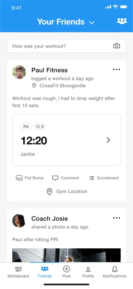
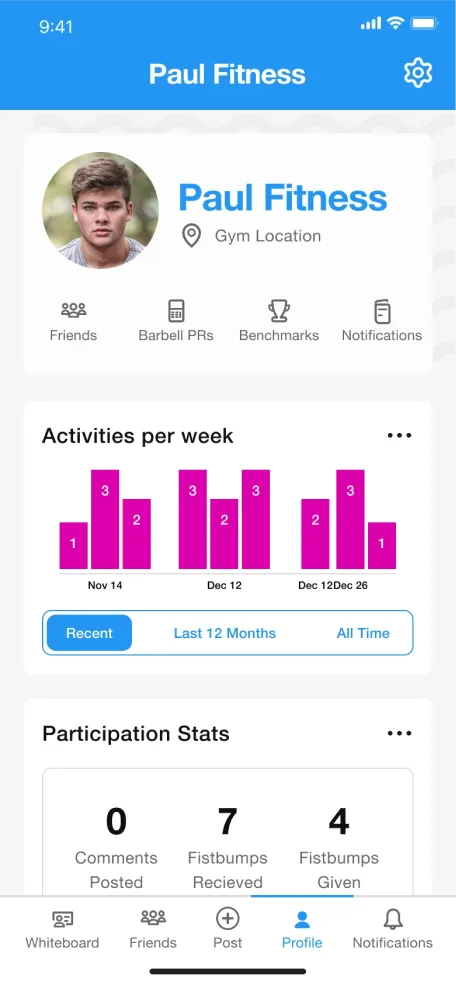
SugarWOD is a workout app for athletes, coaches, and affiliates. It allows users to connect through commenting, photo sharing, and community scoreboards. The app also improves the workout experience with performance tracking, movement prep videos, and a way for friends to support you when you document a new personal record.
ProblemApproach
I conducted competitor analysis across Beyond the Whiteboard, BodySpace, and Garage Gym to generate a list of features currently available.
By becoming aware of baseline capabilities, I sought to understand their app value proposition, fitness analytics, community engagement, and fitness tracking capabilities to find opportunities to integrate with SugarWOD.
-
Key findings
- All fitness apps assumed equipment availability equivalent to traditional gym environments rather than home gym setups.
- Fitness community features to promote accountability.
- Data analytics is standard across three fitness apps assessed as third-party services to independent fitness programs.
- Fitness apps were all cross-platform browser-based and encouraged installing the mobile apps.
- PayPal, iOS native app store, and direct card payment are mixed transaction processes for subscription services.
-
Recommendations
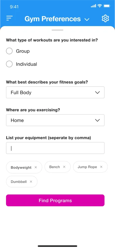
- Reimagine the existing application to focus on minimal equipment, investment, and time for users.
- Utilize tags to personalize experiences, keeping users engaged and motivated.
- Streamline sign-on processes for returning customers.
- Optimize onboarding for first-time users.
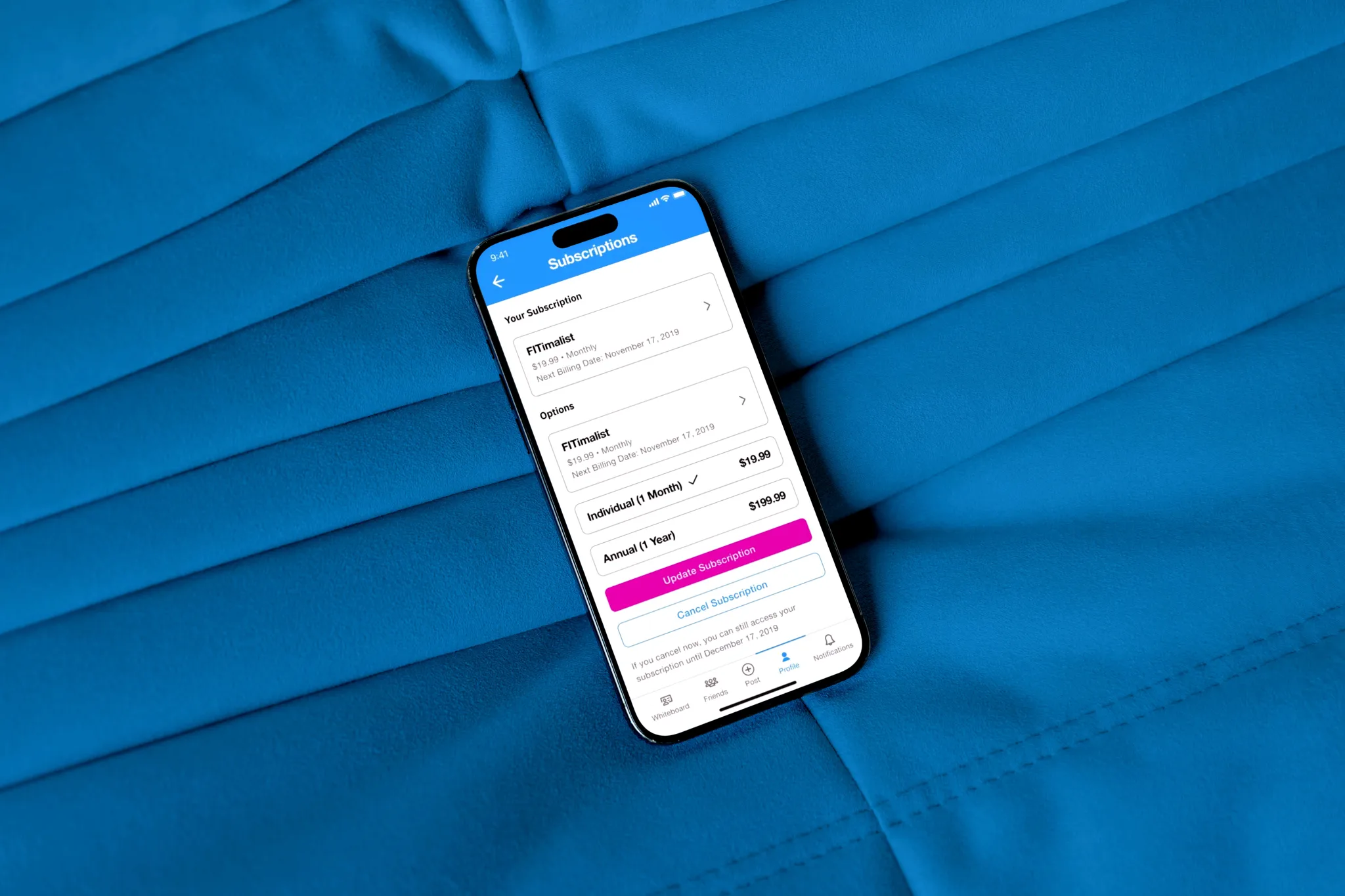
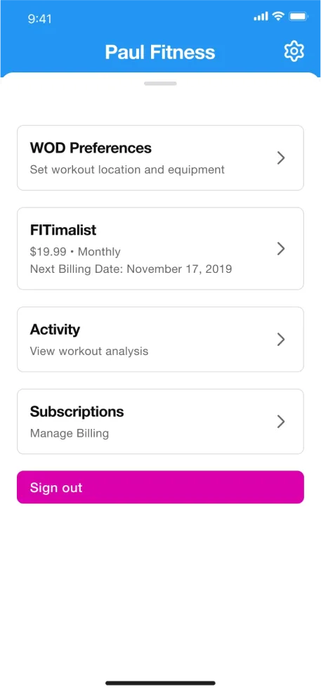
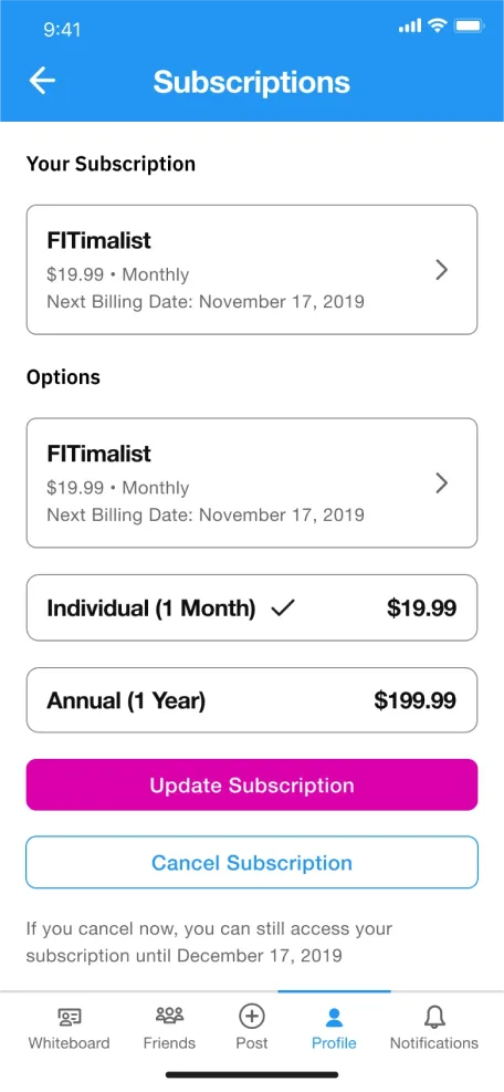
- Provide clear options for users to opt-in or out of new and existing subscriptions.

Paul
"I don't always have access to a gym and look to maintain personalized workouts for maximum results."
25 years old
Wisconsin
Project Manager
- To have curated workouts based on equipment he actually has.
- To be able to set a timeframe for which he can workout, perhaps a target heart rate.
- To not need to use yet another application to track his workouts.
- Workouts 4-5 times a week
- Workouts are a blend of CrossFit and strength body building
- Travels for work every other week
- Not being able to modify his workouts with other movements or equipment
- Not knowing where to go to create custom workouts
- Not knowing where he needs to improve his strength in benchmarks
Constraint
As part of an interaction design course at Kent State University, my focus was on applying the methods taught in the curriculum to propose recommendations.
Ideation
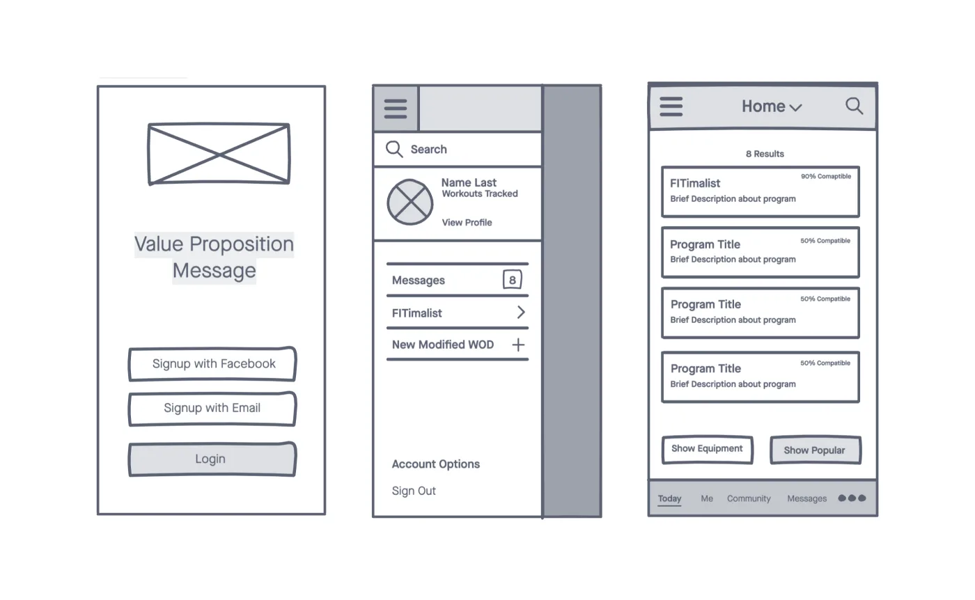
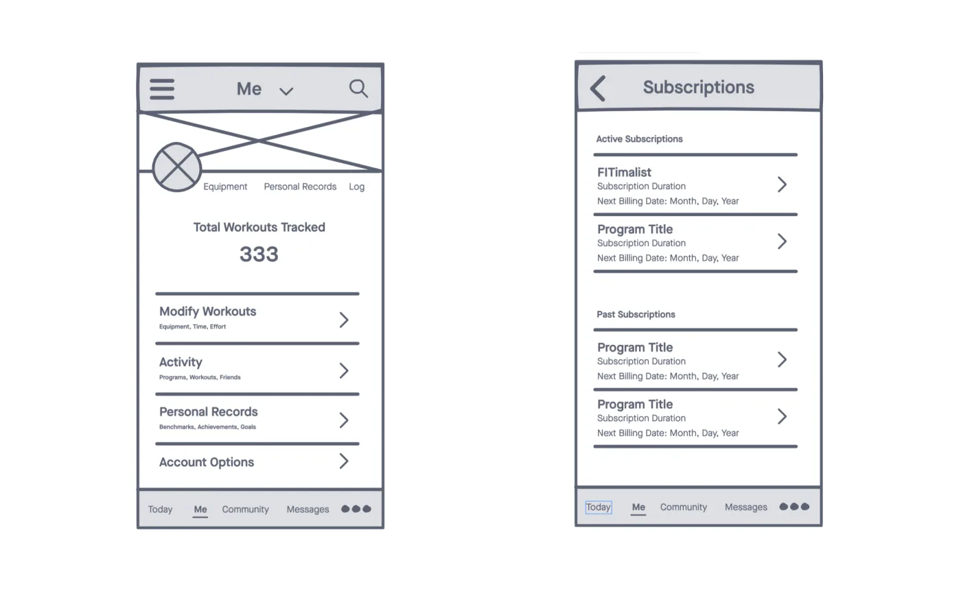
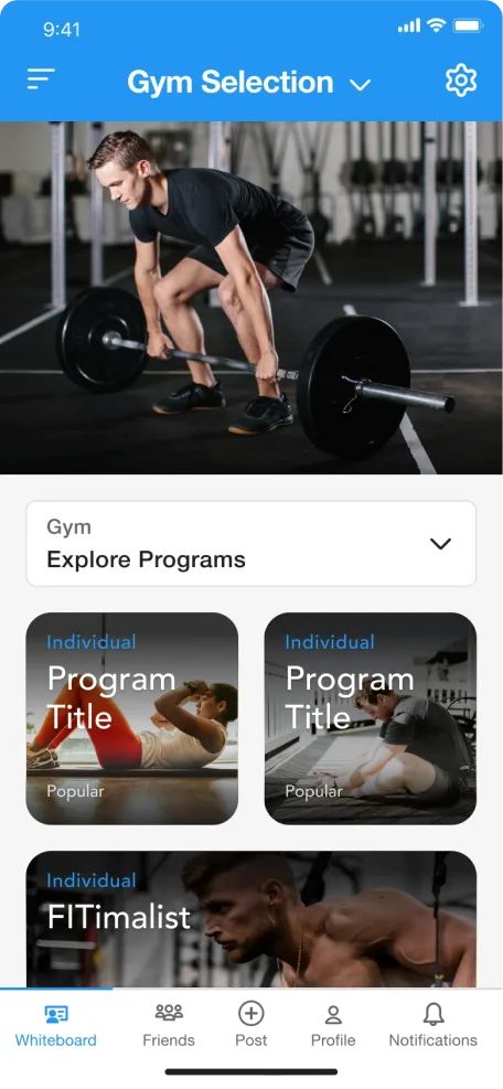
This experience has a visual style established for the product application; for interaction design purposes, I decided to maintain the current styles and introduce new features and functionality.
Key screens
Takeaway
While this ultimately felt like a great visual design exercise, I couldn’t genuinely solve unmet user problems as I had limited time to conduct formal research.- Understand existing UI kits for native channels like iOS and do not reinvent existing native patterns.
- Focus on a content strategy for how to inquire specific information regarding available fitness equipment.
- Maintain existing visual style language to focus more on experience and added functionality.
- Conduct user testing to evaluate information architecture and ease-of-use.
- Ensure color contrast requirements are being met, especially text over images.
- Consider wearable technology UI and how that might integate with the app.
